20 White Kitchen Ideas That Are Bright, Fresh & Absolutely Dreamy
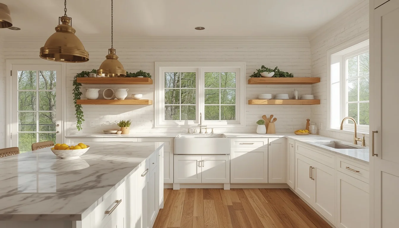
There’s a reason white kitchens keep showing up at the top of every renovation wish list. They catch light in a way no other color does. They make a small galley kitchen feel like it has room to breathe, and they let you change your whole mood with nothing more than a new set of tea towels or a bowl of fruit on the counter.
But a white kitchen done wrong can feel like a hospital hallway. Cold, flat, forgettable. The difference between a white kitchen that feels bright and inviting and one that feels sterile almost always comes down to texture, warmth, and a few smart material choices.
This list covers 20 white kitchen ideas that go past the basic “paint it white” advice. You’ll find cabinet styles, backsplash pairings, countertop combinations, lighting choices, and layout tricks pulled from real design logic, not just pretty photos. Whether you’re planning a full renovation or a weekend refresh, there’s something here you can actually use.
Table of Contents
1. Classic White Shaker Cabinets with Brass Hardware
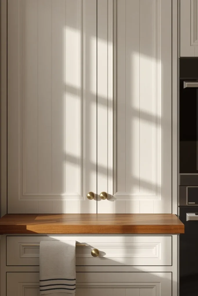
Shaker cabinets stay in style because the recessed panel front works with almost any countertop, backsplash, or flooring you pair it with. Swap the standard brushed nickel pulls for unlacquered brass or aged gold hardware, and the whole kitchen shifts from builder-grade to designer-considered in an afternoon. The warm metal keeps the white from feeling flat, especially under morning light, and it plays well with butcher block, marble, or quartz countertops. This combination works because it separates the “structure” of the kitchen (the cabinets) from the “jewelry” (the hardware), so you can update the metal finish later without touching the cabinetry itself. It’s one of the lowest-cost, highest-impact updates on this entire list.
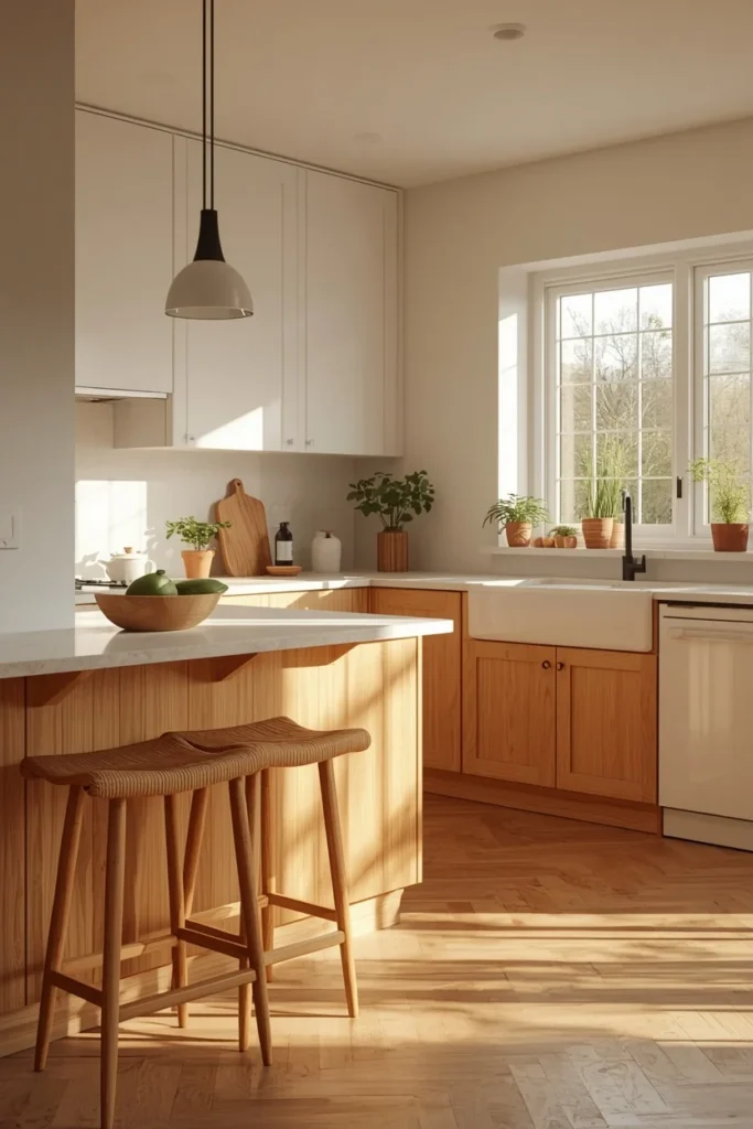
2. Warm White & Natural Wood Two-Tone Kitchen
Pairing white uppers with a stained or natural wood lower cabinet bank keeps the ceiling line light while grounding the room visually, which matters most in kitchens with lower ceilings or less natural light. The wood also hides everyday scuffs and fingerprints far better than an all-white lower run, which makes it a practical choice for busy households with kids or pets. Oak, walnut, and white oak all read differently depending on the stain, so matching the undertone to your flooring keeps the whole room from feeling disjointed. A soapstone or honed quartz countertop bridges the two tones nicely without competing with either one. This combination has held up in design circles for years because it solves a real problem: an all-white kitchen can visually float, while wood anchors it to the floor.
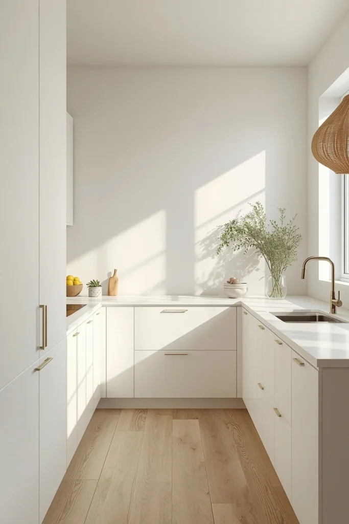
3. Scandinavian Minimalist White Kitchen
A Scandinavian white kitchen strips away ornamentation almost entirely. Flat-panel cabinet doors, integrated appliance fronts, and hidden hardware (cutout finger pulls instead of knobs) keep the visual line uninterrupted from one end of the kitchen to the other. Light oak floors and a single wood or woven texture, like a pendant lamp shade or a stool, keep the room from feeling clinical. This style works especially well in smaller kitchens because the lack of visual clutter makes the whole room read as larger than it is. The trade-off is that this look depends almost entirely on precise installation and clean lines, so it’s less forgiving of uneven cabinet gaps or mismatched hardware than a more traditional style.
4. Waterfall Marble Island
A waterfall edge, where the countertop material wraps down the sides of the island instead of stopping at the edge, turns a plain island into the visual anchor of the whole kitchen. White marble with soft gray veining is the classic choice, though a quartz version gives you a similar look with less maintenance and no sealing required. This detail works best on a larger island since the wrapped panels need enough surface area to show off the veining pattern instead of getting cut off awkwardly. Pairing the island with a contrasting wood or painted perimeter cabinet keeps the marble from overwhelming the room. It’s a higher-cost upgrade, but it’s consistently one of the details buyers and renters remember most about a kitchen.
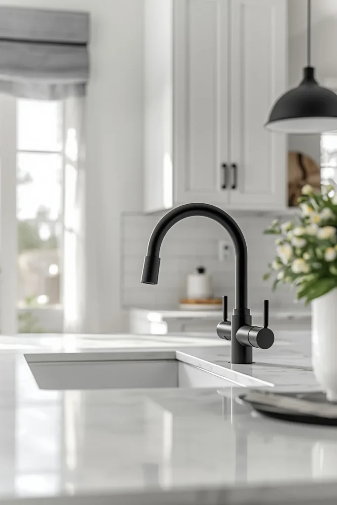
5. White Cabinets with Black Matte Fixtures
Black matte faucets, cabinet pulls, and pendant lighting against white cabinetry create a contrast that photographs well and holds up in person, too. The key is restraint: pick two or three black elements, not every fixture in the room, so the black reads as an intentional accent rather than a competing color scheme. This combination works particularly well in kitchens with a lot of natural light, since the dark accents keep an all-white room from feeling washed out or flat under strong sun. Matte finishes hide water spots and fingerprints better than polished black hardware, which matters near a sink or stovetop. It’s also one of the easier updates to reverse later if trends shift, since you’re only swapping hardware and fixtures, not cabinetry.
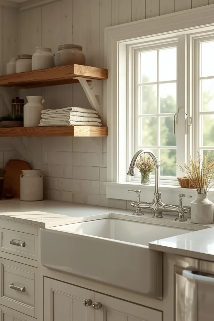
6. Farmhouse White Kitchen with Apron-Front Sink
An apron-front (farmhouse) sink sits proud of the cabinet face instead of tucking underneath the counter edge, and it instantly signals a farmhouse aesthetic even before you add a single other design element. Pair it with white shaker cabinets, a wood countertop or butcher block section, and a simple bridge faucet in polished nickel or brass. The deep basin is genuinely useful for washing large pots and sheet pans, so this isn’t a purely decorative choice, it solves a real kitchen problem. Open shelving nearby with stoneware crocks and dish towels reinforces the lived-in, gathered-over-time feeling that defines this style. This look tends to age well because it’s rooted in function rather than a passing trend.
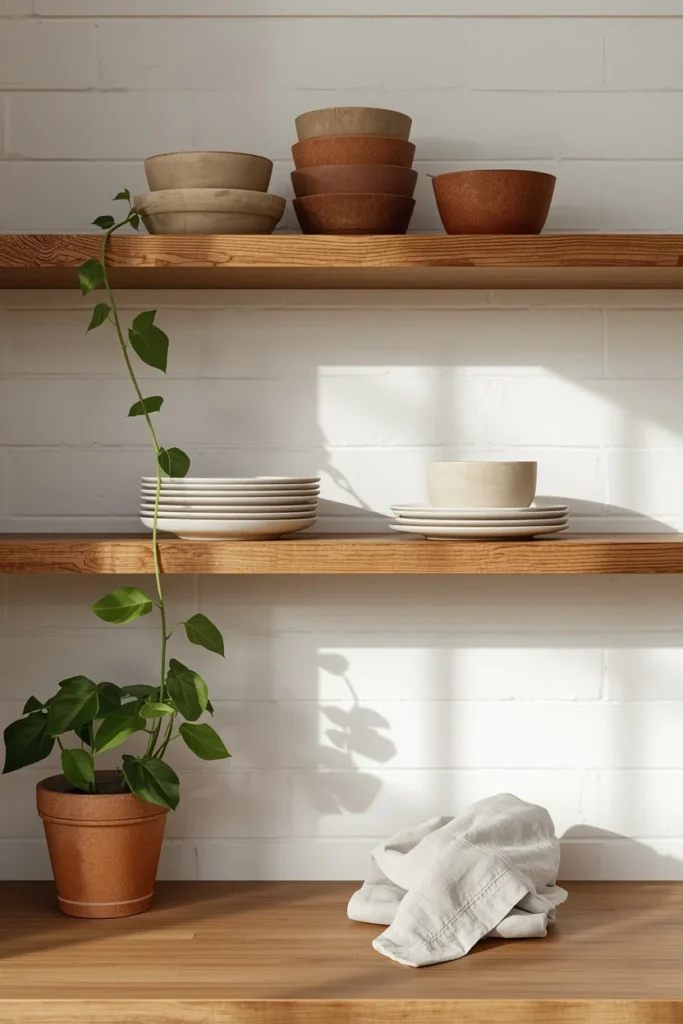
7. Open Shelving Styled with Ceramics & Greenery
Open shelves replace a section of upper cabinets and give a white kitchen visual texture without adding another color to the palette. Layer in ceramic bowls, a stack of linen napkins, and one trailing plant like pothos or a small ivy, rather than filling every shelf edge to edge. The trick to making open shelving actually work day to day is limiting it to items you use often enough that dust doesn’t build up, since open shelves show grime faster than closed cabinets. Grouping items by height and leaving visible negative space between groupings keeps the shelf from looking cluttered in photos and in person. This is one of the most budget-friendly updates on the list since it usually just means removing a cabinet door or building simple wood brackets.
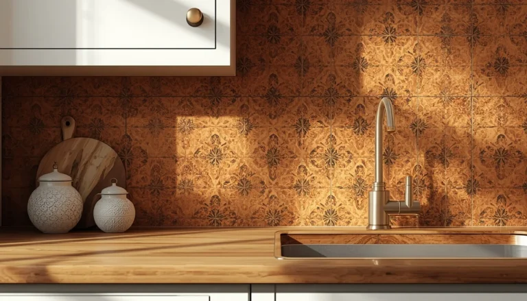
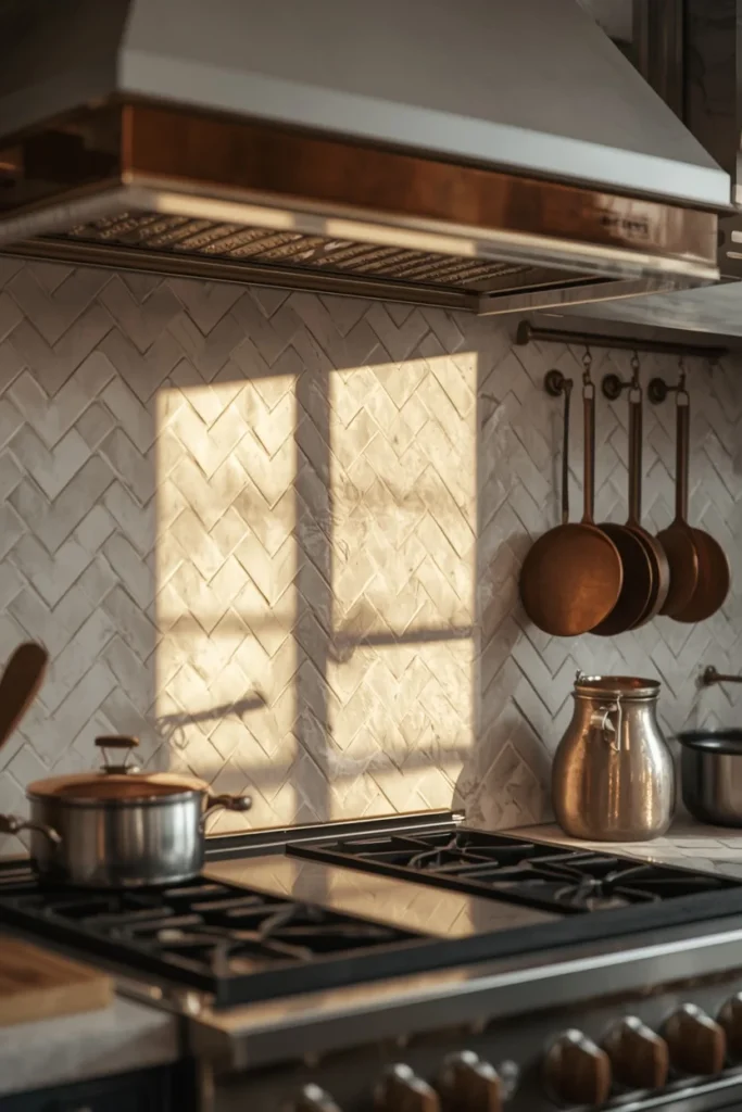
8. Herringbone Tile Backsplash
A herringbone pattern adds movement to a white kitchen without introducing a new color, which makes it one of the easiest ways to add visual interest to an all-white palette. Subway tile, marble, or zellige tile all work in this pattern, though zellige’s slightly irregular surface catches light in a way that flat tile can’t replicate. This layout takes longer to install than a straight-set pattern because of the angled cuts at the edges, so budget for slightly higher labor costs if you’re hiring it out. Pairing it with a simple white grout keeps the pattern subtle; a contrasting gray grout makes the herringbone shape much more graphic and bold. It works especially well behind a range as a focal point, framed by open shelving or cabinetry on either side.
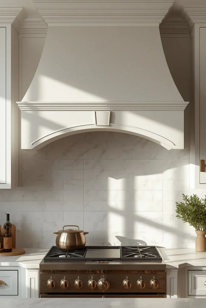
9. Arched Statement Range Hood
An arched or curved range hood softens all the straight lines that usually dominate a kitchen, cabinet edges, countertop corners, and backsplash grout lines. Plaster or venetian plaster finishes on the hood add a handmade texture that flat paint can’t match, and they read as custom even on a mid-range renovation budget. This detail works best as the single curved element in the room; if the island or cabinet doors also have heavy curves, the arch loses its impact as a focal point. Flanking the hood with simple open shelves or slim cabinets keeps the eye moving toward the arch instead of competing with it. Because the hood sits at eye level and is one of the first things people notice entering the kitchen, it’s worth spending a little more time getting this detail right.
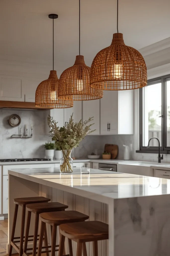
10. Woven Rattan Pendant Lighting
Rattan and woven pendant shades add warmth over an island or sink in a way that metal or glass fixtures simply can’t. The texture reads as relaxed and collected, which keeps an all-white kitchen from feeling like a showroom. Two or three matching pendants hung at a consistent height over an island create rhythm across the room, while a single oversized pendant works better over a smaller peninsula or table. Keep the rest of the lighting simple, recessed cans or under-cabinet strips, so the woven fixtures stay the visual highlight rather than competing with other statement lighting. This detail is also one of the easier swaps to make without an electrician if you’re simply replacing an existing fixture on the same wiring.
11. Creamy Off-White Cabinetry with Warm Undertones
A true stark white can feel harsh, especially in kitchens with a lot of natural light or cool-toned countertops. Shifting to a creamy off-white, something like alabaster, warm ivory, or soft linen, keeps the airy feeling of a white kitchen while adding warmth that stark white can’t provide. This undertone choice matters most when paired with warm metals like brass or gold, since a cool white next to warm gold hardware can look slightly mismatched under certain lighting. Testing paint swatches on the actual cabinet material, in both morning and evening light, is the only reliable way to know how a specific white will read in your space. This is a subtle shift, but it’s often the difference between a kitchen that feels sterile and one that feels lived-in and warm.
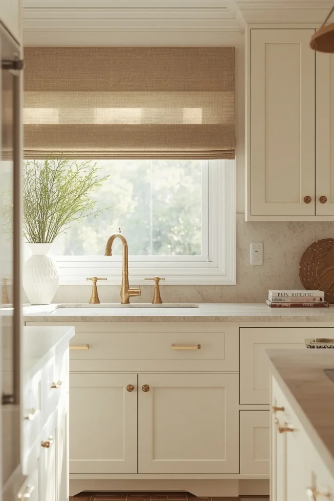
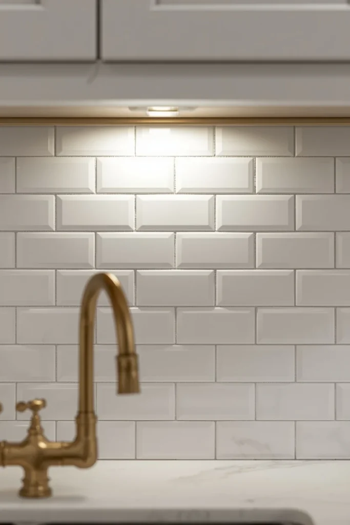
12. Classic White Subway Tile Backsplash
Subway tile in a simple running-bond pattern remains one of the most reliable backsplash choices because it’s affordable, easy to source, and never reads as dated the way some trend-driven tiles eventually do. Beveled subway tile catches light along its edges and adds subtle texture compared to a flat version, which matters most under strong under-cabinet lighting. Choosing a slightly larger format, like 3×9 or 4×12 instead of the standard 3×6, reduces the number of grout lines and gives the wall a cleaner, more current look. Pairing white subway tile with a contrasting grout color, like a soft gray, adds definition without introducing a whole new color into the kitchen. This is consistently one of the best value-for-cost updates in any white kitchen renovation.
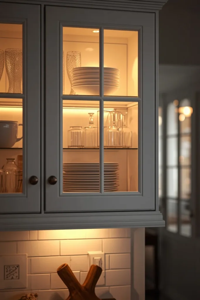
13. Glass-Front Upper Cabinets
Swapping one or two upper cabinet doors for glass fronts breaks up a long run of solid white cabinetry and gives you a spot to display glassware, white dishware, or a favorite ceramic collection. Interior cabinet lighting makes a real difference here since a dark, unlit glass cabinet at night can look more like a hole in the wall than a feature. Keeping the display curated, glasses grouped by type, dishware stacked neatly, prevents the cabinet from looking cluttered the way a fully packed glass front often does. This works best on cabinets you actually access often, since fingerprints and smudges show up more visibly on glass than on solid doors. It’s a detail that adds architectural interest without requiring a full cabinet replacement, since most cabinet doors can be retrofitted with glass inserts.
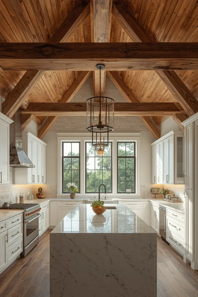
14. Exposed Wood Ceiling Beams
Natural wood beams across a white kitchen ceiling add warmth exactly where an all-white room often feels the coldest, overhead. This works especially well in kitchens with vaulted or higher ceilings, since the beams break up what would otherwise be a large, uninterrupted expanse of white. Reclaimed or rough-sawn wood beams add more texture and character than a smooth, uniform beam, and they photograph with more depth under both daylight and pendant lighting. Pairing the beam tone with the flooring or island wood keeps the room feeling connected rather than like two unrelated design choices layered on top of each other. This is a higher-effort structural addition, but it’s one of the few details that changes the entire feel of a room from a single design move.
15. Soft Sage or Blue Island with a White Perimeter
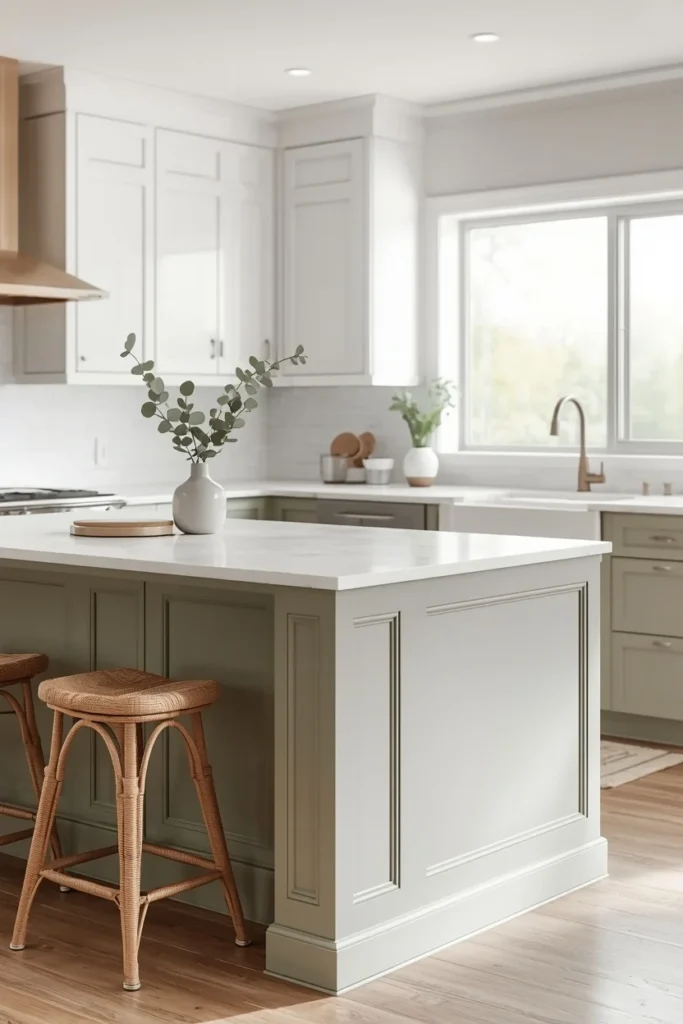
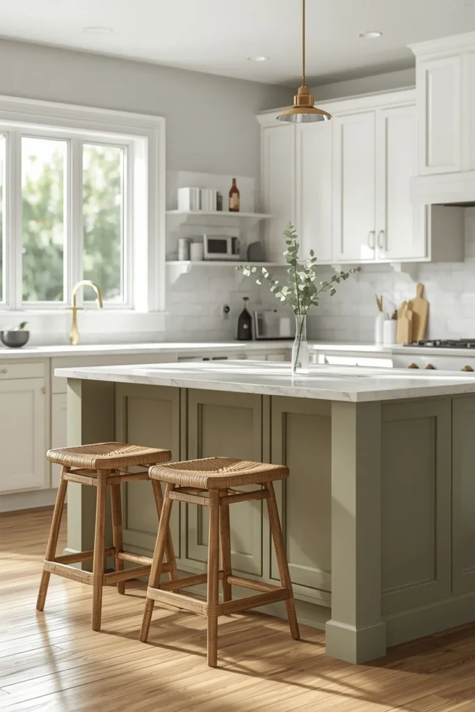
Painting just the island in a soft sage green or dusty blue while keeping the perimeter cabinets white gives you color without the commitment of an entire colored kitchen. This two-tone approach also helps define the island as a distinct zone in open-concept layouts where the kitchen flows directly into a living or dining space. Choosing a muted, grayed-down shade rather than a saturated color keeps the look from feeling like a passing trend, and it pairs more easily with wood tones, brass, and black hardware alike. Matching the island color to a smaller accent elsewhere in the room, like a runner rug or a set of barstool cushions, ties the whole space together intentionally rather than looking like an afterthought. This is a relatively low-cost way to test color in a kitchen before committing to it on a larger scale.
16. Subtly Veined Quartz Countertops
Quartz countertops give you the visual softness of marble veining without the sealing, staining, and etching concerns that come with natural stone, which matters most in a kitchen that sees daily cooking rather than occasional entertaining. Choosing a quartz with subtle, thin veining rather than bold, dramatic movement keeps the countertop from competing with backsplash tile or an accent island color. Matching the vein color to your hardware, gray veining with black or nickel, warm veining with brass or gold, creates a more intentional, pulled-together look than picking each material in isolation. Quartz also holds up better against knife nicks and heat than laminate, making it a practical mid-range option between budget laminate and high-end natural stone. This is one of the more expensive updates on this list, but it’s also one that most buyers and renovators notice first when they walk into a kitchen.
17. Built-In Breakfast Banquette
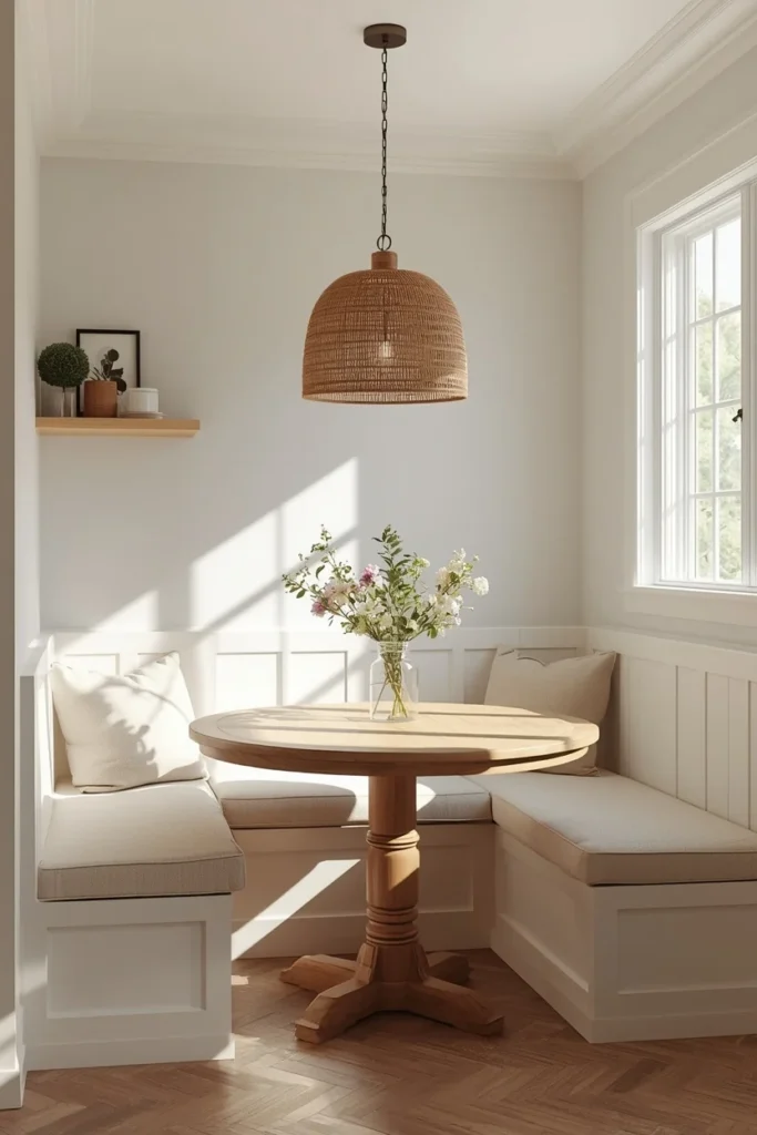
A built-in bench seat with a small table tucked into a kitchen corner turns unused square footage into genuine everyday living space, especially useful in kitchens without room for a full dining table. Upholstering the bench in a durable, stain-resistant fabric, and choosing a washable slipcover style if kids are in the house, keeps the nook practical rather than purely decorative. Adding storage underneath the bench seat, lift-top or drawer-style, gives you extra space for linens or pantry overflow in kitchens that are tight on cabinet room. A round table in this nook, rather than square, makes it easier to move around the space without banging into sharp corners in a tight footprint. This is one of the higher-effort builds on the list, but it consistently becomes the most-used seat in the house once it’s finished.
18. White Walk-In Pantry
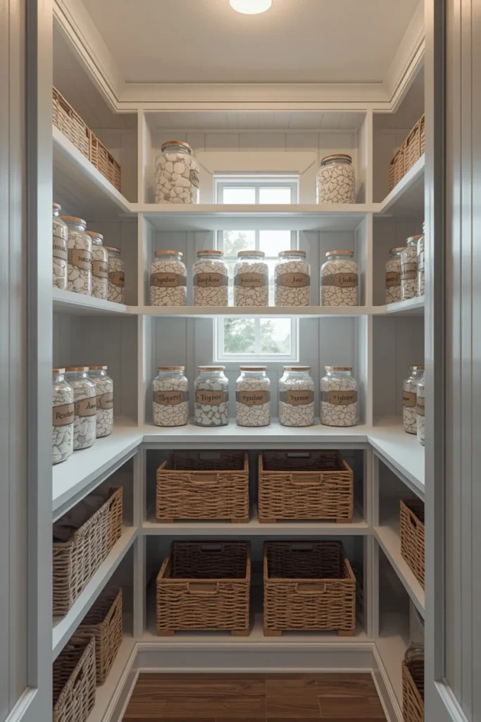
A walk-in pantry with white shelving and matching storage containers keeps everyday clutter, cereal boxes, snack bags, spare appliances, out of view from the main kitchen, which is part of why the main space stays looking calm and photo-ready. Open wood or wire shelving works better than solid cabinetry inside a pantry since it makes contents visible at a glance, which reduces food waste from forgotten items pushed to the back. Labeling bins and jars in a consistent font and material keeps the pantry looking intentional rather than like a storage closet that happens to be organized. A small window or interior light with a warm color temperature makes the pantry feel like an extension of the kitchen rather than an afterthought closet. This is a functional upgrade first, but it also happens to be one of the most-saved kitchen features on Pinterest because of how satisfying an organized pantry looks in photos.
19. Layered Under-Cabinet & Toe-Kick Lighting
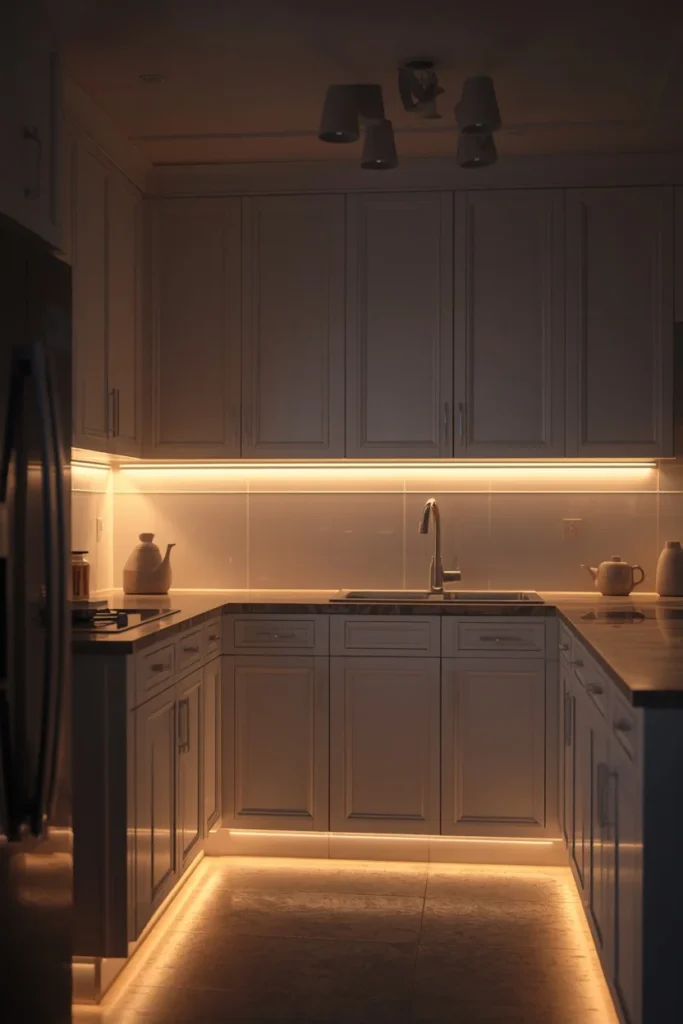
Under-cabinet LED strips light the countertop for actual food prep, while a second, lower layer of toe-kick lighting along the base of the cabinets adds a soft glow that makes the whole kitchen feel warmer after dark. This layered approach matters because overhead lighting alone tends to flatten a white kitchen, washing out texture in the cabinetry and countertop. Choosing a warm color temperature, around 2700 to 3000 Kelvin, rather than a cool white bulb keeps the light from feeling clinical against white surfaces. Dimmable strips let you shift from bright task lighting while cooking to a softer ambient glow for evening entertaining, all on the same fixture. This is a relatively affordable retrofit in most kitchens, since LED strip kits can often be installed without hiring an electrician if you’re working with existing outlets.
20. Vintage-Inspired Butler’s Pantry Nook
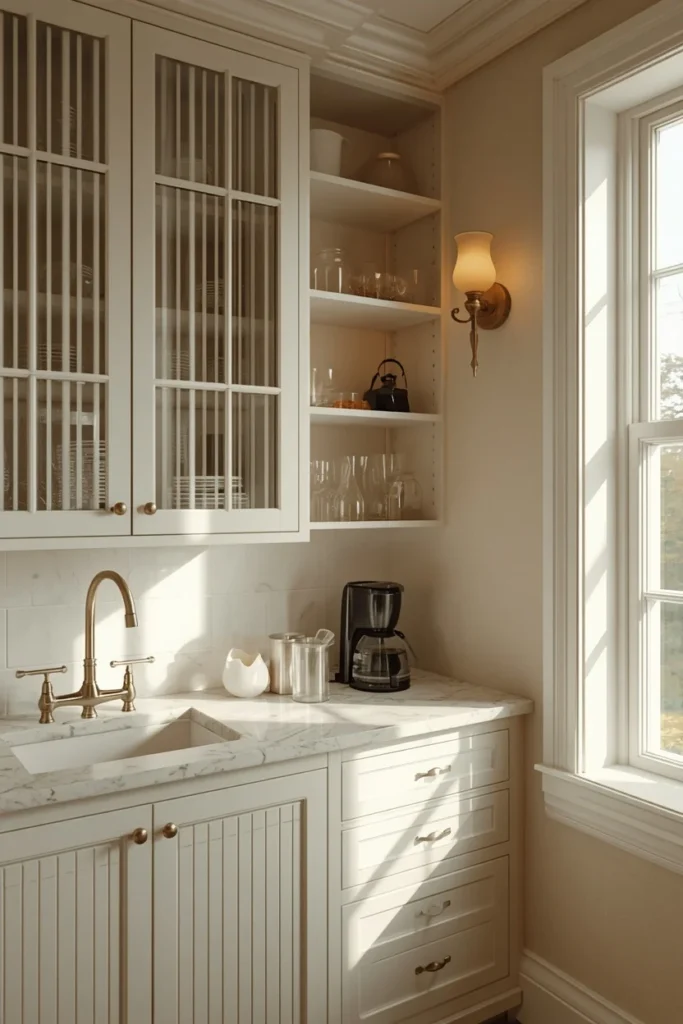
A small butler’s pantry, a narrow secondary prep and storage area just off the main kitchen, gives you a spot for coffee stations, bar setups, or extra dish storage without cluttering the primary cooking space. Vintage-inspired brass faucets, fluted glass cabinet fronts, and a small marble counter section give this nook a collected, old-world character that differs intentionally from the cleaner lines of the main kitchen. This layout works especially well in older homes with a butler’s pantry already roughed in, or in new builds with a hallway or closet space near the kitchen that can be converted. Open shelving above the counter for glassware and a small under-counter beverage fridge make the space functional for entertaining, not just decorative. This idea photographs beautifully because it offers a smaller, more detailed vignette compared to a wide kitchen shot, which tends to perform well as a close-up Pinterest pin.
Styling Tips
Keep countertops mostly clear and let one or two objects, a wood cutting board, a bowl of citrus, do the visual work instead of a dozen small appliances. Layer at least two textures into every white kitchen, wood, woven rattan, linen, or stone, since color alone can’t carry the warmth that texture provides. Vary your metal finishes on purpose: pick one dominant metal (brass, black, or nickel) and use a second sparingly as an accent, rather than mixing four different finishes with no clear hierarchy. Fresh greenery, even a single stem in a small vase, does more to make a white kitchen feel alive in photos than almost any other styling choice.
Practical Implementation Ideas
Start with hardware and lighting swaps before committing to a full cabinet repaint or replacement, since these lower-cost changes often solve more of the “flat and cold” feeling than people expect. If you’re repainting existing cabinets rather than replacing them, a bonding primer designed for cabinetry is worth the extra step, since standard wall primer won’t hold up to daily kitchen wear. Test paint and stain samples on actual leftover cabinet material or a scrap board rather than on drywall, since color reads differently on different surfaces. Bring in one warm wood element, a cutting board, open shelf, or stool, even if you’re not ready to commit to a full two-tone cabinet layout.
Common Mistakes to Avoid
Choosing a stark, cool-toned white without testing it against your actual lighting is one of the most common regrets in white kitchen renovations, since the same paint chip can look bright and airy in one room and flat and gray in another. Skipping texture entirely, all smooth cabinets, all flat countertop, no woven or wood elements, is what makes a white kitchen feel sterile rather than inviting. Overcrowding open shelves until they look like storage rather than styled display defeats the purpose of removing cabinet doors in the first place. Mixing too many metal finishes without a clear plan (gold faucet, chrome pulls, black lighting, nickel appliances) reads as unplanned rather than intentionally eclectic.
Small-Space Alternatives
In a smaller kitchen, extra-tall upper cabinets that reach the ceiling draw the eye upward and make the room feel taller, while also giving you more storage than standard-height cabinets. Open shelving on just one wall, rather than a full run of upper cabinets, keeps a small kitchen from feeling boxed in while still providing storage. A single, well-placed window over the sink, left uncovered or dressed in a simple sheer, brings in more usable light than several smaller covered windows would. Light flooring in a similar tone to the cabinetry keeps sightlines uninterrupted across the room, which is one of the simplest tricks for making a compact kitchen read as larger.
Budget-Friendly Alternatives
Painting existing cabinets rather than replacing them is consistently the highest-value update on any white kitchen budget list, especially when paired with new hardware for a bigger visual shift. Peel-and-stick backsplash tile, when installed carefully, gives you the look of subway or herringbone tile at a fraction of the material and labor cost of real tile. Thrifted ceramics, vintage cutting boards, and secondhand woven baskets add the texture layer this style needs without new-retail pricing. Swapping just the cabinet hardware and a single light fixture, without touching cabinets, countertops, or backsplash at all, is often enough to shift a dated white kitchen into a fresher, more current look.
Pro Styling Recommendations
Photograph your kitchen at different times of day before finalizing paint or cabinet color, since morning and evening light can shift a white shade more than most people expect. Choose countertop and backsplash materials in person under your kitchen’s actual lighting rather than relying only on a showroom sample, which is often lit very differently than a home kitchen. If you’re working with a designer or contractor, bring reference photos that show the specific undertone and texture you want, since “white kitchen” alone is too broad a request to get a consistent result. Save any leftover paint, tile, or stain sample in a labeled container, since matching a discontinued product years later is far harder than keeping a small reference on hand.
FAQs
Conclusion
A white kitchen works best when it’s built from a handful of intentional choices rather than one single color decision. The cabinets set the foundation, but it’s the hardware, the countertop veining, the open shelf styling, and the warmth of the lighting that decide whether the room feels bright and welcoming or flat and forgettable. Pick two or three ideas from this list that fit your budget and your home’s existing bones, and build outward from there instead of trying to change everything at once. The kitchens that photograph the best, and that people actually love cooking in, are almost always the ones with a little texture, a little warmth, and one or two details that feel personal.