20 Studio Apartment Ideas That Make One Room Feel Like a Whole Beautiful Home
A studio apartment asks a lot of one room. It has to sleep you, feed you, hold your work calls, and still look like somewhere you’d want to invite people over to. That’s a tall order for four walls and a few hundred square feet.
The apartments that pull it off don’t do it with more space. They do it with zoning, with furniture that works twice as hard, and with a handful of design decisions that quietly separate “bedroom” from “living room” even when there’s no wall between them.
This guide covers 20 of those decisions — the dividers, the furniture, the color choices, and the small personal touches that turn one open room into something that reads as a full, considered home rather than a single box you happen to sleep in.
Table of Contents
1. Curtain-Divided Sleep Nook
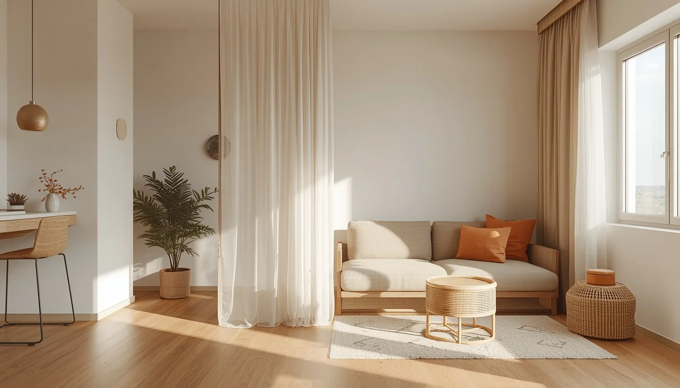
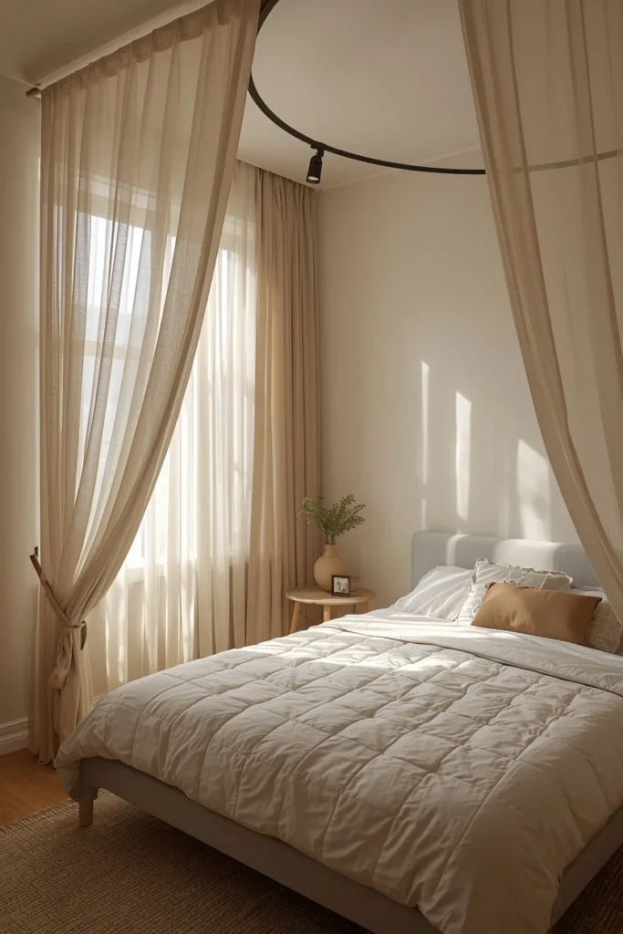
Hanging a floor-to-ceiling curtain between the bed and the rest of the room is one of the fastest ways to create a private sleeping zone without touching a single wall. A curved ceiling track lets the curtain wrap around the bed on more than one side, which matters if the bed sits away from a corner rather than tucked against it. Sheer linen keeps daylight moving through the space when the curtain is open, while a heavier velvet or blackout-lined panel gives real privacy and sound dampening when it’s drawn closed at night. Because the whole setup mounts to the ceiling or a tension rod, it’s fully renter-friendly and comes down without leaving a mark. This is usually the first zoning move worth making in any studio, since it solves the biggest issue — a bed in full view of the front door — for very little cost.
2. Bookshelf as a Room Divider
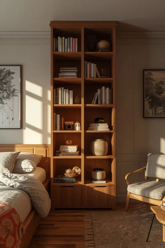
A tall, open-backed bookshelf placed perpendicular to the wall does double duty as storage and as a soft boundary between the sleeping area and the living space. Filling it only partway, rather than packing every shelf solid, keeps sightlines open so the room doesn’t feel chopped into two separate boxes. Using the lower half as a solid-backed unit and the upper half as open shelving gives the sleeping side a sense of enclosure near the bed while still letting light travel through higher up. This approach works especially well for anyone who needs the storage anyway, since it replaces what would otherwise be a purely decorative room divider with genuine shelf space for books, folded linens, and display objects. It also tends to feel more permanent and intentional than a curtain, which suits a longer-term lease.
3. Murphy Bed for a True Living Room by Day
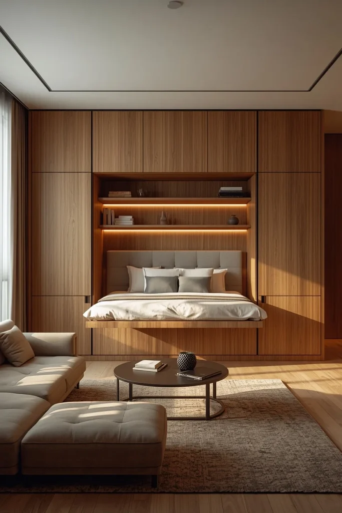
A wall bed that folds up into a cabinet during the day is one of the only ways to reclaim an entire section of floor for genuine living-room use. Modern Murphy bed units often include a fold-down desk, a bookcase front, or built-in nightstands that stay functional whether the bed is up or down, so the piece doesn’t sit idle for half the day. Choosing a unit finished in the same tone as surrounding cabinetry or trim helps it disappear into the room’s architecture rather than reading as an obvious bed-in-a-box. This option makes the most sense for anyone who regularly hosts people during the day or evening and wants the room to genuinely function as a living space rather than a bedroom with a couch pushed into it. It requires more upfront investment than a curtain or bookshelf, but it’s the closest a studio can get to having a real second room.
4. Platform Bed with Under-Bed Storage
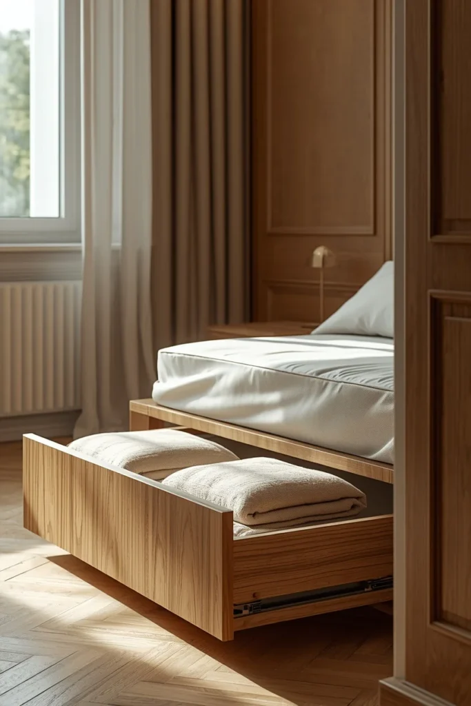
Raising the bed slightly on a platform with built-in drawers underneath turns what’s usually wasted space into real storage for out-of-season clothing, extra bedding, or bulky items that don’t fit in a small closet. A platform also visually elevates the sleeping area, giving it a small architectural distinction from the rest of the floor even without a curtain or divider. Choosing drawers that pull out from the side rather than requiring the mattress to be lifted makes daily access far more practical. This approach suits anyone who needs the storage more than they need a fully enclosed sleeping nook, since the platform itself does some of the zoning work simply through its slight change in floor level. Pairing it with a low, upholstered headboard finishes the look without adding bulk to the room.
5. Rolling Kitchen Island as a Flex Zone
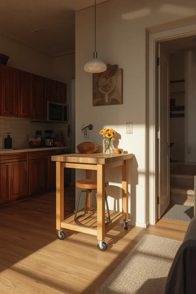
A kitchen island on locking wheels gives a studio kitchenette the counter space, prep surface, and casual dining spot that a fixed layout often can’t fit. In the morning it can sit against the counter as a coffee station; at midday it rolls toward the center as extra workspace; by evening it becomes a small dining surface for one or two people. This flexibility matters most in open-plan studios where the kitchen has no clear boundary from the rest of the room, since the island itself becomes the visual marker of where the cooking zone ends. Choosing one with a lower shelf or a few integrated drawers adds storage for cookware without needing extra cabinetry. It’s one of the more versatile single purchases a studio dweller can make, since it performs three or four jobs depending on the time of day.
6. Low-Back Sofa as a Visual Boundary
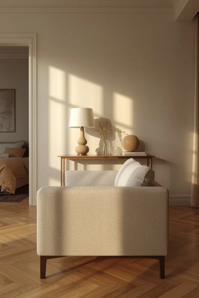
Positioning a sofa with its back facing the sleeping or work area, rather than pushing every piece of furniture against the walls, creates a natural divide using furniture that’s already doing a job. A low-backed silhouette keeps sightlines open across the room so the boundary feels intentional rather than blocking, which matters in a studio where every wall of visual weight makes the space feel smaller. Adding a slim console table behind the sofa reinforces the boundary further while providing a spot for a lamp, a small tray, or decorative objects that face the “other” zone. This approach costs nothing beyond furniture placement, making it one of the easiest zoning tricks to test before committing to a curtain or a built-in divider. It works particularly well in rectangular studios where the bed sits at one end and the living area occupies the other.
7. Fold-Down Wall Desk for Work-From-Home
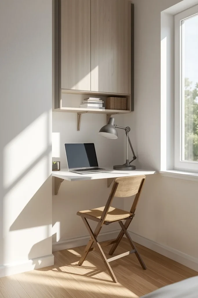
A wall-mounted desk that folds flat against the wall when not in use gives remote workers a genuine workspace without permanently sacrificing floor space to a desk that sits empty most evenings. Look for a design with a small shelf or drawer built into the mounting bracket, since that keeps a laptop charger, notebook, and pen within reach even when the desk is folded away. Mounting it near a window takes advantage of natural light during work hours, which matters more for video calls and focus than most people expect. This solution suits studios where a permanent desk would eat into already-tight square footage, and it pairs naturally with a single folding or stacking chair that tucks elsewhere when not in use. It’s a small addition that solves one of the most common studio apartment complaints: nowhere dedicated to actually work.
8. Sleeper Sofa for Guest-Ready Flexibility
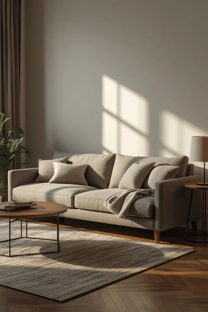
A quality sleeper sofa lets a studio double as both a full-time living room and an occasional guest room, eliminating the need for a separate bed frame that only gets used by the primary tenant. Investing in a well-built model with a supportive mattress matters here, since a cheap pull-out tends to feel obviously temporary and uncomfortable for both the host and any guest. This approach makes the most sense for anyone who doesn’t need a dedicated sleeping zone daily and would rather keep the room fully open as a living space most of the time. Pairing the sofa with a slim side table that can hold a lamp or drink keeps the piece feeling like real furniture rather than a fold-out afterthought. It’s a higher upfront cost than a basic sofa, but it replaces the need for two separate large furniture pieces.
9. Layered Rugs to Define Zones
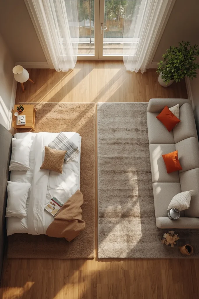
Placing a distinct rug under each functional area — one beneath the bed, a different one under the living room seating, perhaps a small runner near the kitchenette — visually marks where each zone begins and ends without adding any furniture or dividers at all. Choosing rugs in a related but not identical palette keeps the overall room feeling cohesive rather than patchwork, while the shift between them still reads clearly underfoot. This trick works especially well in fully open studios with no architectural features to lean on, since the floor becomes the primary tool for organizing the space. A slightly larger rug under the living area, with furniture legs resting on it, tends to make that zone feel more grounded and intentional than a rug that’s too small for the furniture arrangement. It’s one of the lowest-cost, lowest-commitment zoning ideas on this list.
10. Mirror Wall to Add Light and Depth
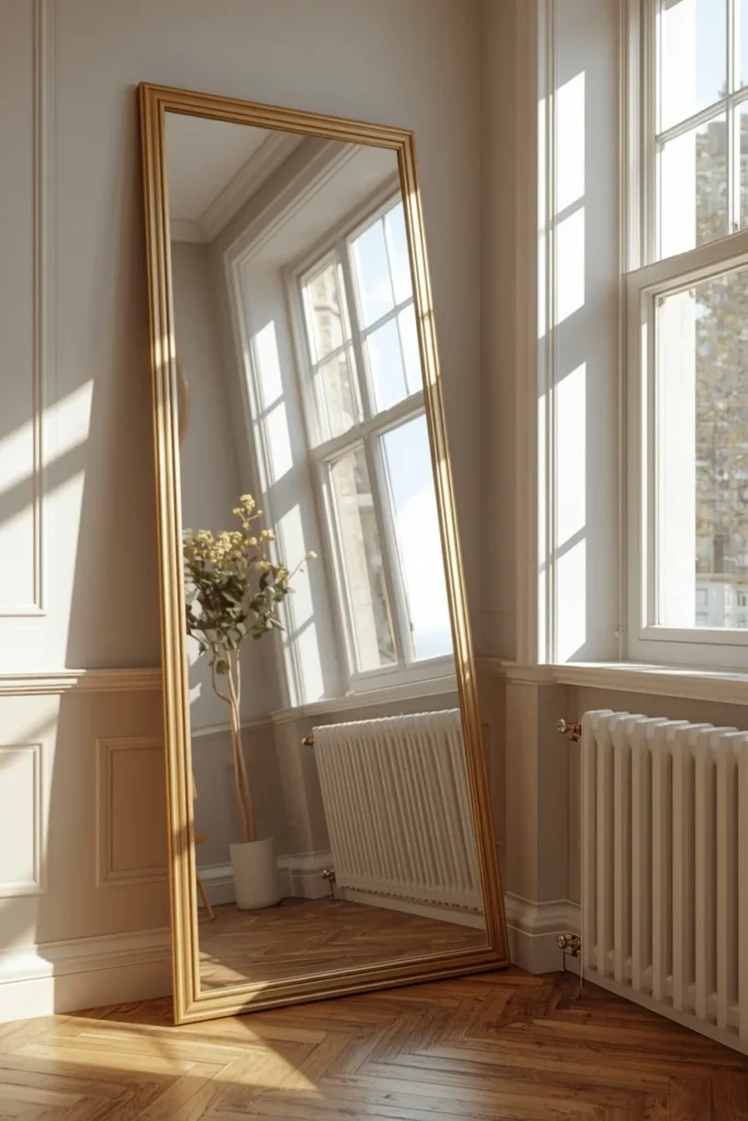
A large mirror, or a run of mirrored panels along one wall, bounces natural light around a studio and creates the visual illusion of a room roughly twice its actual depth. Positioning it opposite a window rather than beside one maximizes the amount of daylight it reflects back into the space throughout the day. A single oversized floor mirror leaning against the wall reads more like an intentional decor piece than a full mirrored wall, which can feel closer to a dance studio if overdone. This trick is especially valuable in studios with only one window or a north-facing exposure, where natural light is already limited. Framing the mirror in a warm wood or brass tone keeps it from feeling cold or overly clinical against the rest of the room’s palette.
11. Floor-to-Ceiling Vertical Storage
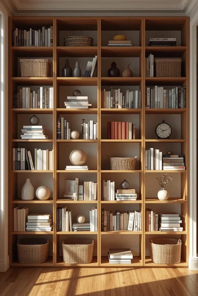
Tall, narrow shelving units or wall-mounted cabinets that run all the way to the ceiling take advantage of vertical space that floor-level furniture never touches. Storing frequently used items on the lower shelves and seasonal or rarely used items up high keeps the system practical rather than just visually tall. This approach matters most in studios with limited closet space, since vertical shelving can absorb overflow from an undersized coat closet or kitchen cabinet run. Choosing open shelving for at least part of the unit lets it double as display space for books, plants, and personal objects rather than reading as pure utilitarian storage. Anchoring tall units to the wall is a safety necessity, especially in a home with kids or pets who might climb or lean on lower shelves.
12. Window Ledge Reading and Dining Nook
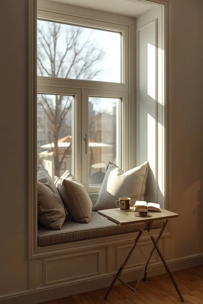
A wide window ledge or a built-in bench beneath a window can double as both a casual dining spot and a reading nook, giving a studio a dedicated corner that feels separate from the main living area even without walls. Adding a slim fold-down table beside the bench lets it function as an eating surface when needed, then fold flat against the wall the rest of the time. A single cushion with a couple of pillows softens the ledge for lounging, while café curtains or a simple roman shade keep the spot feeling cozy rather than exposed. This idea suits studios with a deep window sill, a radiator cover, or an underused alcove near a window, turning a passive architectural feature into one of the most-used corners in the apartment. It’s a small investment that adds real function to space that would otherwise sit empty.
13. Warm Minimalist Japandi Palette
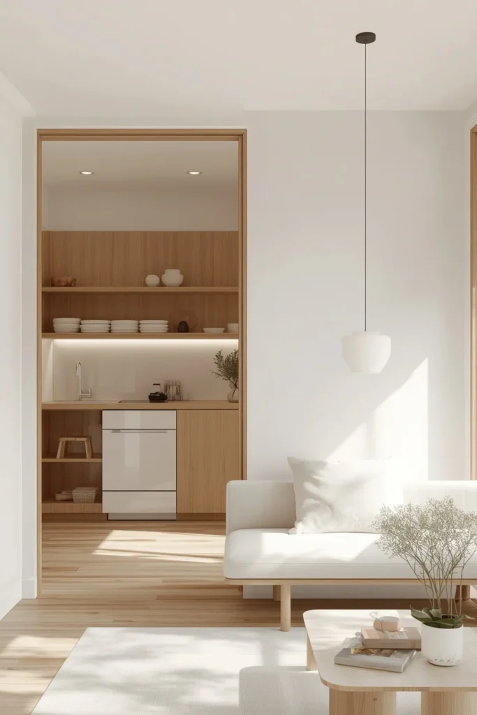
A warm minimalist palette — soft white walls, natural oak tones, and a single low-profile linen sofa — gives a studio breathing room by resisting the urge to fill every surface. This style thrives on restraint rather than square footage, which makes it especially well suited to small spaces where visual clutter reads more intensely than it would in a larger home. A single statement pendant light, open shelving instead of upper cabinets in the kitchenette, and one or two well-chosen textural pieces do more for the room than a dozen small decorative objects would. The most common mistake with this approach is buying the right pieces without editing enough afterward, since even one superfluous object can break the calm the style depends on. This palette suits renters who want a considered, uncluttered look without needing bold color or pattern to make the space feel finished.
14. Bohemian Textural Studio
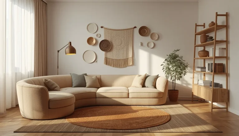
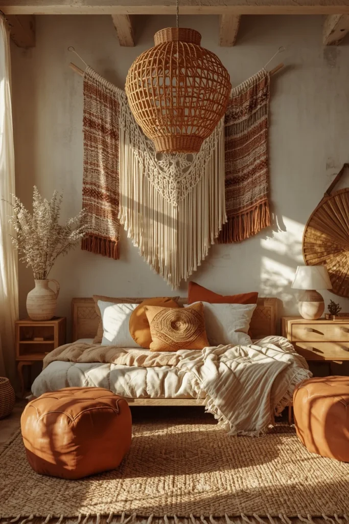
A bohemian studio leans into woven baskets, linen throws, handmade ceramics, and layered textiles rather than clean lines, creating a relaxed, personal atmosphere that still reads as intentional rather than cluttered. Macramé wall hangings, a rattan pendant light, and a mix of vintage and new furniture pieces give the room warmth and story without requiring a large footprint to pull off. Because this style depends on texture more than square footage, it adapts easily to almost any studio layout, from a rectangular railroad apartment to an oddly shaped converted loft. Keeping a consistent, muted color family across the layered textiles — think terracotta, cream, and olive — prevents the collected look from tipping into visual chaos. This approach suits renters drawn to expressive, personal decor who don’t want their small space to feel sparse or overly restrained.
15. Moody Accent Wall Zone
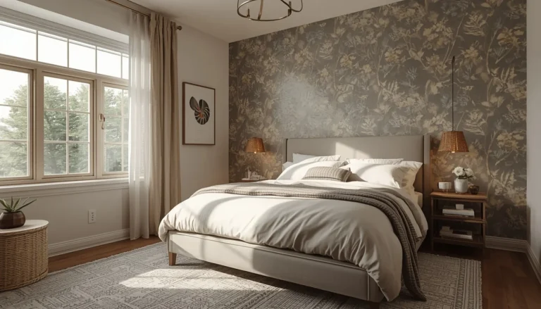
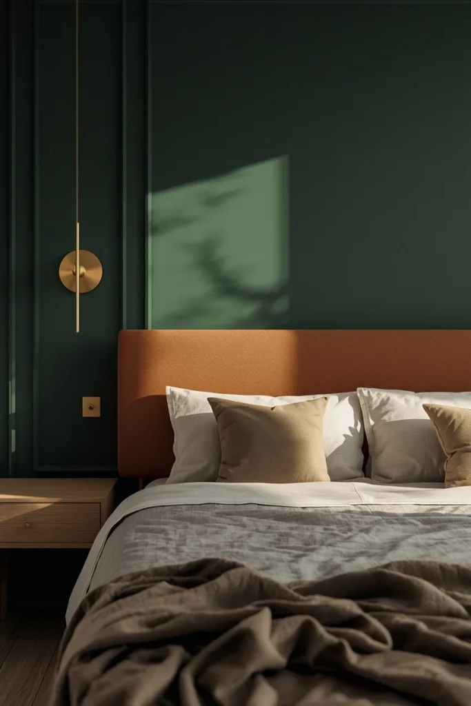
Painting just the wall behind the bed or the living area in a deep, saturated color — charcoal, forest green, or deep terracotta — visually anchors that zone without requiring any structural change to the room. Because the rest of the walls stay lighter, the moody wall reads as a deliberate design choice rather than making the whole studio feel smaller or darker. This trick works particularly well behind a bed, since it gives the sleeping area a sense of enclosure and depth that a plain white wall doesn’t provide. Pairing the dark wall with warm brass or wood-toned accents keeps the space feeling rich rather than cold, and a single well-placed piece of art or a mirror on that wall adds another layer of intention. This is a renter-friendly move as long as the lease allows painting, and most landlords will accept a return to neutral before move-out.
16. Arched Doorway Detail
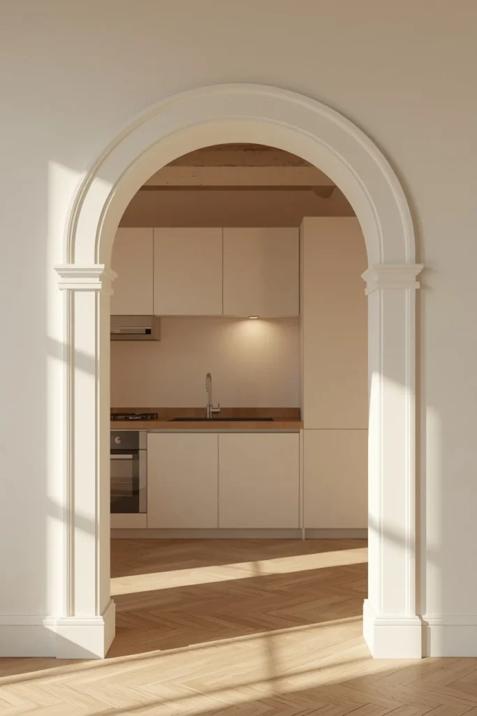
Adding an arched shape to a flat, rectangular doorway or nook opening — through a drywall arch kit or even a painted trompe l’oeil arch — introduces architectural character that most modern apartment buildings don’t naturally offer. This detail is especially popular in studios where a closet opening, a kitchenette pass-through, or a bathroom doorway is the only spot available for a distinctive design moment. A painted arch is the lower-commitment version, requiring only paint and careful measuring, while a drywall arch kit changes the actual opening shape for a more permanent result. This trick reads as “designed” rather than “decorated,” which matters in a rental where most other architectural choices are already fixed. It pairs particularly well with a warm minimalist or Japandi-influenced studio, where the arch becomes one of the only curved, soft elements in an otherwise straight-lined room.
17. Storage Ottoman as Coffee Table and Extra Seating
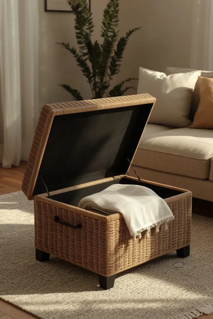
An upholstered ottoman with a hidden storage compartment replaces both a coffee table and an extra seat, tucking away blankets, remote controls, or off-season items inside a piece that already earns its place in the living area. Choosing one with a removable tray top keeps it functional as a surface for drinks or a laptop, while the storage underneath stays completely out of sight. This is a small but meaningful upgrade over a standard coffee table, since it removes the need for a separate storage bench or basket taking up additional floor space elsewhere in the room. Pairing it with a low sofa keeps the scale proportional, since an oversized ottoman can quickly dominate a small living area. It’s one of the easiest single-furniture swaps to make in an existing studio setup without any real disruption.
18. Closed Under-Bed Drawer System
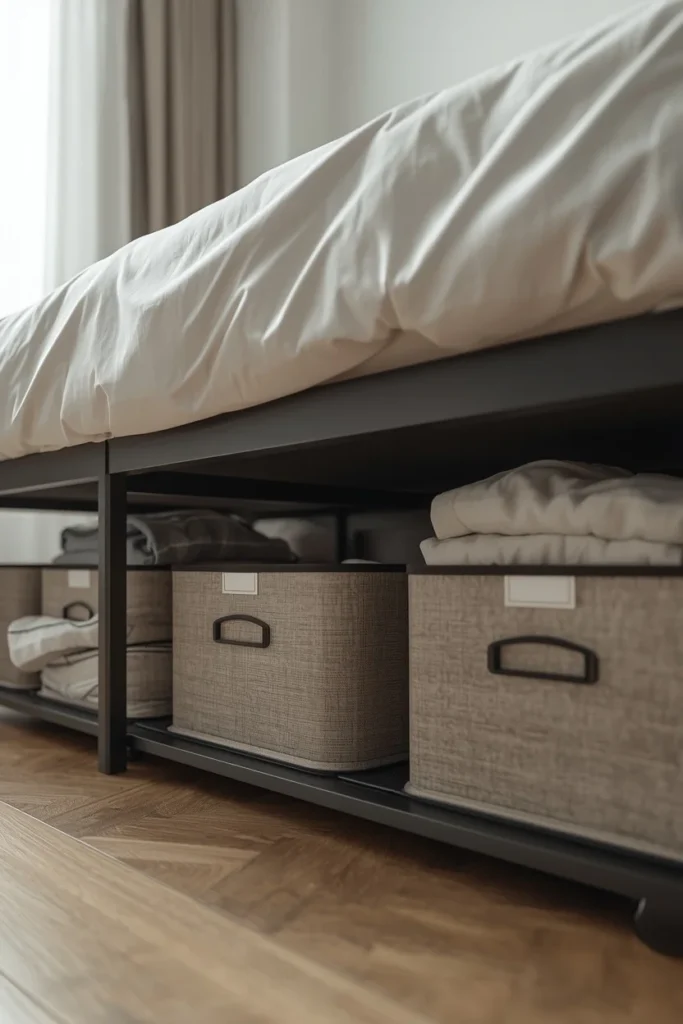
For studios without a raised platform bed, a set of rolling drawers or bins built specifically for under-bed clearance offers similar storage benefits without requiring new furniture. Measuring the exact clearance height under the existing bed frame before buying is essential, since even an inch of difference can make a drawer system unusable. Clear or labeled bins work best for maintaining order, since items sliding under a bed are easy to forget about entirely if the storage isn’t visible or organized. This is one of the more budget-friendly storage upgrades on this list, since it works with furniture already in the room rather than requiring a replacement bed frame. It suits renters who want more storage without the bigger investment or reconfiguration a platform bed would require.
19. Glass Partition for Light-Filled Separation
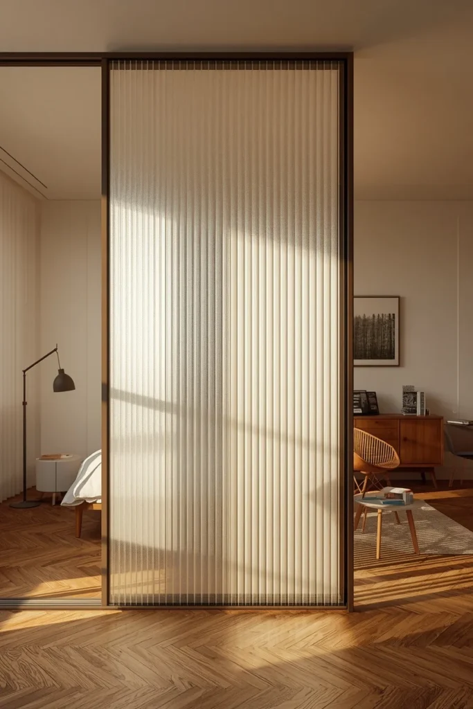
A fixed or sliding glass partition creates a genuine physical boundary between the sleeping and living areas while still allowing daylight to pass through uninterrupted, which matters enormously in a studio where blocking any window is a real cost. Frosted or fluted glass adds a layer of privacy without going fully opaque, striking a middle ground between an open floor plan and a solid wall. This option requires more investment and sometimes landlord approval compared to a curtain or bookshelf, since it usually involves a semi-permanent installation. It suits studios with high ceilings or loft-style layouts, where the glass can run close to full height without feeling heavy or closing in the room. Pairing the partition with sheer curtains on a track gives the option of even more privacy on nights when full opacity is preferred.
20. Personalized Display Corner
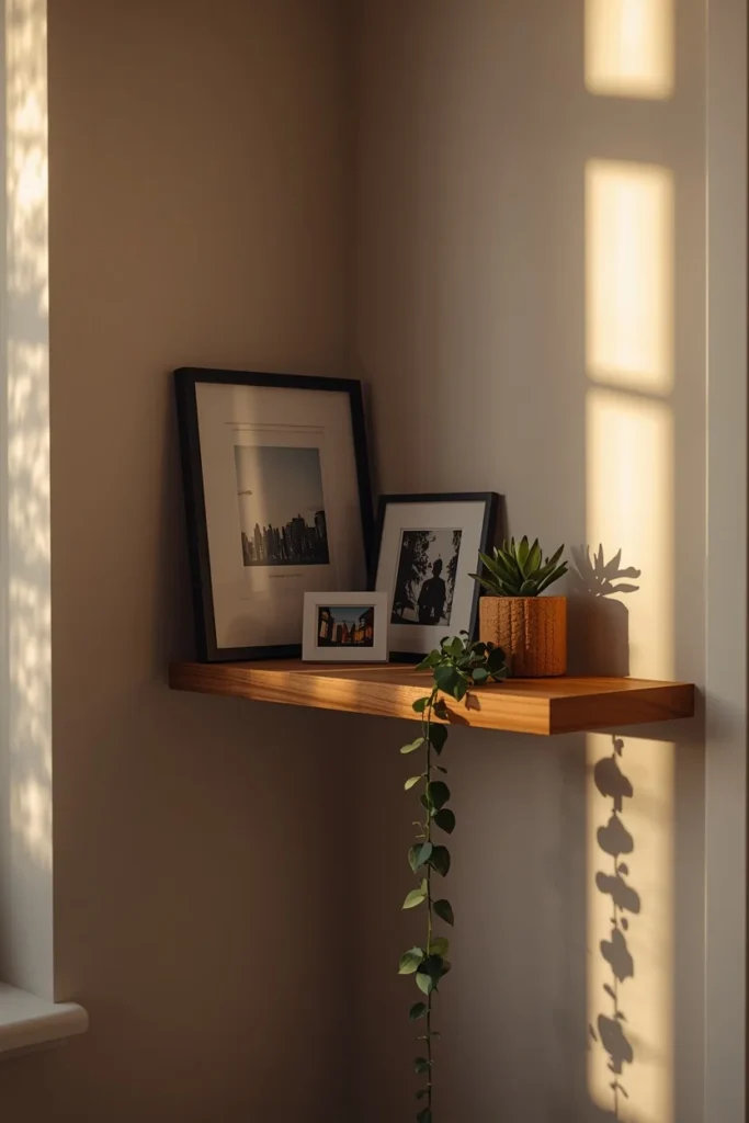
Dedicating one small shelf, wall, or corner to personal photographs, travel souvenirs, or a rotating collection of meaningful objects keeps a studio from feeling like a generic, catalog-styled room. This doesn’t require much space — a single floating shelf or a gallery of small framed pieces is enough to give the apartment a sense of identity beyond its furniture choices. Rotating the display occasionally, rather than treating it as a fixed installation, keeps the corner feeling current and prevents it from blending into the background over time. This idea matters most in a small space precisely because there’s so little square footage available for personal expression elsewhere, making this one corner do a disproportionate amount of emotional work for the whole apartment. It’s a reminder that a well-designed studio isn’t just about function — it should also feel unmistakably like the person who lives there.
Styling Tips
- Repeat one or two accent colors across different zones (a pillow here, a vase there) so the whole studio reads as one cohesive space rather than disconnected corners.
- Keep furniture legs visible rather than choosing pieces with solid skirting, since visible legs let light pass underneath and make the room feel less crowded.
- Use one dominant pattern per zone at most, letting solid colors carry the rest of the room so nothing competes for attention.
- Choose adjustable, dimmable lighting in each zone so the same room can feel bright and functional during work hours and warm and relaxed in the evening.
- Add at least one low-maintenance plant per zone to soften hard furniture lines without requiring much daily upkeep.
Practical Implementation Ideas
- Measure the full room and sketch zones on paper before buying any dividers or furniture, noting window and outlet placement so nothing gets blocked.
- Choose multifunctional furniture first — a sleeper sofa, storage ottoman, or drop-leaf table — before filling remaining gaps with single-purpose pieces.
- Test a low-cost divider option, like a curtain or rearranged furniture, before committing to a more permanent or expensive built-in solution.
- Prioritize vertical storage early, since floor space is almost always the more limited resource in a studio compared to wall height.
- Keep a consistent flooring or rug transition between zones so the eye reads the space as one flowing room rather than mismatched sections.
Common Mistakes to Avoid
- Pushing every piece of furniture against the walls, which often makes a studio feel more scattered rather than more open.
- Choosing a divider so solid it blocks most of the room’s natural light, making the space feel smaller instead of more organized.
- Buying furniture sized for a larger home, which overwhelms a compact floor plan even if each individual piece is attractive.
- Skipping a lighting plan and relying only on one overhead fixture, which flattens the whole room and makes zoning harder to read visually.
- Over-personalizing every surface at once, which can tip a cozy studio into feeling cluttered and visually overwhelming.
Small-Space Alternatives
For studios under 350 square feet, skip a full room divider altogether and rely on rug placement, a low-back sofa, and a curtain around just the headboard area to suggest zoning without losing floor space. A wall-mounted fold-down desk and a storage ottoman can replace a dedicated office corner and a separate coffee table, keeping the footprint as open as possible while still covering every function the room needs to perform.
Budget-Friendly Alternatives
A simple curtain rod and a length of fabric can replicate the look of a custom room divider for a fraction of the cost of a built-in wall or glass partition. Secondhand furniture, particularly wardrobes, bookshelves, and consoles that double as dividers, offers real function without the price of new pieces. Under-bed rolling bins are one of the cheapest storage upgrades available and require no tools or installation at all.
Pro Styling Recommendations
Choose the zoning method before the furniture, since a curtain, bookshelf, or glass partition each dictates slightly different furniture placement and sightlines. Keep the color palette consistent across all zones so the eye reads the studio as one home rather than a patchwork of unrelated rooms. When in doubt on a single splurge, put it toward the bed or the sofa, since both anchor their respective zones and get used every single day.
FAQs
Conclusion
A studio apartment isn’t a smaller version of a house — it’s a different kind of design problem, one where every piece of furniture and every design choice needs to justify its place. The studios that feel like full homes usually aren’t the biggest ones on the block. They’re the ones where the layout was planned around how the person actually lives, where storage was built in rather than added as an afterthought, and where at least one corner was left for something that has nothing to do with function at all. Start with the zoning decision that matters most for your daily routine, then build outward from there.