20 Genius Ways to Connect Your Living & Dining Room Seamlessly & Stylishly
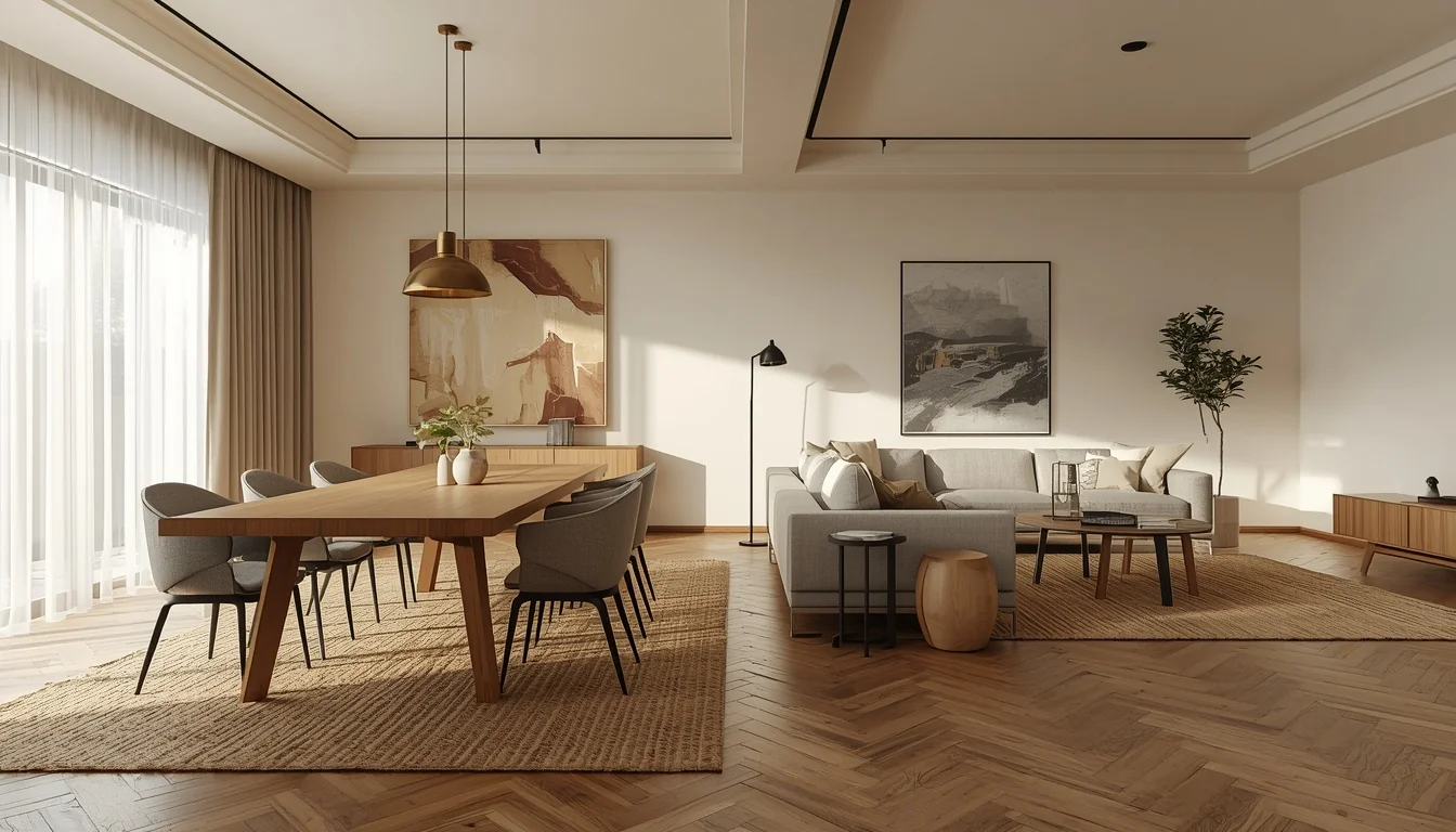
Your living room and dining room share a floor plan, but they rarely share a design plan. One side gets a plush sofa and a gallery wall. The other gets a table, four chairs, and not much else. The result feels like two rooms that happen to be next to each other instead of one space that flows.
The good news is that connecting them doesn’t require knocking down anything. It comes down to small, repeatable design decisions: where the rug ends, which paint color climbs the walls, how the light lands in each zone. Below are 20 ways to make that happen, whether you’re working with a tiny apartment or a wide-open floor plan.
Table of Contents
1. Anchor Both Zones With One Oversized Rug
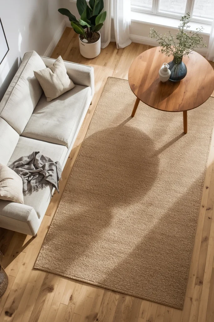
A single large rug that stretches under both the sofa’s front legs and the dining table’s edges tells your eye that this is one room with two jobs, not two separate rooms. Wool and jute blends hold up well under dining chairs that get pulled in and out daily, while a low pile keeps chair legs from catching. Choose a neutral base with subtle texture, like a herringbone weave or a faded vintage pattern, so it reads as calm rather than competing with your furniture. This one move does more visual heavy lifting than almost any other change on this list, because rugs are the first thing your eye registers when scanning a floor plan. If your budget only allows for one big purchase this season, make it this one.
2. Let One Paint Color Flow Wall to Wall
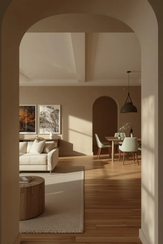
Skipping a color change where the living room ends and the dining room begins removes the visual seam entirely. A warm off-white, soft greige, or muted clay tone works in almost any lighting condition and photographs well for both cozy and bright rooms. If you want definition without a hard stop, try a tonal shift instead, like painting the dining nook’s back wall one shade deeper than the rest of the room. This keeps the eye moving smoothly from one zone to the next instead of hitting an abrupt line. Painters recommend testing your chosen color in both the morning and evening light of the space before committing, since open floor plans often catch light from more than one direction.
3. Use Furniture Backs to Draw a Soft Boundary
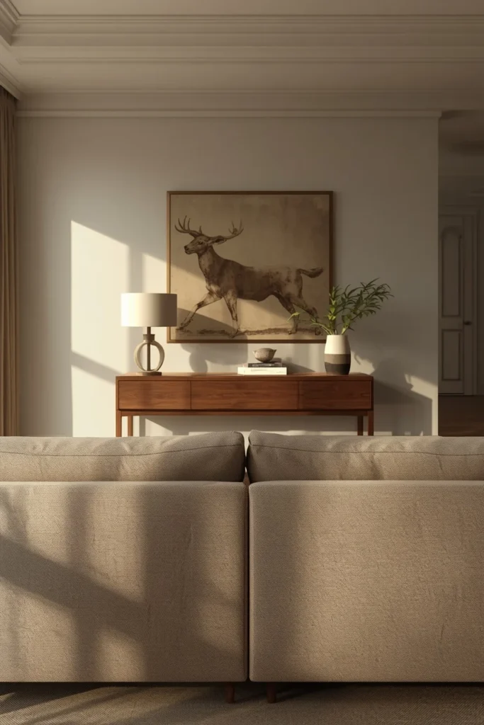
Positioning your sofa so its back faces the dining area creates a natural, low divider without adding a single new object to the room. This works especially well in long, narrow layouts where the living and dining zones sit end to end. Add a slim console table or a row of floor cushions behind the sofa to reinforce the boundary and give yourself extra surface space for lamps or drinks. The trick is keeping the sofa’s back low enough that sightlines stay open across the room, since a tall sectional can accidentally wall off the dining area visually. Furniture placement like this reads as intentional zoning rather than a makeshift solution, which is exactly the effect you want in a shared space.
4. Match Your Metal Finishes Across Both Rooms
If your living room lamps are brushed brass but your dining chandelier is matte black, your eye clocks the mismatch even if you can’t name why the room feels off. Picking one primary metal finish, whether that’s warm brass, aged bronze, or matte black, and repeating it across light fixtures, curtain rods, and picture frames in both zones creates quiet cohesion. You don’t need every metal object to match exactly; aim for roughly 70 percent consistency with a few intentional exceptions. This is one of the cheapest fixes on this list, since it usually just means swapping a few hardware pieces rather than buying new furniture. Designers call this a finish story, and it’s often the detail that makes a combined room feel professionally styled.
5. Hang a Pendant That Echoes Your Living Room Lighting
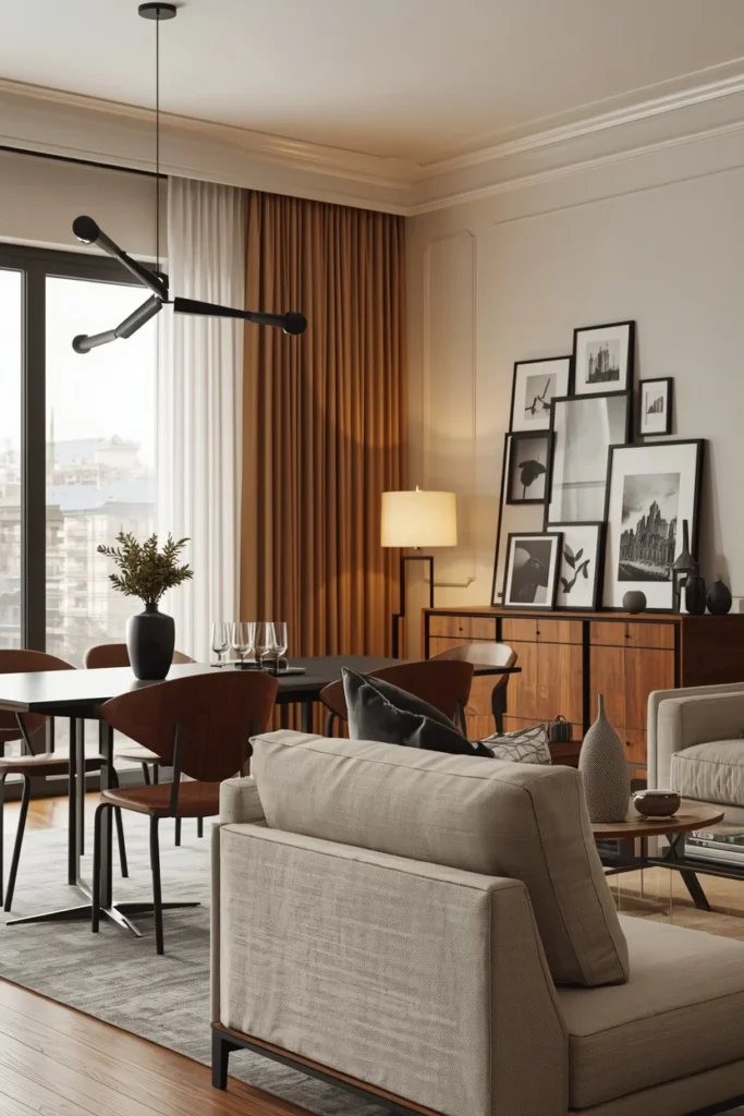
Your dining pendant doesn’t need to match your living room floor lamp exactly, but it should speak the same design language. If your living room lighting leans organic and woven, choose a rattan or linen-shade pendant for the table rather than a sharp, industrial fixture. If your living space favors clean architectural lines, a sculptural glass or metal pendant will feel more at home than anything overly rustic. This kind of lighting consistency matters more than most people expect, because pendant lights sit at eye level and become a focal point the moment someone enters the room. Keep the pendant’s bottom edge roughly 30 to 36 inches above the tabletop so it reads as intentional rather than oversized.
6. Bridge the Rooms With a Console Table Behind the Sofa
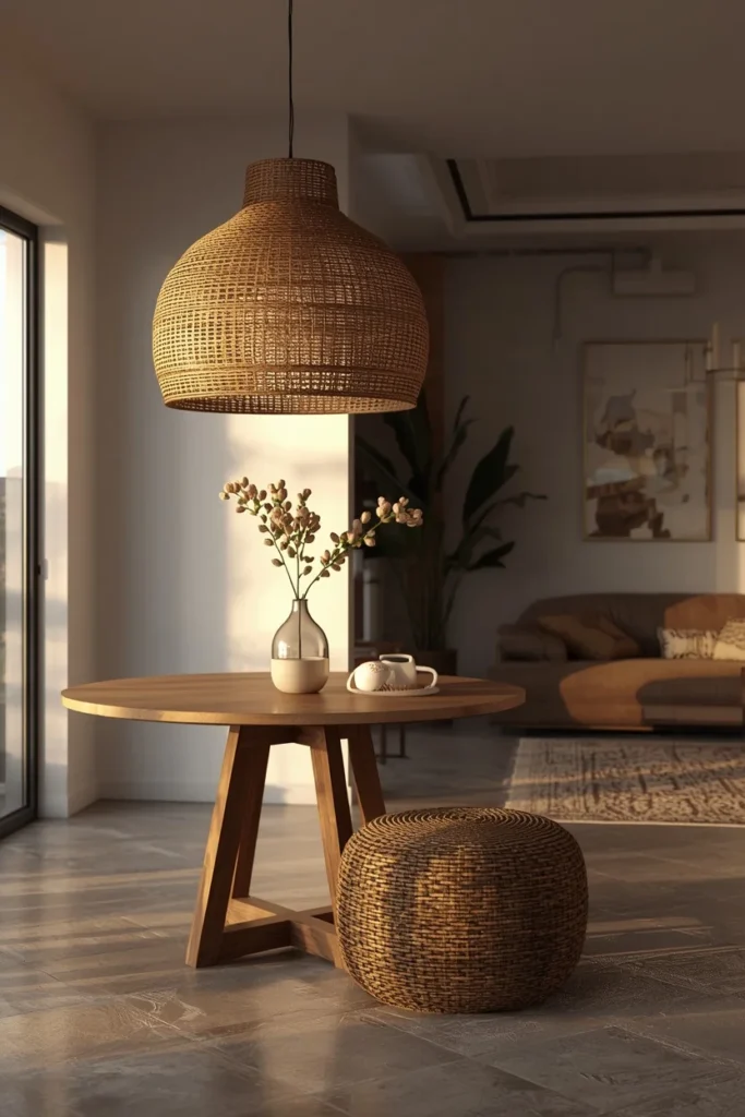
A console table placed behind the sofa, facing the dining area, does triple duty: it softens the transition between zones, adds storage, and gives you a spot for a lamp, a stack of books, or a small vase. Choose a piece with visible legs rather than a solid base so the room still feels open underneath. This works particularly well when your sofa can’t sit against a wall, which is common in open floor plans where the living area floats in the middle of the room. Style the console with items that pull colors from both the living room and dining room palettes, since it physically sits between the two and can visually stitch them together. Keep it no taller than your sofa back so it doesn’t block sightlines across the room.
7. Choose a Ceiling Detail That Spans Both Spaces
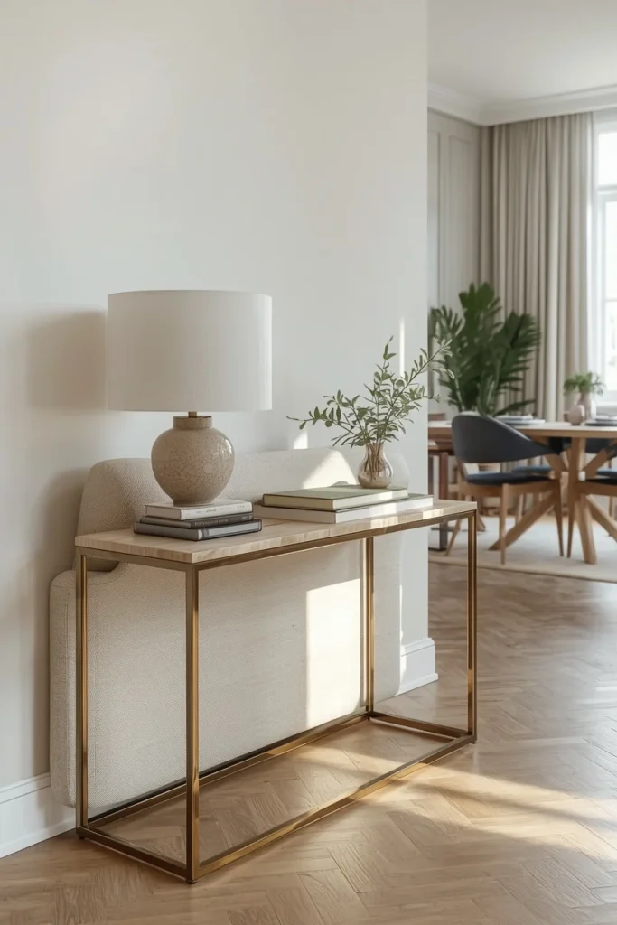
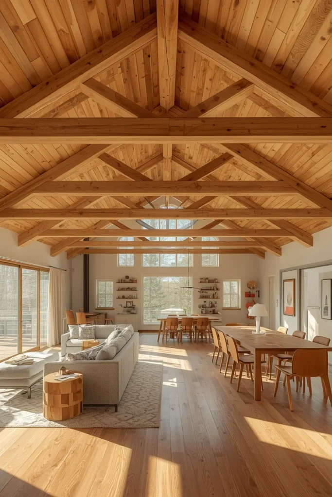
Beams, a painted ceiling color, or a stretch of picture molding that runs across both the living room and dining room ceiling pulls the whole space together from above, which is a sightline most people forget to consider. This works especially well in homes with lower ceilings, since a continuous detail overhead makes the room feel taller and more unified rather than chopped into sections. If a full renovation isn’t in the budget, even a single coat of paint on the ceiling in a soft warm white, carried through both zones, achieves a similar effect. Architectural detailing like this is trending heavily in 2026 dining spaces as homeowners move away from stark, undefined open-concept ceilings toward rooms with more structure and warmth. It’s a subtle upgrade that photographs beautifully because it adds depth without adding clutter.
8. Repeat One Fabric or Pattern in Small Doses
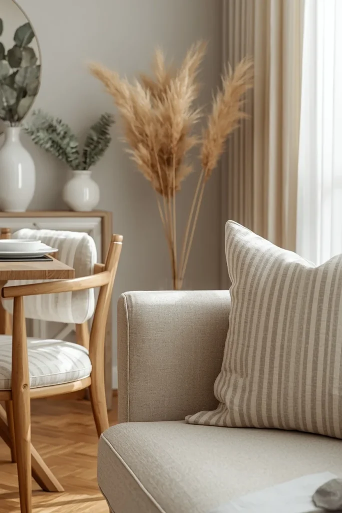
Choosing one pattern, whether it’s a subtle stripe, a soft floral, or a woven texture, and using it in small amounts in both rooms creates a thread the eye can follow. This might mean the same fabric on your dining chair cushions and a set of throw pillows on the sofa, or a table runner that echoes your living room curtains. The key word is small doses; repeating a bold pattern too heavily can overwhelm the space rather than unify it. Aim for the pattern to appear in two or three spots total across the combined room, no more. This trick is a favorite among stylists because it’s inexpensive to execute and can be swapped seasonally without touching furniture or paint.
9. Pick a Round or Oval Table to Soften Traffic Flow
Rectangular tables with sharp corners can create awkward pinch points in open floor plans, especially where foot traffic passes between the dining area and the living room. A round or elongated oval table softens those corners and makes it easier to move between zones without squeezing past furniture. Round tables also encourage a more social seating arrangement, since everyone can see each other without a long table stretching the conversation thin. In smaller combined spaces, a round table often fits more comfortably into an awkward corner than a rectangular one would. This shape choice is showing up more in 2026 dining spaces specifically because it supports better movement through open-plan homes.
10. Let a Bookshelf or Credenza Divide Without Walling Off
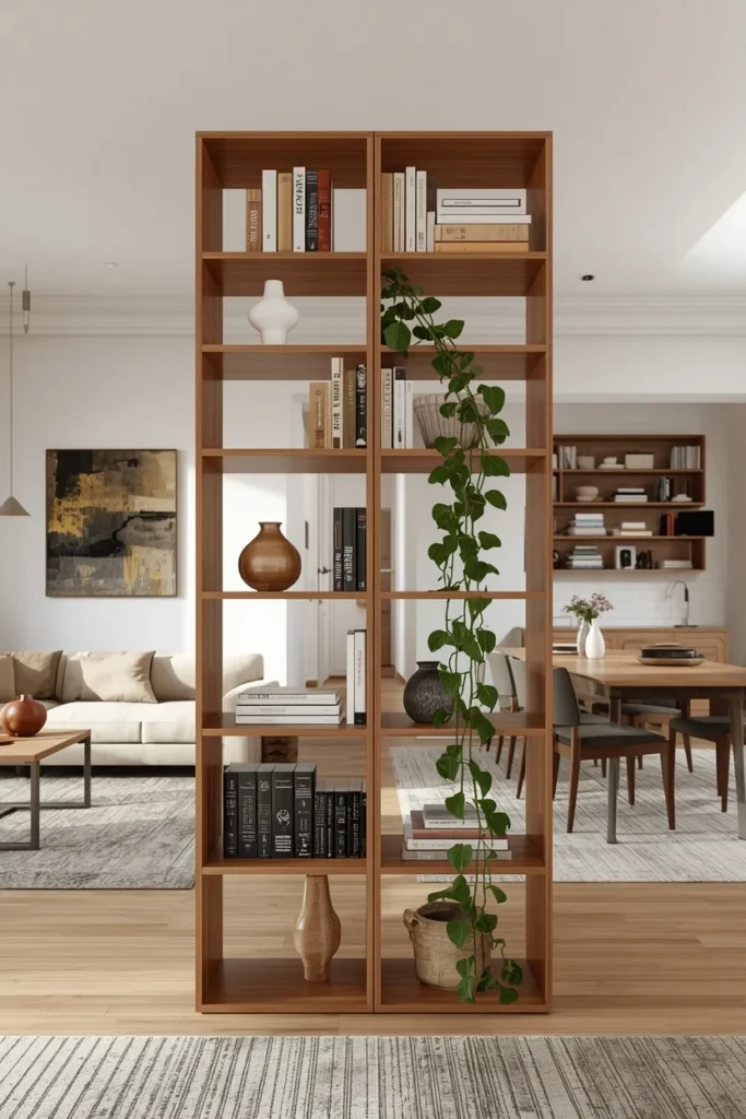
An open-backed bookshelf or a low credenza placed perpendicular to the room’s main sightline can define where the living room ends and the dining room begins without blocking light or views. Open shelving lets you see through to the other side, which keeps the room feeling spacious even though there’s now a clear boundary. Style it with a mix of books, ceramics, and a plant or two, keeping one shelf empty for visual breathing room. This works particularly well in loft-style apartments and studio layouts where a full wall isn’t an option but some separation is still needed for daily function. A credenza also adds valuable storage in rooms that otherwise lack a dedicated cabinet.
11. Use the Same Flooring Direction Throughout
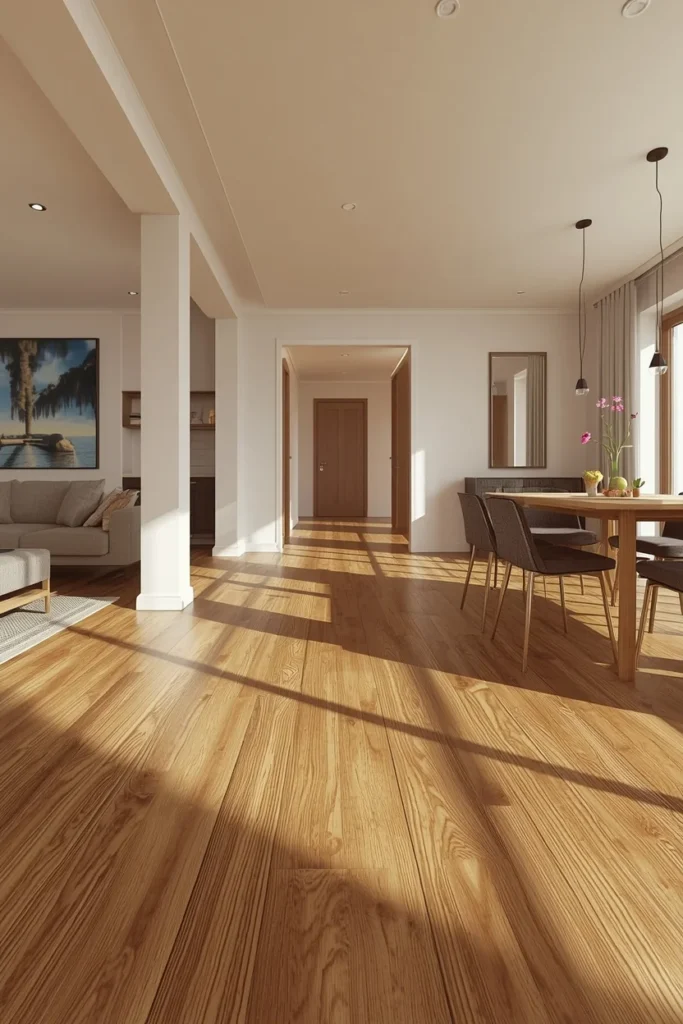
If your home has hardwood or plank flooring, making sure the boards run in the same direction through both the living room and dining room reinforces the sense of one continuous space. This matters most in newer builds or renovations where flooring choices are still being made, but even existing floors benefit from rugs laid in the same orientation to mimic this effect. Mismatched plank direction, or worse, mismatched flooring materials between the two zones, is one of the fastest ways to make an open floor plan feel disjointed. If you’re stuck with a flooring seam you can’t change, a well-placed rug or furniture grouping can help visually mask the transition. This is a detail that matters more to how a room feels than how it photographs, but it shows up in both.
12. Layer a Gallery Wall That Crosses the Sightline
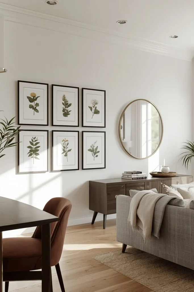
A gallery wall that begins near the living room seating area and continues onto a wall visible from the dining table creates a visual thread that pulls both spaces together. Choose frames in one or two consistent finishes, like black metal or natural wood, so the collection reads as curated rather than random. Mixing in a mirror within the arrangement helps bounce light between both zones, which is especially useful in rooms that only have windows on one side. Keep the artwork content loosely related in tone, whether that’s botanical prints, abstract shapes, or black-and-white photography, so the wall feels cohesive from any angle in the room. This is an easy weekend project that adds personality without requiring any furniture changes.
13. Add a Statement Chandelier as the Room’s Anchor
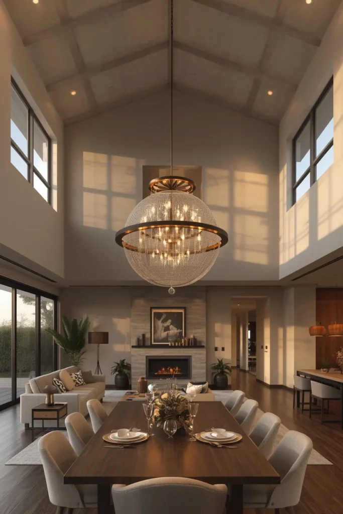
In taller or larger combined spaces, a single oversized chandelier hung between the two zones, rather than directly and only over the dining table, can act as a shared focal point for the whole room. This works best in homes with vaulted or high ceilings where there’s enough vertical space for a dramatic fixture to breathe. The chandelier becomes the piece both areas orbit around, similar to how a fireplace anchors a traditional living room. Choose a design with some visual weight, whether that’s a linear drum shape, a disc silhouette, or a sculptural chain fixture, so it reads as intentional rather than accidental. This idea works particularly well for open-plan homes that feel like they’re missing a central architectural moment.
14. Choose Dining Chairs That Echo Your Sofa’s Silhouette
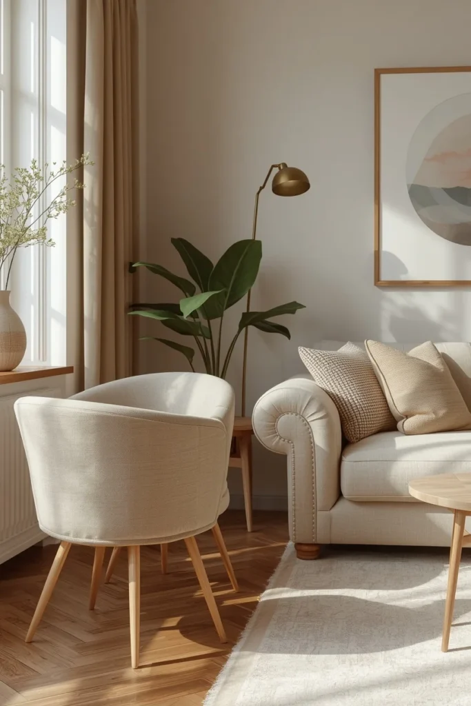
If your sofa has soft, rounded arms and low legs, dining chairs with the same relaxed, curved profile will feel like they belong in the same room. Conversely, a sofa with sharp, tailored lines pairs more naturally with structured, straight-backed dining chairs. This doesn’t mean every piece needs to match in fabric or color, just in overall shape language. Mixing materials, like a wood dining chair alongside an upholstered sofa, still works as long as the silhouettes rhyme rather than clash. This detail is subtle enough that most guests won’t consciously notice it, but they’ll feel that the room makes sense as a whole.
15. Use Curtains or Drapery to Frame Both Zones
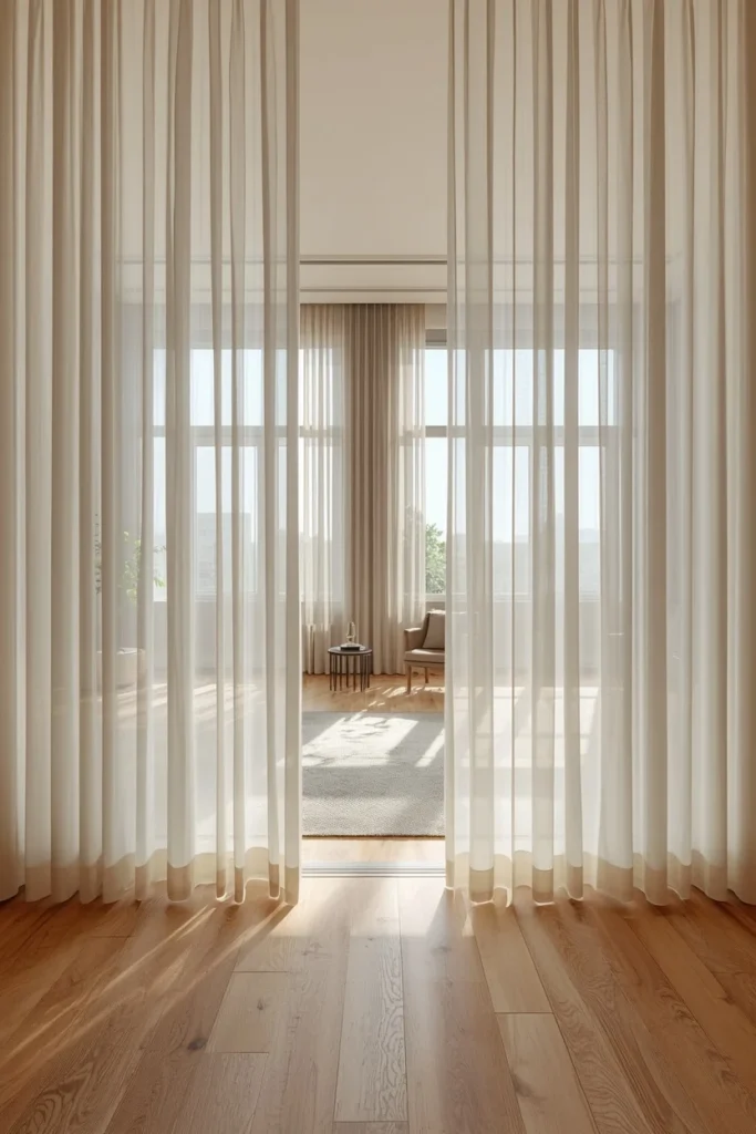
Floor-to-ceiling curtains hung in a consistent fabric and color across every window in the combined space, regardless of which zone the window sits in, create a soft, continuous frame around the entire room. This is one of the simplest changes that makes a noticeable difference, since curtains draw the eye vertically and horizontally at the same time. Choose a lightweight linen or cotton blend that lets natural light filter through during the day while still offering privacy in the evening. Hanging curtain rods close to the ceiling, rather than directly above the window frame, adds height to the whole room and reinforces the sense of one unified space. This trick works in both rented apartments and owned homes since curtain rods are easy to install and remove.
16. Bring in Plants as a Living Bridge
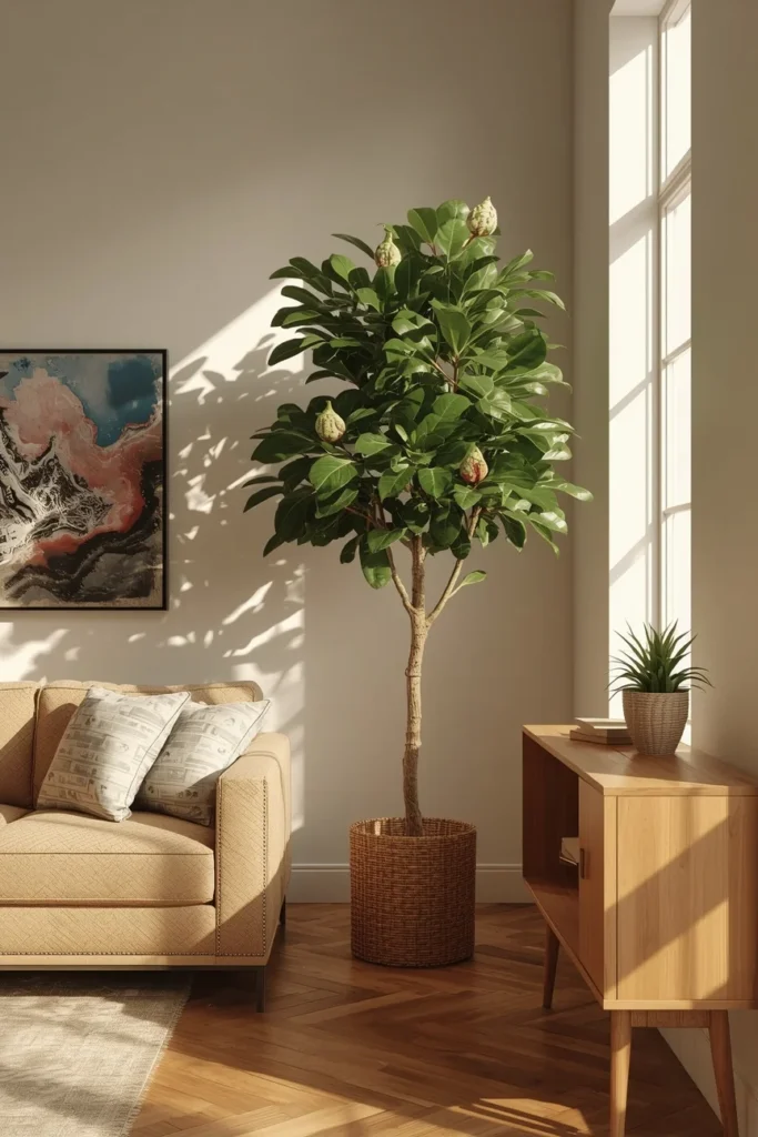
Placing plants of similar type or scale in both the living room and dining area, like a floor-standing fig tree near the sofa and a smaller version of the same plant on the dining console, creates a natural, living connection between the two spaces. Greenery softens hard furniture lines and adds a sense of life to rooms that might otherwise feel static. Choose low-maintenance varieties like pothos, snake plants, or ZZ plants if natural light is limited in either zone. Repeating the same plant type at different scales throughout the room is a trick borrowed directly from professional stylists, since it reads as deliberate rather than scattered. This is also one of the most affordable ways to add texture and color to a neutral room.
17. Build a Banquette for Flexible, Space-Saving Seating
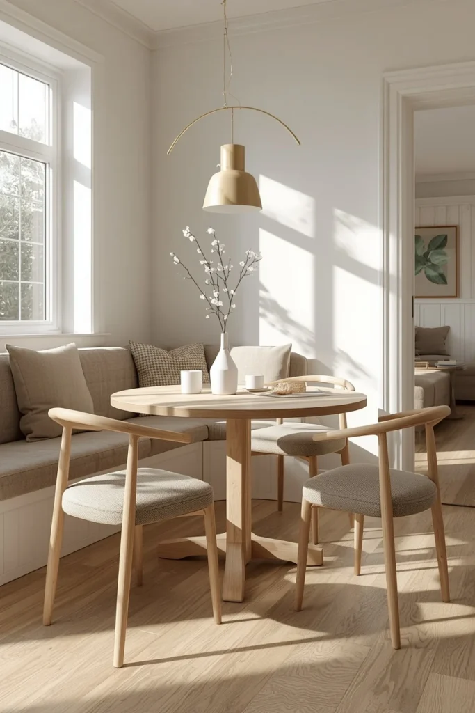
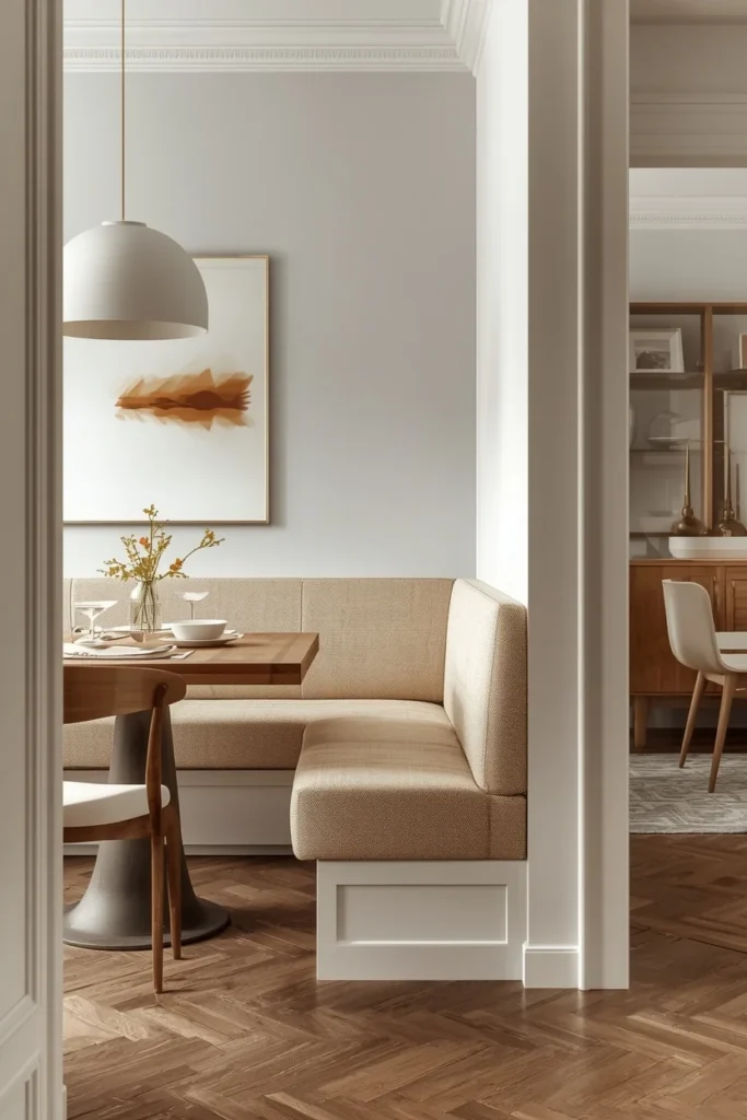
A built-in or freestanding banquette along one wall of the dining area saves floor space compared to a full set of chairs, which frees up room for the seating area to feel less cramped. Upholstering the banquette in the same fabric family as your living room sofa ties the two seating zones together visually while giving the dining nook a cozier, more residential feel. Banquettes also double as extra seating when hosting, since guests can slide in without needing to pull chairs from another room. This idea works particularly well in smaller combined spaces where every square foot of floor space matters. Add a few throw pillows in colors pulled from the living room palette to complete the connection.
18. Keep Window Treatments Identical Across the Open Plan
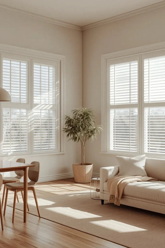
Beyond just curtains, this includes blinds, shades, and shutters. If your living room windows have white wood blinds, the dining area’s windows should match rather than introducing a different material or color. Consistency in window treatments is easy to overlook because each window often gets addressed separately during a renovation or move-in, but the mismatch becomes obvious once furniture is in place. This is especially important in corner rooms or spaces with windows on two different walls, since inconsistent treatments there create a visual split exactly where you don’t want one. Matching treatments also simplify future updates, since you only need to source one style when it’s time to refresh.
19. Use a Runner Instead of a Rug for Narrow Layouts
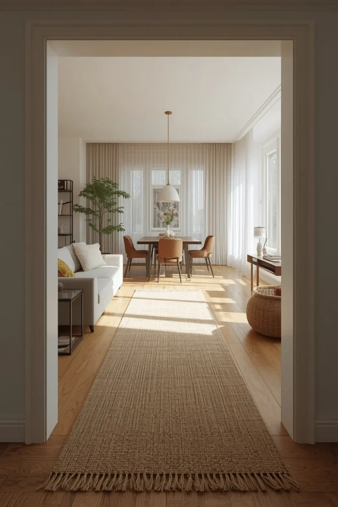
In long, narrow rooms where a single large rug isn’t practical, a wide runner stretching from the living area into the dining zone achieves a similar sense of continuity. Runners work particularly well in shotgun-style apartments or galley-shaped open floor plans where the room is significantly longer than it is wide. Choose a runner in a durable weave, like flatwoven wool or a washable synthetic blend, since this path will see consistent foot traffic. Keep the runner’s width proportional to the room, generally leaving at least a foot of bare floor on either side. This solution costs less than most large area rugs and is easier to clean, which makes it a practical choice for high-traffic combined spaces.
20. Balance Symmetry With One Asymmetrical Statement Piece
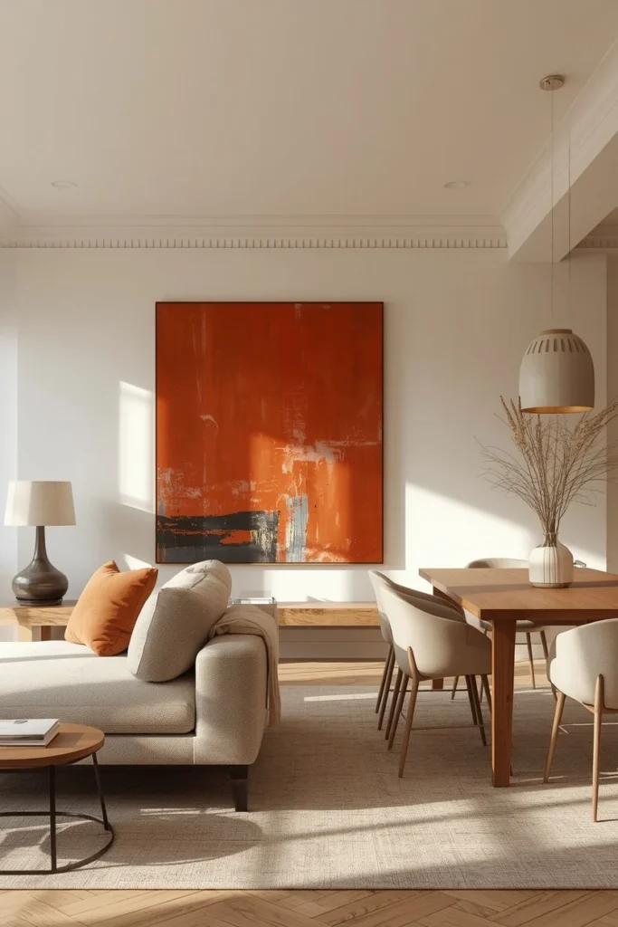
While consistency across both zones creates cohesion, one deliberately asymmetrical piece, like an oversized piece of art, a sculptural floor lamp, or a bold accent chair, keeps the combined room from feeling too matchy or showroom-like. Place this statement piece in a spot where it can be appreciated from both the living room and dining area, such as against a shared wall. This single point of contrast actually strengthens the sense of design intention, since a room with zero variation can start to feel flat rather than pulled together. Choose one bold element only; adding two or three competing statement pieces undoes the calming effect of everything else on this list. Think of it as the exclamation point at the end of an otherwise quiet, well-organized sentence.
Styling Tips
- Pick one “hero” color and let it show up in both zones through different materials, like a sage green in living room pillows and a matching sage stripe on dining linens.
- Keep artwork and decor scaled to the size of the wall, not the size of the individual zone; a small living room wall next to a large dining wall still needs proportional pieces.
- Group lamps and lighting in odd numbers across the combined space for a more natural, layered glow.
- Leave at least 30 inches of walking clearance between the dining table and any living room furniture so traffic flow feels comfortable.
Practical Implementation Ideas
- Start with the rug and paint color first, since these two elements affect every other decision in the room.
- Test furniture placement with painter’s tape on the floor before moving anything heavy.
- Photograph the space from the entryway to check how the two zones read together at first glance, since that’s the same angle most guests will see.
- Add lighting last, once furniture placement is finalized, so you know exactly where fixtures need to sit.
Common Mistakes to Avoid
- Treating the dining area as an afterthought with mismatched furniture left over from another room.
- Using two competing rug patterns that pull the eye in different directions.
- Choosing dining chairs that are too formal or too casual compared to the living room’s overall style.
- Overcrowding the shared walkway between zones with oversized furniture that blocks natural movement through the room.
Small-Space Alternatives
- Swap a full dining set for a drop-leaf or extendable table that can shrink when not in use.
- Use a bench on one side of the table instead of chairs to save visual and physical space.
- Choose a loveseat instead of a full sofa if the living zone needs to shrink to make room for dining.
- Mount a fold-down table against a wall for occasional dining needs in very tight layouts.
Budget-Friendly Alternatives
- Repaint instead of replacing large furniture pieces to unify the color story.
- Swap hardware and lighting fixtures for low-cost, high-impact updates.
- Use removable wallpaper or paint on just one accent wall shared by both zones.
- Layer a budget runner or smaller rug instead of investing in one oversized area rug right away.
Pro Styling Recommendations
- Work with a lighting plan that includes at least three light sources per zone: ambient, task, and accent.
- Choose one dominant wood tone for large furniture pieces and allow smaller accessories to introduce contrast.
- Keep a consistent baseboard and trim color throughout the space, even if wall colors shift slightly between zones.
- Add one oversized mirror to visually double the room’s light and depth, positioned so it reflects a window rather than a blank wall.
FAQs
Conclusion
A living room and dining room that feel connected doesn’t happen by accident, and it doesn’t require a renovation either. It comes down to a handful of repeated decisions: one rug, one paint story, one lighting language, carried confidently across both zones. Start with whichever idea on this list fits your space and budget right now, and let the rest follow over time. The goal was never to make two rooms identical. It was to make them feel like they were always meant to sit side by side.