16 Moody Blue Bathroom Ideas That Feel Luxurious & Deeply Relaxing
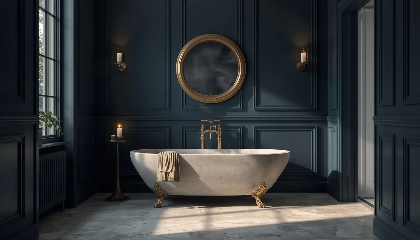
Your bathroom is the one room in the house where you’re allowed to be a little dramatic. Nobody’s living in there full time. Nobody’s judging the color choice at a dinner party. It’s just you, a closed door, and five minutes of quiet.
That’s exactly why moody blue works so well in this particular room. Deep navy, slate, stormy blue, and blue-gray don’t need to fight for attention the way they might in a living room. They just need to feel calm, close, and a little bit indulgent, like stepping into a boutique hotel bath instead of the same bathroom you’ve had for years.
Below are 16 moody blue bathroom ideas, each with the paint depth, material pairing, and lighting note that makes it actually work in a real home, plus a ready-made image prompt so you can see the look before you commit to a single paint sample.
Table of Contents
- Why Blue Works So Well in a Moody Bathroom
- The 16 Ideas
- Styling Tips That Make Moody Blue Feel Luxurious
- Practical Implementation Ideas
- Common Mistakes to Avoid
- Small-Space Alternatives
- Budget-Friendly Alternatives
- Pro Styling Recommendations
- FAQs
- Final Thoughts
- Suggested Pinterest Boards
- Internal Linking Ideas
Why Blue Works So Well in a Moody Bathroom?
Blue already carries a built-in association with water, quiet, and rest, so pushing it into deeper navy, slate, or stormy tones doesn’t feel like a stretch the way a dark red or deep purple sometimes can. A bathroom is also one of the few rooms in the house where you spend short, intentional bursts of time rather than hours at a stretch, which means a dark color reads as cocooning instead of heavy. Most bathrooms have fewer windows than the rest of the house too, so you’re not fighting shifting daylight all afternoon the way you would in a bedroom or living room.
The one thing that makes or breaks a moody blue bathroom isn’t the paint color itself. It’s the lighting temperature, the finish sheen, and how much warmth you bring in through brass, wood, or stone. Get those three right and almost any depth of blue will land.
The 16 Ideas
1. Deep Navy Walls With Warm Brass Fixtures
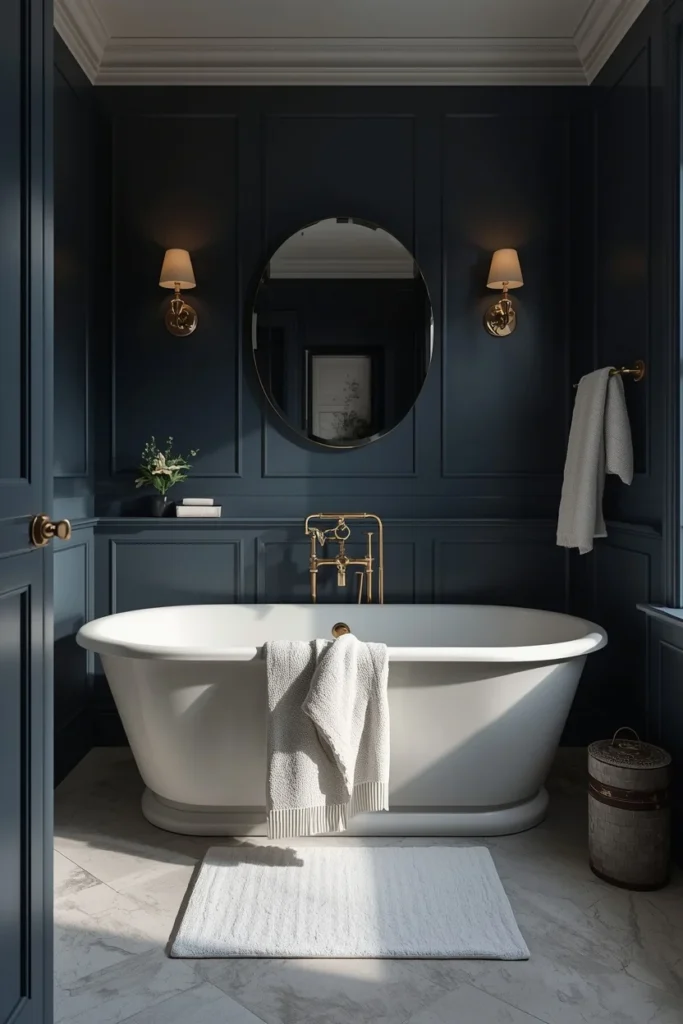
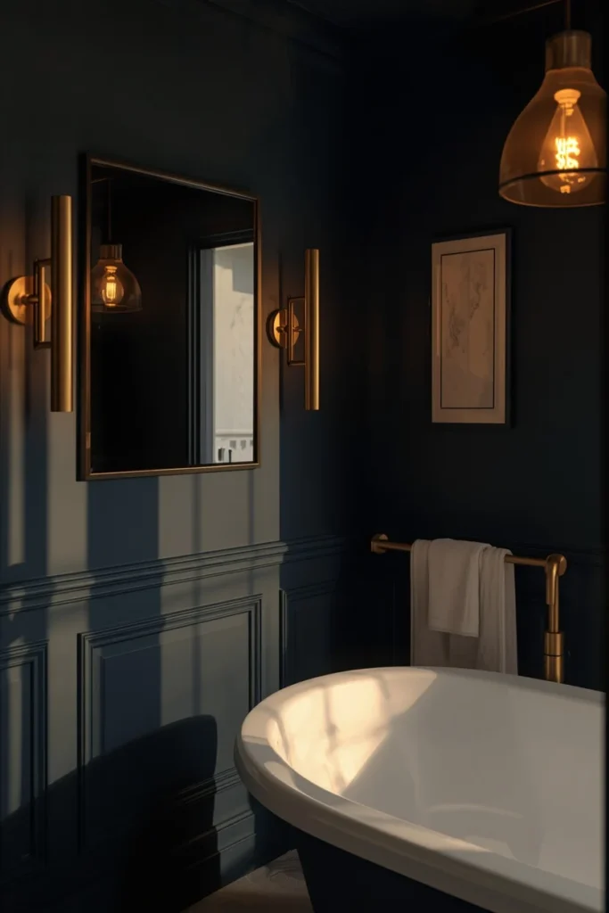
Navy is the single most reliable moody blue for a bathroom because it reads as a true classic rather than a passing color trend, and it never tips into looking cartoonish the way a brighter blue can. Painting all four walls in a deep, slightly gray-toned navy gives the room an enveloping, cocoon-like feel, especially in a primary bath where you want the space to feel private and slow-paced. The real trick is pairing that navy with warm brass or antique brass fixtures instead of chrome, since cool metals next to cool paint can quickly tip a warm, moody room into something that feels flat and cold. A slightly aged or unlacquered brass finish looks more grounded than a bright polished gold, and it keeps the whole room from reading as trendy rather than timeless. Add a plush white or ivory bath mat and a few linen towels to keep the palette from feeling too heavy.
2. Charcoal-Blue With a Warm Wood Vanity
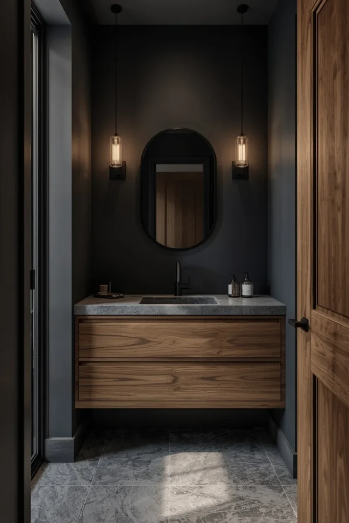
A charcoal that leans slightly blue rather than true black or true gray gives you almost all the drama of a black bathroom with a softer, more livable edge. This shade works especially well when it’s paired with a warm wood vanity, since the wood grain keeps the room from feeling like one flat block of dark color and adds the organic texture that stops a moody bathroom from reading as cold or overly serious. Because charcoal-blue sits between navy and true black, it also tends to photograph beautifully under warm bulbs, shifting from almost-black in low evening light to a rich, deep blue-gray during the day. Pair it with a simple white or honed stone countertop so there’s still a bright surface for the eye to rest on. This combination is a favorite for modern and transitional bathrooms that want depth without going full black.\
3. Glossy Navy Tile in the Shower
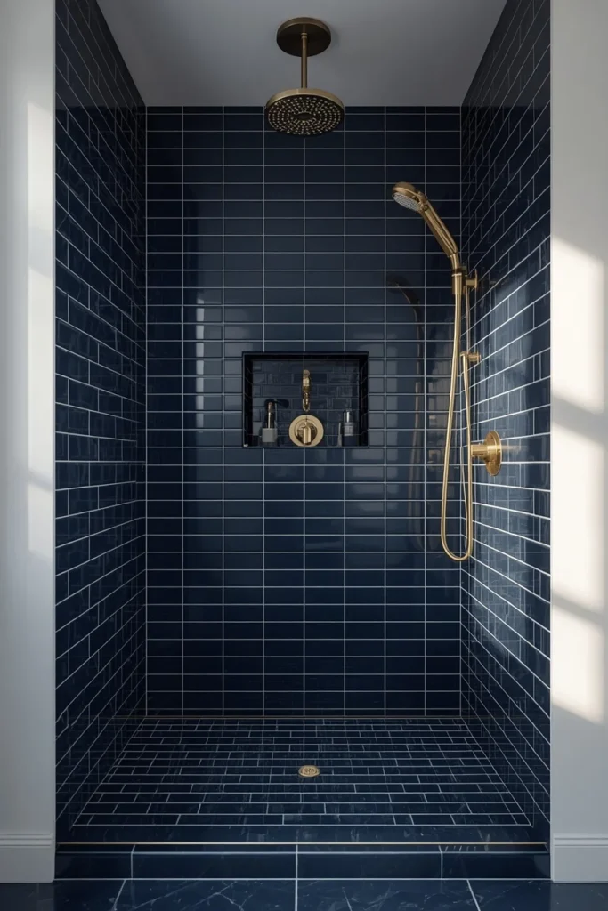
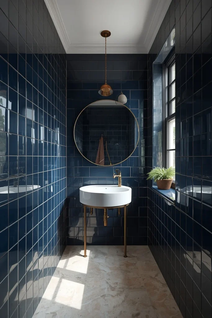
Instead of painting the walls, this idea puts the moody blue directly into the shower using glossy navy tile, which gives the room a more permanent, higher-end feel than paint alone can achieve. Gloss finish matters here specifically, since a shiny navy tile bounces available light back into the room instead of absorbing it the way a matte dark surface would, which keeps a small shower from feeling like a dark box. Running the tile floor to ceiling inside the shower, rather than stopping partway up the wall, makes the space feel taller and more intentional instead of like an afterthought accent. Outside the shower, keeping the rest of the bathroom in a warm white or soft plaster tone lets the navy tile read as the clear focal point of the room. This is one of the most durable moody blue ideas on the list, since tile holds up to daily water exposure far better than painted drywall.
4. Blue Wainscoting With Lighter Upper Walls
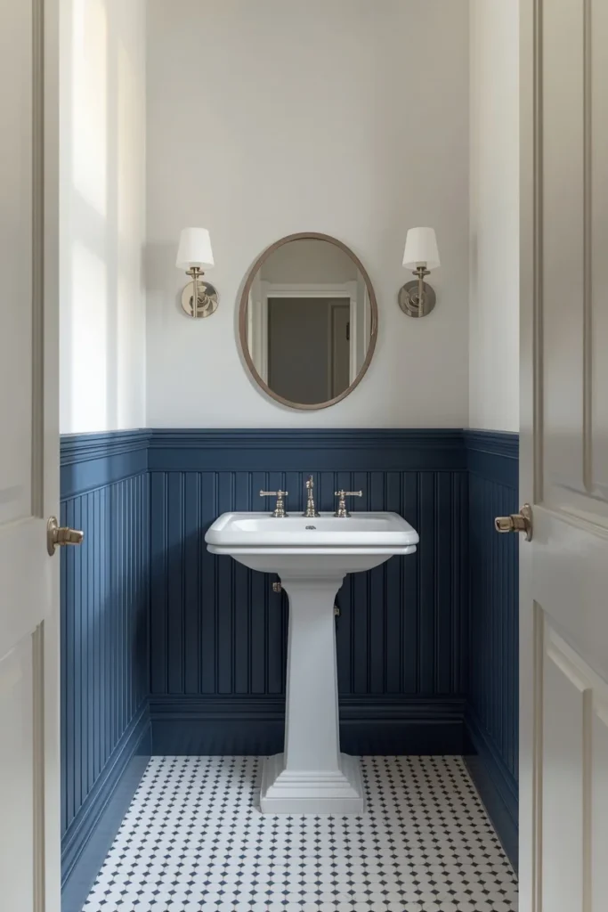
For anyone who loves moody color but isn’t ready to commit to a fully dark room, blue wainscoting is a smart middle ground that gives the bathroom structure and color without covering every surface in a deep shade. Painted beadboard, panel molding, or board-and-batten in a rich navy or slate blue on the lower half of the wall, paired with a soft white or warm off-white above, keeps the space feeling grounded at eye level while staying bright up top. This approach is especially effective in older homes with existing molding or trim detail, since a full dark bathroom can sometimes feel disconnected from a more traditional architecture, while wainscoting feels tailored to it. It’s also one of the more resale-friendly moody blue ideas, since the lighter upper walls keep the overall room from reading as too bold for a future buyer. Finish the look with a simple white pedestal sink or console vanity to keep the focus on the paneling.
5. Black-Blue Ceiling for a Taller-Feeling Room
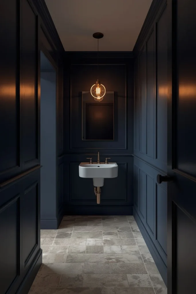
Carrying a deep navy or charcoal-blue up onto the ceiling, rather than stopping it at the top of the wall, is what actually separates a moody bathroom from a bathroom with one dark wall. It sounds counterintuitive, but removing that visual “lid” where a dark wall meets a bright white ceiling actually makes a small bathroom read as taller, not shorter, since the eye doesn’t hit a hard stopping point partway up. This works especially well in bathrooms with lower ceiling heights, where a bright white ceiling can sometimes emphasize just how low the room feels. Keep the flooring lighter, whether that’s white tile or a pale stone, so there’s still a clear anchor point at the bottom of the room. This is one of the lowest-cost, highest-impact moves on this entire list, since it only requires one extra can of paint.
6. Vertical Blue Tile to Elongate a Small Shower
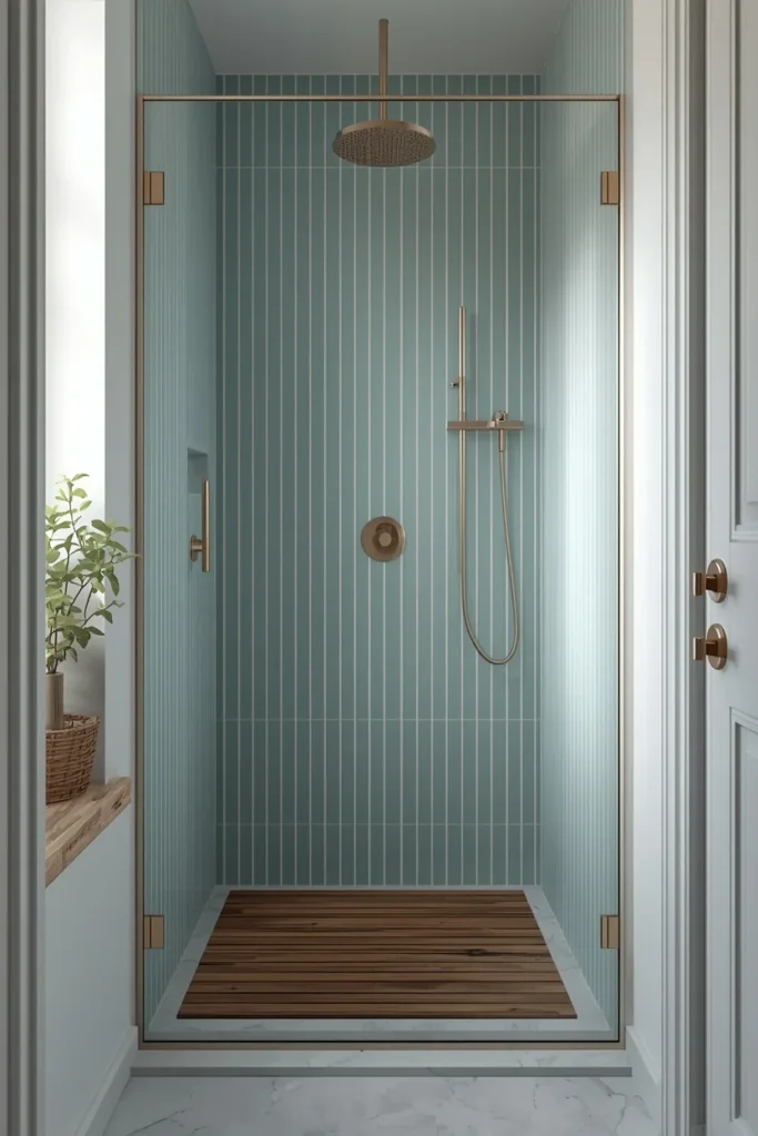
In a compact shower, laying blue tile in a vertical pattern rather than a standard horizontal subway layout draws the eye upward and makes the ceiling feel higher than it actually is, which matters a lot in a small footprint bathroom. A misty or slate blue in a narrow, skinny-format tile reads as more minimal and modern than a bold navy, which keeps the space feeling calm rather than closed in. Pairing the tile with warm brass fixtures and a touch of natural wood, like a teak shower mat or wood-look accent shelf, softens what could otherwise feel like a purely cool, hard-surfaced space. This combination works especially well in modern and Scandinavian-leaning bathrooms that want a moody moment without heavy ornamentation. Keep the grout close in tone to the tile itself so the vertical lines stay clean rather than getting chopped up by contrast grout.
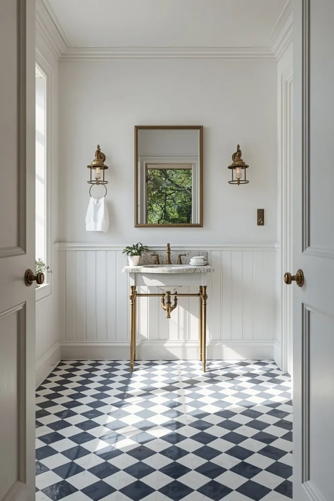
7. Checkered Navy and White Floor Tile
A checkerboard floor in navy and white brings a European, old-world feel into a moody blue bathroom without requiring you to paint a single wall dark, which makes it a great entry point for anyone hesitant about committing to full-room color. The pattern itself does a lot of the visual work, so the rest of the room can stay relatively simple: white walls, a classic pedestal or console sink, and warm brass or aged bronze fixtures to soften the crisp black-and-white contrast underfoot. This idea photographs especially well against natural light, since the glossy tile finish bounces daylight around a room that might otherwise feel closed in with a fully dark palette. It’s also one of the more durable, low-maintenance choices on this list, since floor tile holds up to daily wear far better than painted walls in a high-traffic bathroom. This combination tends to suit traditional and transitional homes best, particularly ones with existing vintage or period detail.
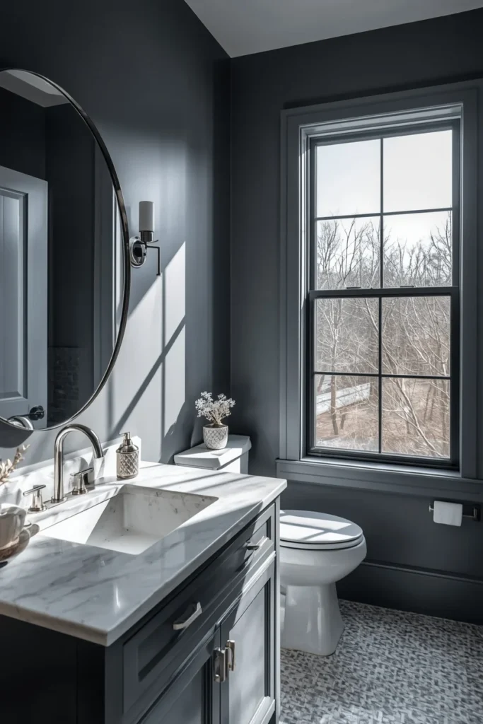
8. Stormy Blue-Gray With Polished Nickel
A step softer and cooler than true navy, stormy blue-gray gives a bathroom real depth without tipping into the drama of a fully saturated dark blue, which makes it a good fit for anyone who wants a moody feel but still leans toward a more minimal, restrained aesthetic. Pairing this shade with polished nickel or chrome fixtures, rather than brass, keeps the whole look feeling crisp and contemporary instead of warm and vintage. White quartz or marble countertops bring back the brightness the walls take away, so the room still feels open rather than closed in. This combination tends to work especially well in modern primary bathrooms with larger windows, since natural daylight brings out the subtle gray undertone in the blue without letting it drift into a flat, muddy color. It’s a sophisticated, quietly confident option for anyone who finds true navy or black slightly too bold for their taste.
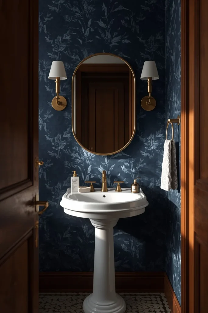
9. Deep Indigo Powder Room With Statement Wallpaper
A powder room is the lowest-risk place in the entire house to go bold, since it’s a small space that guests only spend a few minutes in, which makes deep indigo wallpaper a genuinely smart choice rather than a reckless one. A moody wallpaper with a subtle pattern, whether that’s a botanical print, a soft texture, or a fine architectural motif, adds richness and depth without overwhelming a room that typically doesn’t have much square footage to begin with. Pairing that wallpaper with warm wood accents and brass hardware keeps the whole look feeling rich rather than heavy, and a simple white pedestal sink gives the eye a clean place to land against a busier wall. Because powder rooms require far less material than a full bathroom, this is also one of the more affordable ways to try a genuinely dramatic moody blue look. This combination tends to leave the strongest impression on guests of any idea on this entire list.
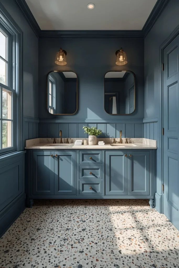
10. Slate Blue With Terrazzo Accents
Slate blue paired with a playful terrazzo floor or countertop brings a boutique-hotel energy into a bathroom that might otherwise feel purely serious or restrained. The terrazzo introduces small flecks of contrasting color and texture that keep the eye moving around the room, which balances out the flatness that a single block of dark paint can sometimes create on its own. Warm bronze or brass fixtures tie the two elements together, while a double vanity in a color that echoes the wall tone (rather than matching it exactly) keeps the room from feeling like everything was picked from the same paint chip. This combination works especially well in larger primary bathrooms, since terrazzo tends to read best when there’s enough surface area to actually see the pattern. It’s a genuinely playful take on moody blue for anyone who wants drama with a bit of personality mixed in.
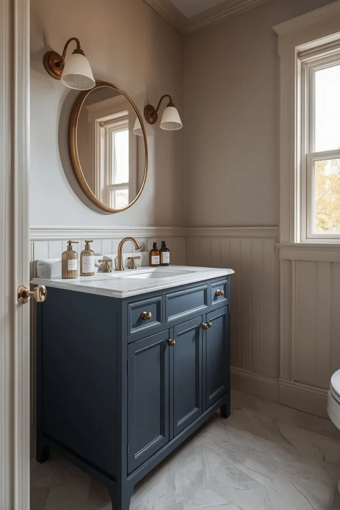
11. Navy Vanity Only (The Weekend Version)
If a full dark bathroom feels like too big a commitment, painting just the vanity in a deep navy against soft greige or warm white walls gives you the moody anchor point without touching the rest of the room. This is genuinely one of the easiest and most reversible ways to try the trend, since a vanity repaint is a weekend project rather than a full renovation, and it can be undone just as quickly if you change your mind later. The navy vanity becomes the clear focal point the moment you walk in, especially when paired with brass hardware and a simple white or stone countertop that keeps the rest of the palette calm. This approach also happens to be one of the most budget-friendly ideas on this list, since it typically requires less than a gallon and a half of paint. It’s a smart starting point for anyone who’s never worked with dark color before and wants to test the waters.
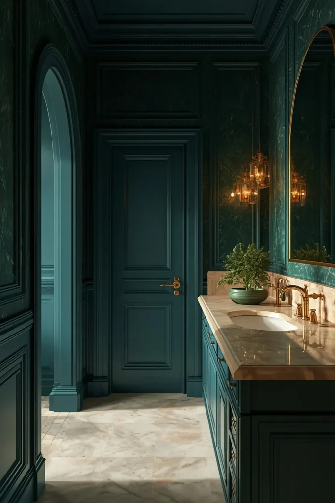
12. Blue-Green Jewel Tone With Gold Accents
A deeper teal or blue-green jewel tone brings warmth into the moody blue category in a way that true navy sometimes can’t, since the hint of green keeps the color from reading as purely cool. Paired with gold or warm brass fixtures and a cream or warm white countertop, this combination leans glamorous rather than somber, making it a strong pick for anyone who wants drama with a distinctly luxurious, jewel-box feeling. This shade tends to photograph beautifully under warm, low lighting, deepening into something closer to emerald in evening light while reading as a clear, rich blue-green during the day. It works especially well against classic architectural details, like arched doorways or paneled walls, since those features tend to catch and hold the depth of a jewel tone in a way flat walls don’t. This is one of the more distinctive moody blue ideas on the list for anyone who wants their bathroom to feel unmistakably their own.
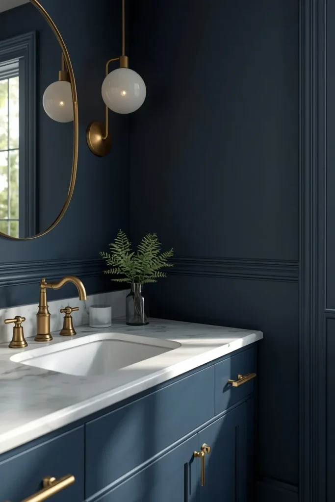
13. Matte Navy With Marble Countertop and Brass
A true matte finish on deep navy walls, rather than a satin or eggshell sheen, gives the color a soft, velvety depth that avoids the glare and imperfection-highlighting that a glossier finish can create in a dark room. Pairing that matte navy with a marble countertop brings in the veining and natural movement that keeps the space from feeling flat, while brass fixtures add the warm glow that stops the whole room from tipping cold. This combination is a favorite in primary bathrooms specifically because it reads as high-end and considered rather than trend-driven, thanks to the timeless pairing of navy, marble, and brass that’s been used in classic interiors for decades. A note on upkeep: matte finishes show water splashes more easily than satin, so this look does best paired with good ventilation and a quick wipe-down habit near the sink. Done well, it’s one of the most consistently elegant moody blue combinations you can choose.
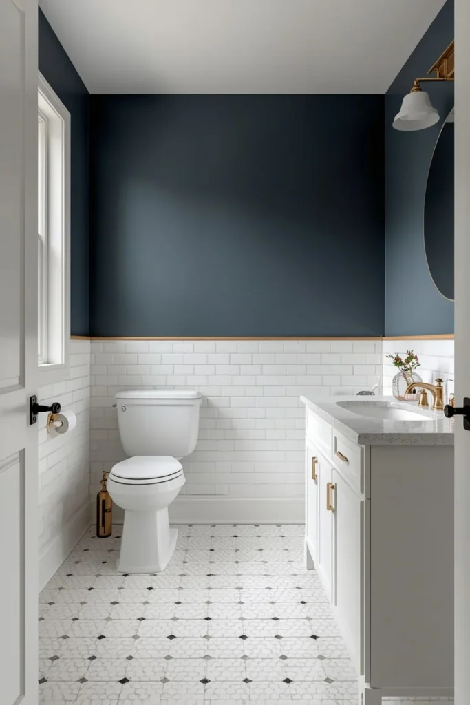
14. Blue Tile to Chair-Rail Height With Charcoal Above
For anyone nervous about committing to a fully dark bathroom, running white or pale tile up to chair-rail height and taking a deeper charcoal-blue from there up to the ceiling gives you the moody drama up top while keeping a bright, easy-to-clean surface down where water and splashes actually happen. This layered approach is one of the most resale-friendly moody blue ideas on the list, since the lower half of the room stays neutral and adaptable even if a future owner isn’t drawn to dark color. It also solves a genuinely practical problem: the lower half of a bathroom wall takes the most daily wear from water, toothpaste splatter, and general use, so keeping that section tile rather than paint means less maintenance over time. A simple brass or nickel trim strip where the two materials meet adds a clean, finished transition line. This is a smart middle-ground choice for shared family bathrooms that still want the moody upper-wall effect.
15. Layered Warm Lighting for a Spa-Like Feel
Sometimes the moodiest, most luxurious detail in a blue bathroom isn’t the paint color at all, it’s the lighting plan built around it. Layering a dimmable pendant or flush ceiling light with a pair of warm sconces flanking the mirror, rather than relying on a single harsh overhead fixture, creates the soft interplay of shadow and glow that makes a dark blue bathroom feel like an actual retreat instead of a dim, underlit room. Sticking to warm-toned bulbs in the 2700K to 3000K range is essential here, since cool, blue-toned LED bulbs will fight against a moody blue wall color and drain all the warmth out of the room. A dimmer switch is one of the cheapest upgrades you can make to any bathroom, and it completely changes the atmosphere for an evening bath versus a bright morning routine. This idea works as a finishing layer on top of literally any other combination on this list, and it’s arguably the single highest-impact, lowest-cost change you can make.
16. Glossy Finish and Mirror Placement for Small Bathrooms
In a genuinely small bathroom, the single biggest factor in whether moody blue feels cozy or cramped is how much light bounces back into the room, which comes down to two things: finish sheen and mirror placement. A glossy or semi-gloss paint or tile finish reflects far more available light than a flat matte surface, so even a deep navy can feel alive rather than dead in a compact space. Placing a large mirror directly across from the window, rather than off to the side, doubles the effective daylight in the room and visually pushes the walls outward. Keeping the flooring lighter than the walls, whether that’s a pale tile or a light stone-look vinyl, also helps ground the room without adding to the overall darkness. These two adjustments alone can be the difference between a small moody bathroom that feels intentional and one that feels like it’s swallowing the room.
Styling Tips That Make Moody Blue Feel Luxurious
- Match your metals to your undertone. Warmer navy and indigo shades pair best with brass, gold, or bronze, while cooler stormy blues and blue-grays lean better toward nickel or chrome.
- Choose sheen carefully. Matte finishes give the richest, most velvety color depth, but they show water splashes more easily. Satin or semi-gloss is more forgiving in high-splash zones like around the sink.
- Bring in real texture. Linen towels, a woven rug, and a wood stool or shelf keep a moody blue room from feeling flat or one-dimensional.
- Test your paint under your actual bulbs. Dark colors shift dramatically between daylight and warm evening lighting, so always sample a large swatch and check it morning and night before committing.
- Give the eye one bright anchor. Whether that’s a white countertop, a pale floor, or a large mirror, one consistently light surface keeps a dark room from feeling like it’s closing in.
Practical Implementation Ideas
- Start with the vanity, not the walls. If you’re unsure about committing to a fully dark bathroom, painting just the vanity is the lowest-risk way to test the look.
- Use tile for high-water areas. Paint and shower splashes don’t mix well long-term, so save the deepest colors for tile inside the shower and keep painted walls in drier zones.
- Plan your lighting before you plan your paint. A dimmer switch and a pair of warm sconces cost far less than a full repaint and make a bigger difference in how “moody” the finished room actually feels.
- Roll two full coats. Dark colors, especially navy and charcoal-blue, look patchy and streaky with a single coat and need a proper second pass to read as rich and even.
- Order large paint samples, not tiny chips. A 12-by-12-inch swatch on your actual wall tells you far more than a paint chip ever will, especially with a deep, saturated color.
Common Mistakes to Avoid
- Using cool, blue-toned bulbs. This is the single fastest way to make a moody blue bathroom feel cold instead of cozy. Stick to warm bulbs in the 2700K to 3000K range.
- Choosing a glossy finish everywhere. High gloss paint reflects light unpredictably in a dark room and can highlight every imperfection in the wall. Save gloss for tile, not painted drywall.
- Leaving a single overhead light as the only light source. One harsh overhead fixture creates flat, unflattering light in a dark room. Layer in sconces or a dimmable pendant instead.
- Skipping the swatch test. A tiny paint chip cannot tell you how a dark color will read across a full wall or under your specific bulbs. Always test a large sample first.
- Going all-cool with your metals and surfaces. A moody blue room with only chrome, cool white, and no warmth anywhere else can tip into feeling clinical rather than relaxing.
- Forgetting the ceiling. Stopping dark paint right at the ceiling line can visually shrink a small room. Consider carrying the color up and over, or keeping the ceiling deliberately bright for contrast.
Small-Space Alternatives
- Choose a glossy or semi-gloss finish over matte, since gloss bounces more available light around a compact room.
- Reserve full-wall navy or charcoal for larger primary bathrooms, and stick to a single accent wall, the vanity, or the ceiling in a smaller powder room.
- Place your largest mirror directly across from the window, not beside it, to maximize how much daylight reflects back into the space.
- Keep the flooring a shade lighter than the walls so the room still has a visual anchor and doesn’t read as one dark, undefined box.
- Vertical tile patterns in the shower draw the eye upward and make a low ceiling feel taller than it actually is.
Budget-Friendly Alternatives
- Paint the vanity instead of the walls. This is the single cheapest way to bring moody blue into a bathroom, often for under thirty dollars in paint.
- Swap your bulbs before you touch the paint. Moving from cool, daylight bulbs to warm 2700K bulbs costs very little and immediately changes how any existing color in the room feels.
- Add a dimmer switch. A basic dimmer costs around twenty-five dollars installed and instantly gives any bathroom more range between a bright morning routine and a moody evening soak.
- Try removable wallpaper in a powder room. Peel-and-stick wallpaper in a deep blue print lets renters and budget-conscious homeowners try the look without a long-term commitment.
- Focus on one wall, not four. A single accent wall behind the vanity or tub uses a fraction of the paint a full room requires while still delivering the moody effect.
Pro Styling Recommendations
- Roll a large sample swatch, at least 12 by 12 inches, on two different walls and check it under your real bathroom lighting at both midday and evening before buying a full gallon.
- If you’re pairing two saturated elements, like a jewel-toned wall with a bold tile, keep every other surface in the room neutral so the two statement pieces don’t compete with each other.
- Work with a painter experienced in dark colors for the walls specifically, since navy and charcoal-blue genuinely do need a full, even second coat to avoid a streaky, unfinished look.
- If your bathroom has limited natural light to begin with, lean toward brass and warm bulbs rather than chrome and cool bulbs, since the warmth does real work bouncing light back into the room.
FAQs
Final Thoughts
A moody blue bathroom isn’t about how dark you’re willing to go. It’s about giving one small room permission to feel completely different from the rest of your house, calmer, closer, a little more indulgent. Start with warm lighting, pick a blue that matches your undertone preference, and let brass, wood, or marble carry the warmth the color can’t provide on its own. Whether that means four full navy walls or just one freshly painted vanity, the formula behind every idea on this list stays the same.