19 Green House Exterior Ideas That Are Fresh, Bold & Beautifully Unexpected
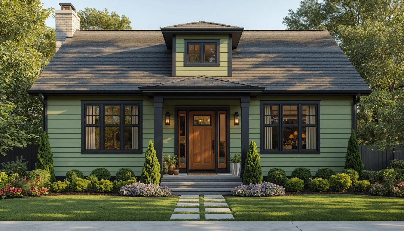
Green is the exterior color homeowners ask about the most and commit to the least. It photographs beautifully on Pinterest, then gets quietly swapped for “safe” gray at the paint counter — not because green doesn’t work, but because most people have never seen it broken down shade by shade, pairing by pairing.
That hesitation is solvable. Green is having a real moment in 2026, with sage, olive, and deep forest tones consistently named among the top exterior trends of the year. The difference between a green house that looks dated in five years and one that looks intentional for decades comes down to choosing the right depth of green for your light, your materials, and your architecture.
This guide walks through 19 green house exterior ideas, organized from the safest, most universally flattering shades to the boldest, most unexpected combinations — with the exact paint colors, trim pairings, and architectural matches behind each one.
Table of Contents
- Why Green Is the Exterior Color of 2026
- Sage & Muted Green: The Safe, Sophisticated Starting Point (Ideas 1–6)
- Olive & Moss Green: Warm, Grounded, Architectural (Ideas 7–10)
- Dark Forest & Emerald: Bold Statement Greens (Ideas 11–14)
- Green as an Accent: Doors, Trim & Details (Ideas 15–19)
- Choosing Your Green: A Designer’s Decision Framework
- Common Mistakes to Avoid
- Frequently Asked Questions
Why Green Is the Exterior Color of current year?
For the past decade, exterior color trends were dominated by gray. That’s shifting. Earthy sage green unquestionably dominates predicted exterior paint trends for 2026, a muted, versatile tone that harmonizes with natural surroundings in a way cooler grays never quite managed.
It isn’t only sage. From sage to forest green, nature-inspired colors are surging across the board, connecting homes to their landscapes and creating an organic, serene appeal that buyers and homeowners are actively seeking out after years of stark white and cool gray dominance.
Why now? Part of it is fatigue with the “gray wave” of the last decade — and part of it is that green simply photographs and lives better than its reputation suggests. The 2026 designer move is tone-on-tone: a darker olive on the siding with a lighter sage on the window casings, sharpened with black metal hardware, gutters, and fixtures that read modern against any depth of green.
Before diving into the 19 ideas, it’s worth understanding the three “families” of exterior green, because the right choice depends entirely on which one suits your light, your roofline, and your existing materials:
| Green Family | Mood | Best Light Conditions | Example Shades |
| Sage / muted gray-green | Calm, safe, versatile | Works in most light | Evergreen Fog, Sage SW 7745, October Mist |
| Olive / moss | Warm, grounded, rustic | Best with strong natural light | Aegean Olive, Olive Grove, Herb Bouquet |
| Forest / emerald | Bold, dramatic, statement | Needs strong sun to avoid feeling heavy | Rosemary SW 6187, Majolica Green |
Sage & Muted Green: The Safe, Sophisticated Starting Point (Ideas 1–6)
If you’ve never painted a house green before, sage is the lowest-risk entry point — muted enough to read as a sophisticated neutral from a distance, with enough green undertone to feel fresh and different up close.
1. Full-Body Sage Green With Crisp White Trim
Answer: A full sage-green exterior with crisp white trim is the single safest, most universally flattering green house combination available, suitable for almost any architectural style.
Explanation: Higher-LRV sage greens stay calm and restful rather than heavy because they reflect more light, and white trim sharpens every architectural line against that softness.
Practical Example: Sherwin-Williams Sage SW 7745 or Benjamin Moore October Mist 1495, paired with a crisp white like SW Pure White, delivers a combination that reads as classic rather than trendy — both colors have higher LRVs (light reflectance values) that keep the palette from going dark or murky.
Designer Secret: Choose your sage one shade darker than what looks right on the paint chip. Sunlight consistently lightens the perceived value of exterior paint, so a chip that looks “just right” indoors often washes out outdoors.
Best For: Colonial, cottage, and traditional homes — particularly those surrounded by mature trees or gardens, where the muted tone echoes the landscape rather than competing with it.
2. Gray-Sage With Warm Neutral Trim
Answer: For homeowners who want green but aren’t ready to commit fully, a gray-leaning sage paired with a warm neutral trim (instead of stark white) softens the transition.
Explanation: Gray-sage shades like Sherwin-Williams Evergreen Fog read more gray than green in bright daylight, then cozy up and reveal more of their green undertone under evening or lamp light — making the color feel less like a bold decision and more like an elevated neutral.
Practical Example: Evergreen Fog SW 9130 looks gorgeous paired with warm neutrals rather than crisp white, softening the overall effect for homeowners easing into exterior green for the first time.
Common Mistake: Pairing a gray-sage with a cool white trim cancels out its warmth entirely. Choose a trim with a hint of cream or beige to preserve the cozy, grounded effect.
3. Tone-on-Tone Sage: Darker Siding, Lighter Casings
Answer: The defining 2026 designer move for green exteriors is tone-on-tone — using a darker olive or sage on the main siding and a lighter sage on the window casings and trim detail.
Explanation: Rather than the high-contrast green-and-white formula of the last decade, tone-on-tone keeps everything within the same color family at different depths, which reads as more sophisticated and less “paint by numbers.”
Practical Example: A darker olive body color with a lighter sage on casings, finished with black metal hardware and gutters, sharpens the whole look and reads distinctly modern compared to a flat single-color application.
Who Benefits: This works especially well on homes with multiple siding materials or architectural levels (a main body plus a gable or dormer), where the tonal shift can follow the existing structure instead of fighting it.
4. Sage Green With Natural Wood Accents
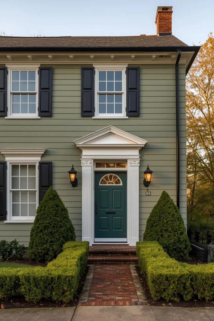
Answer: Pairing sage siding with natural, unstained wood accents — a front door, porch beams, or garage door — creates one of the most organically cohesive green exterior looks available.
Explanation: Sage and wood share enough warmth in their undertones that they read as a single, considered palette rather than two competing materials, especially when the wood is left natural rather than painted or heavily stained.
Practical Example: Exposed wood beams, cedar porch details, and warm stained doors reinforce the organic, grounded appearance of sage or olive siding while adding texture and dimension that flat paint alone can’t achieve.
Budget Alternative: If replacing a door or beams isn’t feasible, a wood-look composite or simply re-staining an existing wood door in a warm honey tone delivers a similar effect for a fraction of the cost.
5. Sage Green Stucco for Southwestern and Mediterranean Homes
Answer: Stucco softens and mutes any green applied to it, which makes sage an especially forgiving and elegant choice for stucco-clad homes that might read too saturated in a smoother siding material.
Explanation: Stucco’s texture diffuses light differently than smooth fiber cement or wood siding, often making bold colors appear gentler and more sophisticated than they do on a paint chip.
Practical Example: A pale, earthy stucco green paired with crisp white trim — as seen on Craftsman and Spanish-influenced homes — creates a quiet, symmetrical curb appeal that suits warm climates particularly well.
Quick Tip: Always test stucco colors with an actual sample swatch on the wall rather than relying on a digital rendering — stucco’s texture changes how pigment reads more dramatically than any other common siding material.
6. Sage Green With Black-Framed Windows
Answer: Black window frames against sage siding is one of the most repeated and reliable green exterior combinations for 2026, working across both traditional and modern architecture.
Explanation: Black creates immediate definition and contrast against any sage tone, drawing the eye to the windows as an architectural feature rather than letting them blend into the facade.
Practical Example: Dark roofing and black-framed windows create strong contrast against muted olive or sage siding while keeping the overall exterior palette refined, offering a way to introduce a bold accent without committing to an all-over saturated color.
Comparison — Trim Color by Desired Mood:
| Trim Color | Mood Created | Best Paired With |
| Crisp white | Classic, fresh, high contrast | Bright sage, full sun exposure |
| Warm cream | Soft, welcoming, traditional | Gray-sage, olive |
| Black/charcoal | Modern, defined, dramatic | Any sage, especially tone-on-tone |
| Taupe/greige | Cohesive, understated | Olive, moss green |
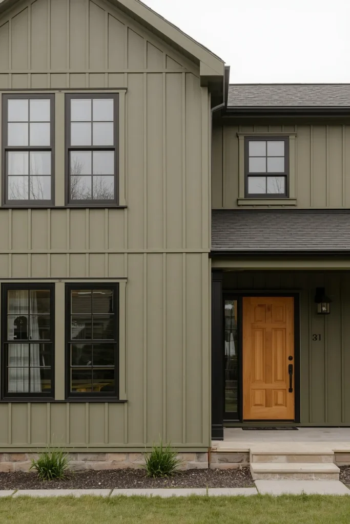
Olive & Moss Green: Warm, Grounded, Architectural (Ideas 7–10)
Olive and moss greens carry more brown and yellow undertone than sage, which makes them feel warmer, earthier, and especially well suited to homes surrounded by natural materials like stone, cedar, and exposed wood.
7. Olive Green Siding With Black Trim
Answer: Olive green paired with black trim is one of the richest, most grounded green exterior combinations available, and it’s especially well suited to modern farmhouse and transitional architecture.
Explanation: The darker accent color helps define windows, rooflines, and architectural details while preserving the warmth of the olive siding underneath, creating contrast without losing the cozy quality that makes olive appealing in the first place.
Practical Example: Pairing an olive shade like Aegean Olive with black trim and hardware creates a rich, intentional palette that reads as designed rather than default — particularly when the black is repeated consistently across gutters, light fixtures, and window frames.
Designer Secret: Keep black trim elements visually connected by using the exact same black across every surface — gutters, frames, and fixtures. Mismatched blacks (cool-toned vs. warm-toned) can read as accidental rather than intentional.
8. Olive Green With Natural Stone Accents
Answer: Olive green and natural stone are one of the most naturally complementary exterior pairings available, because both materials share genuinely earthy undertones rather than just a similar color family.
Explanation: Using stone around entryways, foundations, or porch columns alongside olive siding creates visual depth and helps the entire home feel connected to its surrounding landscape rather than sitting on top of it.
Practical Example: A home with olive siding and a stone-clad lower level or chimney reads as more custom and architecturally considered than the same olive paired with a single flat material throughout.
Who Benefits: This pairing is especially effective for homes already built with partial stone facades, since it works with existing materials rather than requiring new ones.
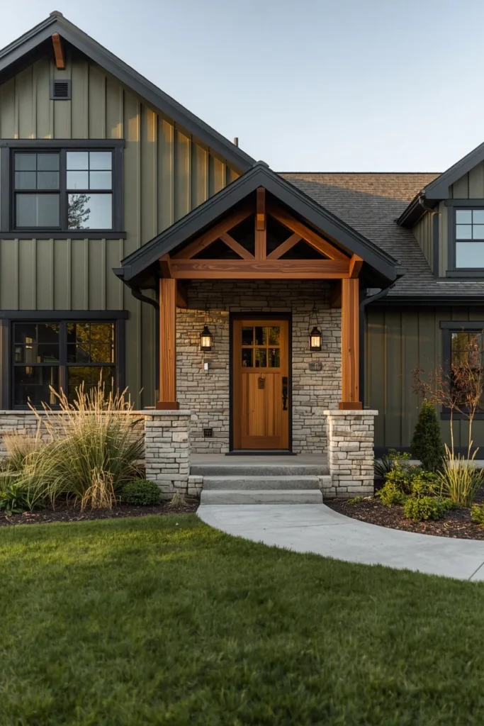
9. Moss Green for a Softer, Subtler Statement
Answer: Moss green offers most of the depth and richness of forest green with significantly more subtlety, making it a strong middle-ground option for homeowners who want bold but not dramatic.
Explanation: Moss carries tints of medium green mixed with deeper pine undertones, delivering a genuine punch of color without tipping into the high-commitment territory of true forest or emerald green.
Practical Example: Moss green pairs particularly well with raw wood elements or brown and tan features, building a calming, oasis-like exterior that feels grounded rather than attention-seeking.
Budget Alternative: If a full repaint feels risky, test moss green on a single architectural element — a garage door or shutters — before committing to the full exterior.
10. Olive Green With Vertical Board and Batten Siding
Answer: Olive green gains noticeably more texture and architectural interest when applied to vertical board and batten siding rather than flat lap siding, especially when paired with darker trim.
Explanation: The vertical lines of board and batten naturally emphasize height and create shadow lines that a single flat color alone can’t produce, which is part of why this siding profile has become a favorite for modern and modern-farmhouse green exteriors.
Practical Example: Vertical board and batten siding in a muted olive tone, paired with darker trim colors, helps emphasize the architectural lines of the home while creating a clean, contemporary appearance that reads as deliberate rather than rustic-by-accident.
Common Mistake: Painting board and batten siding in a single flat sheen with no trim contrast at all. Even a subtle one-shade-darker trim on the battens themselves adds dimension that a perfectly flat application loses.
Quick Checklist — Olive/Moss Pairing Essentials:
- Choose black or deep charcoal trim for maximum definition
- Incorporate at least one natural material (stone, cedar, exposed wood)
- Test the shade against your roof color before committing
- Consider board and batten or another textured profile to add depth
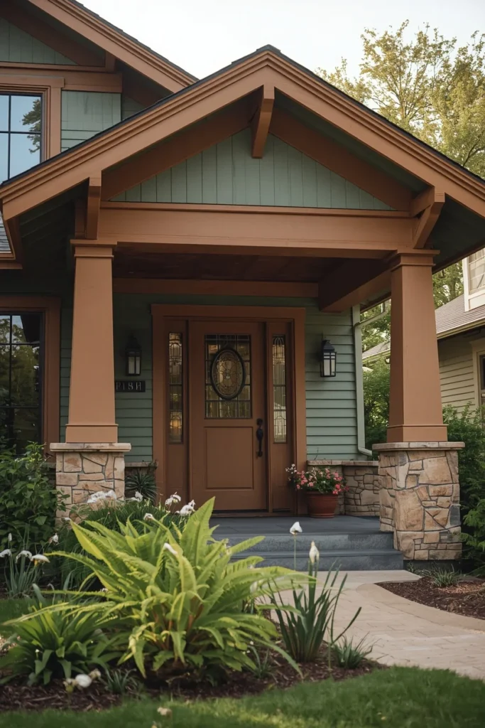
Dark Forest & Emerald: Bold Statement Greens (Ideas 11–14)
This is where green stops being a safe neutral and starts being a genuine architectural statement. Deep forest and emerald greens demand strong light and confident pairing, but they deliver curb appeal that’s almost impossible to replicate with any other color family.
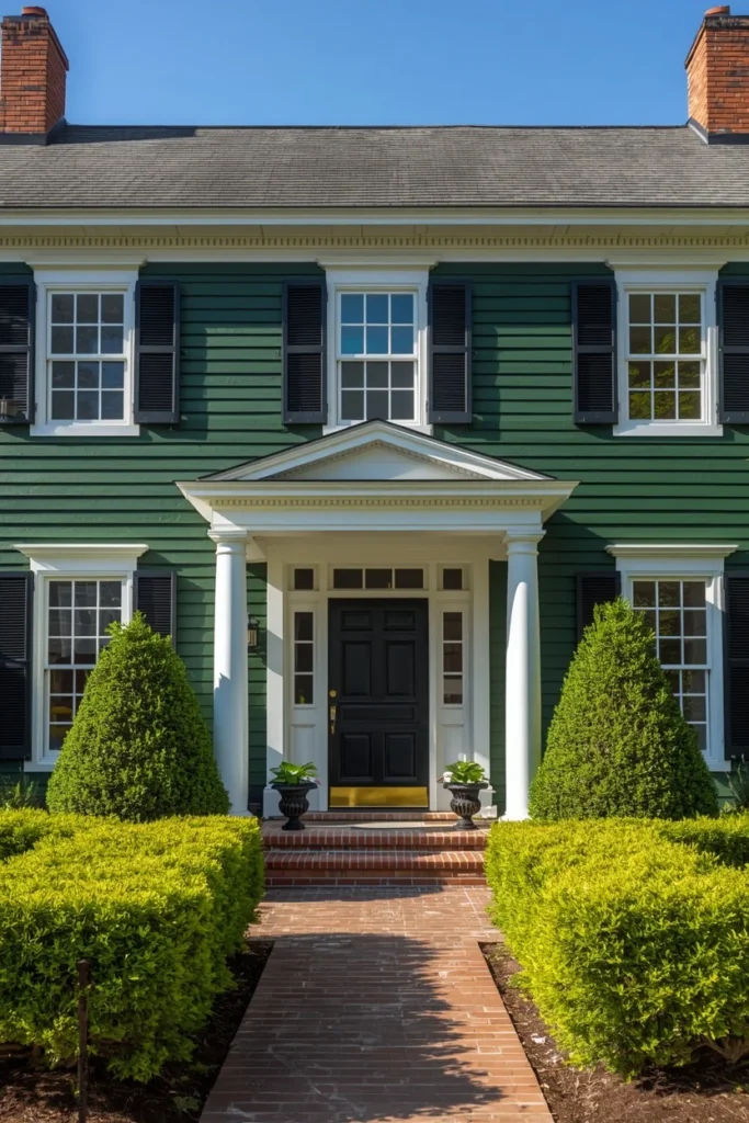
11. Deep Forest Green Full-Body With White Trim
Answer: A full forest-green exterior with white trim is the boldest classic green combination available, and it works because the high-contrast white keeps an otherwise heavy, saturated color feeling crisp rather than dark.
Explanation: Deep, moody, saturated forest greens are best suited to feature walls and statement exteriors, but they need strong natural light to avoid feeling heavy — homes in shaded or tree-covered lots should test this shade carefully before committing to a full application.
Practical Example: Sherwin-Williams Rosemary SW 6187 makes a dramatic full-body statement when paired with crisp white trim and black hardware, working especially well on Colonial and Tudor-style homes with strong architectural symmetry.
Designer Secret: Deep greens absorb more sunlight than lighter shades, so in hot, high-UV climates, choose a premium exterior paint line specifically rated for fade resistance to protect the investment long-term.
Best For: Homes with strong architectural bones — symmetrical Colonials, Tudors with decorative half-timbering, or any facade with enough trim detail to stand out against a dark, saturated body color.
12. Forest Green With Warm Cream Trim (Instead of White)
Answer: Swapping stark white trim for warm cream against a deep forest green softens the high-contrast effect into something that reads as elegant rather than severe.
Explanation: Forest green paired with crisp white trim creates striking contrast, but warm cream accents achieve a similar definition with noticeably more warmth — particularly suited to Colonial and Tudor homes that want drama without starkness.
Practical Example: This pairing works especially well on homes with warm-toned roofing (brown or red-brown shingles), where a stark white trim would otherwise clash with the existing material.
Comparison — Forest Green Trim Pairings:
| Trim Choice | Effect | Best Roof Pairing |
| Crisp white | High contrast, classic, formal | Gray or black roofing |
| Warm cream | Elegant, softer drama | Brown or red-brown roofing |
| Black/charcoal | Moody, monochromatic depth | Any dark roofing |
| Brass/copper accents | Luxurious, warm | Wood elements, stone |
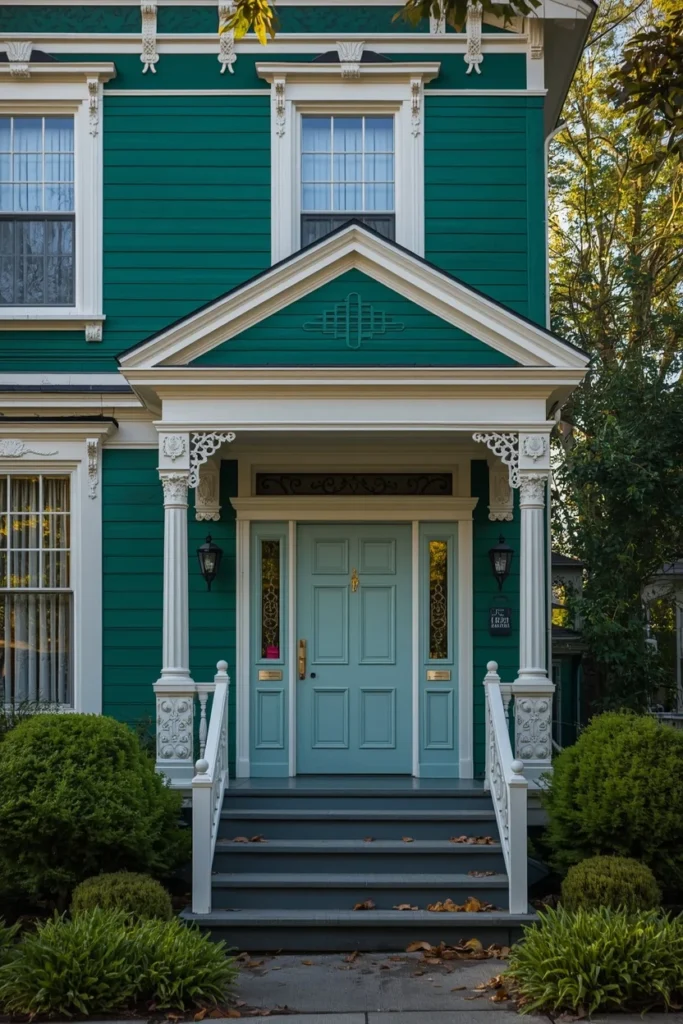
13. Emerald Green for Modern and Victorian Architecture
Answer: True emerald green is the most saturated, attention-commanding green available for exteriors, and unlike many bold colors, it genuinely suits both ultra-modern and ornate Victorian architecture.
Explanation: Everything from modern to Victorian architectural styles can complement emerald, because the saturation reads as intentional rather than dated regardless of how minimal or ornamental the surrounding details are.
Practical Example: Emerald pairs particularly well with white, blue, or gray trim and doorways, giving homeowners several distinct directions depending on whether they want a crisp, contemporary look or a more traditional, jewel-toned one.
Common Mistake: Choosing emerald without sampling it at multiple times of day. This is the boldest shade in the green family, and its perceived intensity shifts more dramatically between morning, midday, and evening light than any muted green.
14. Two-Color Green Drama: Dark Green Body With Even Darker Green Accents
Answer: For homeowners who want maximum drama without introducing a second color family at all, pairing a dark green body with an even deeper green on shutters, the door, or trim creates depth through value alone.
Explanation: This is a monochromatic approach to bold exterior design — rather than relying on contrast between colors, it relies on contrast between light and dark within the same hue, which tends to photograph as sophisticated rather than busy.
Practical Example: A muted, gray-leaning forest green as the main body color with a near-black-green on the front door and shutters creates a layered, intentional palette that avoids the “single flat color” look entirely.
Quick Tip: This approach works best with premium paint lines, since subtle value shifts between two close greens require precise, consistent application to read correctly rather than looking like a mismatched touch-up.
Mini Checklist — Going Bold With Forest/Emerald Green:
- Confirm your lot gets strong, consistent natural light
- Choose a fade-resistant premium exterior paint line
- Sample the color at three times of day before committing
- Decide between high-contrast trim (white) or tonal trim (cream, deeper green)
- Pair with black or brass hardware for definition
Green as an Accent: Doors, Trim & Details (Ideas 15–19)
Not every green exterior idea requires repainting the whole house. These final five ideas show how to introduce green strategically — through a door, brick accent, or hardware — for homeowners who want the look without the full commitment.
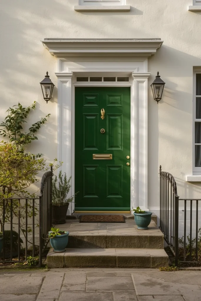
15. A Bold Green Front Door on a Neutral House
Answer: A saturated green front door is the lowest-risk, highest-impact way to bring green into your exterior palette, since doors are inexpensive to repaint and easy to change again later.
Explanation: Painting your front door a bold color offers a low-commitment way to experiment with green specifically because it’s a small, easily changeable area that adds personality without overwhelming the rest of the house.
Practical Example: A deep forest or emerald front door against white, cream, or light gray siding creates an immediate focal point and signals intentional design, even on an otherwise unchanged exterior.
Budget Alternative: A single gallon of quality exterior door paint typically costs far less than even a small siding section, making this the most accessible idea in the entire guide for testing whether green suits your home before a larger commitment.
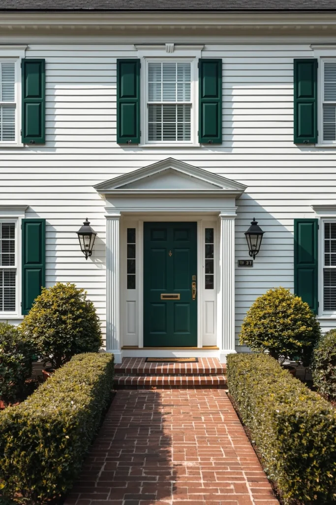
16. Green Shutters for Classic, Removable Drama
Answer: Shutters in a deep, grounding green add architectural dimension to a neutral house without the permanence or cost of a full repaint, and they can be removed or repainted easily if tastes change.
Explanation: Dark, grounding shutter colors add real dimension to an exterior, and charcoal-leaning deep greens work particularly well because they read as a sophisticated neutral from a distance while revealing their green undertone up close.
Practical Example: White or light gray siding with deep green shutters and a matching green door creates a cohesive, classic look that suits Colonial, Cape Cod, and farmhouse styles equally well.
Who Benefits: This is ideal for homeowners in rental situations, HOA-restricted neighborhoods with limited siding color options, or anyone wanting to test green before a full exterior commitment.
17. Green Brick as an Accent Material
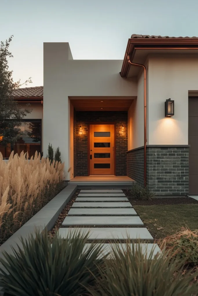
Answer: Rather than painting an entire facade green, using green-toned brick as an accent around windows, doors, or as a water table introduces color and texture without overwhelming the overall design.
Explanation: This approach offers a touch of color and character while keeping the rest of the house clad in a neutral material like siding or stucco, giving the green a defined, intentional placement rather than spreading it across the whole facade.
Practical Example: A home with neutral stucco walls and green brick detailing around the entry and lower water table reads as custom and textural in a way flat paint alone cannot achieve.
Designer Secret: Pairing forest green brick with copper or aged-brass gutters and downspouts adds a layer of warmth and unexpected luxury that elevates the accent beyond a simple color choice.
18. Green Garage Door as a Standalone Focal Point
Answer: Garage doors take up a significant portion of many home facades, which makes them an underused but highly effective place to introduce a bold green without touching the rest of the exterior.
Explanation: A well-designed dark green garage door creates a striking focal point while harmonizing with the rest of a neutral palette, particularly when the color is echoed in a smaller way elsewhere, like a door mat or planter.
Practical Example: Dark green pairs beautifully with both wood and metal garage door materials, meaning this idea works whether your garage door is a traditional panel style or a more modern flush design.
Quick Tip: If your garage door faces the street more prominently than your front door, this single update can outperform a front-door repaint for overall curb-appeal impact.
19. Green Window Frames for Architectural Definition
Answer: Painting window frames in a deep green — rather than the more common black or white — adds character and a sense of intentional design without requiring any change to the siding itself.
Explanation: Green window frames create a polished look that contrasts beautifully with white or light-colored siding, drawing the eye to the windows as a feature rather than letting them disappear into the facade.
Practical Example: Dark green window frames complement nearly any natural landscaping, reinforcing a sense of connection to greenery outside while giving the home a finished, intentional appearance from the street.
Common Mistake: Painting only some window frames green while leaving others a different color due to material differences (vinyl vs. wood). Confirm every visible frame can be painted or matched before starting, or the inconsistency will read as unfinished rather than intentional.
Mini Checklist — Accent-Only Green Ideas Ranked by Commitment:
- Front door (lowest cost, fastest to test, easiest to change)
- Shutters (low cost, classic, removable)
- Window frames (moderate cost, high architectural impact)
- Garage door (moderate cost, high visibility)
- Brick accent (highest cost of the five, but most permanent texture and depth)
Choosing Your Green: A Designer’s Decision Framework
With 19 ideas on the table, narrowing down to one direction comes down to four questions worth answering in order:
1. What can’t you change? Your roof color, brick, and stone are fixed unless you’re replacing them. Choose your green’s undertone (cool-gray-green vs. warm-olive) to harmonize with whichever of these materials is most dominant on your facade.
2. How much natural light does your home actually get? Deep forest and emerald greens need strong, consistent sun to avoid feeling heavy or gloomy. Shaded or tree-covered lots generally read better in sage or olive, which stay luminous even with less direct light.
3. How much commitment do you want right now? A full-body repaint is the biggest investment and the biggest payoff. A door, shutters, or garage door let you test the green family you’re drawn to before committing further.
4. What’s your architectural style actually asking for? Symmetrical Colonials and Tudors carry bold, saturated greens beautifully because their trim detail provides natural contrast. Modern and farmhouse homes often suit the muted tone-on-tone approach better, since they rely on clean lines rather than ornamentation for visual interest.
Comparison — Matching Green Family to Architectural Style:
| Architectural Style | Recommended Green Family | Why It Works |
| Colonial / Tudor | Forest, emerald, or deep sage | Strong trim detail provides natural contrast |
| Modern farmhouse | Olive or tone-on-tone sage | Clean lines suit muted, layered tones |
| Craftsman / Bungalow | Sage or moss with stone/wood | Earthy palette matches material warmth |
| Coastal / Cottage | Light sage or seafoam | Airy, light-reflective tones suit the setting |
| Contemporary / Modern | Olive, moss, or green accents | Bold accents work better than full saturation |
Common Mistakes to Avoid
Mistake: Judging a green from a small paint chip. Sunlight consistently lightens the perceived value of exterior paint, so a color that looks correct on a 2-inch swatch indoors often reads several shades lighter once applied outdoors at full scale.
Mistake: Ignoring your siding material’s effect on the final color. The exact same paint color can look dramatically different on fiber cement, wood, or stucco — stucco in particular tends to soften and mute bold colors, while smooth fiber cement shows color more evenly and predictably.
Mistake: Pairing warm greens with cool trim (or vice versa). Undertone mismatches — a warm olive paired with a stark blue-white, for instance — create visual tension that’s hard to pinpoint but easy to feel. Confirm your green and trim share a similar warmth before committing.
Mistake: Going too light in a hot, sunny climate. Pale greens can wash out and lose their color identity entirely under intense, direct sun. In high-UV regions, choosing a shade one level darker than feels comfortable usually photographs and ages better.
Mistake: Skipping a professional-grade sample test. A peel-and-stick swatch or painted poster board, viewed at your actual home across a full day, prevents far more regret than any number of online photos or chip comparisons.
FAQs
Conclusion
Green isn’t the risky exterior choice it’s often assumed to be — it’s simply a color family with more range than gray, white, or beige, which means it requires a slightly more deliberate decision. Start by identifying which family suits your light and materials (sage, olive, or forest), then decide how much of your exterior you’re ready to commit to, from a single front door to a full tone-on-tone repaint.
Whichever direction you choose, sample it properly before you commit — on your actual walls, in your actual light, across a full day. A green house exterior done thoughtfully doesn’t just stand out on Pinterest; it ages beautifully for years, connecting your home to its landscape in a way few other color choices can match.