18 Living Room Wallpaper Ideas That Are Bold, Beautiful & Conversation-Starting
There is a wall in your living room that isn’t pulling its weight.
You painted it the same color as everything else, placed the sofa in front of it, and moved on. It’s fine. Inoffensive. Exactly like every other wall on the street. And somewhere in the back of your mind, you know the room could be so much more.
That’s where wallpaper comes in — and in 2025 and 2026, it’s doing things that paint simply cannot. Living room wallpaper is moving beyond traditional patterns, with oversized botanical prints, texture, and artistic murals taking centre stage. Designers are embracing the idea that pattern is no longer the supporting act — it’s the main event, with vibrant narratives told through print and color.
This isn’t your grandmother’s wallpaper. No fussy florals, no dated repeating borders. Today’s wallpaper is bold, considered, and the single fastest way to transform a living room from “nice” to “memorable.”
Here are 18 ideas that will make you rethink every plain wall in your home.
Table of Contents
- Oversized Botanical Mural
- Grasscloth for Quiet Luxury
- Moody Dark Floral
- Scenic Panoramic Mural
- Soft Painterly Botanical
- Geometric Precision
- Full-Room Wallpaper Drenching
- Maximalist Jewel-Box Print
- Textured Neutral
- Retro Revival
- Chinoiserie Statement
- Earthy Terracotta & Warm Neutrals
- Vertical Stripe for Height
- Abstract Watercolor Mural
- Wainscoting + Wallpaper Combination
- Behind-the-Bookshelf Accent
- Peel-and-Stick for Renters
- Moiré Pattern — The Sophisticated New Favorite
Wallpaper Ideas
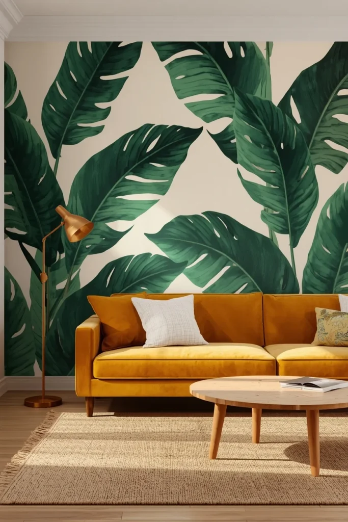
1. Oversized Botanical Mural — The Living Room’s Most Iconic Moment
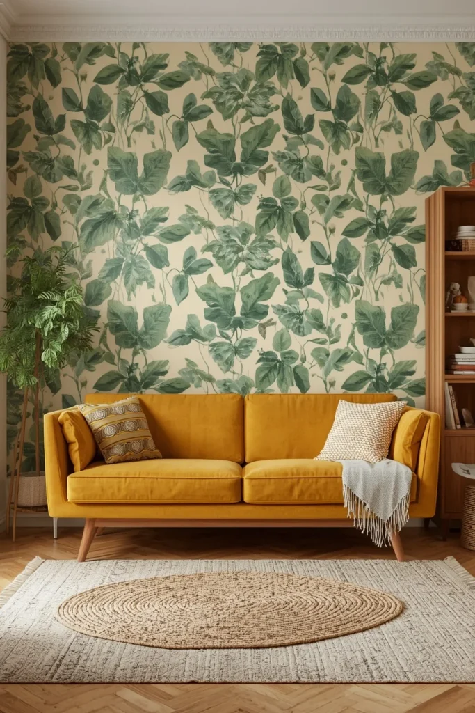
If one wallpaper idea defines the current era of interior design, it’s the oversized botanical mural. Botanical wallpaper murals featuring oversized leaves, ferns, or tropical plants create an instant connection to nature — a design principle known as biophilic design that research shows reduces stress and improves wellbeing.
The key to making it work is scale. Oversized prints create drama without reading as busy. A dense small-repeat jungle pattern can feel overwhelming; the same foliage rendered at 3x the scale feels lush, intentional, and deeply editorial.
Where it works best: Behind the sofa, facing the main entry point of the room. This maximizes the “reveal” moment every time someone walks in.
Furniture rule: When the wallpaper is the star, keep the furniture calm. A warm mustard sofa, a jute rug, and natural wood accents let the botanical do its work without competition.
Color Pairing: Deep emerald leaves on a warm cream background + warm brass hardware + natural linen upholstery.
Designer Secret: Interior designers recommend placing botanical murals on the wall behind your sofa or as a statement wall opposite your main seating area, where they can serve as living artwork. For rooms under 200 square feet, choose murals with breathing room between elements rather than a dense jungle canopy.
2. Grasscloth — The Wallpaper That Whispers “Expensive”
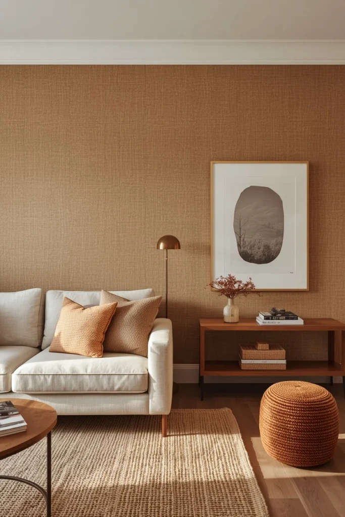
Grasscloth is the designer’s secret weapon for living rooms that need warmth without pattern. Grasscloth wallpaper brings natural texture and warmth to living rooms through woven plant fibers like jute, reed, or bamboo that create subtle horizontal or vertical lines.
The beauty of grasscloth lies in its subtlety. Unlike patterned wallpapers that demand attention, grasscloth provides sophisticated texture that reads almost as a neutral, allowing your furniture, artwork, and accessories to take center stage.
It works in two modes. Applied to all four walls, it creates a cocooning, enveloping quality that feels like the most considered room in the house. Applied to a single feature wall — particularly behind a fireplace or flanking built-in shelves — it adds contrast and texture without commitment.
Tone guide:
- Warm beige or wheat tones → traditional, coastal, and farmhouse living rooms
- Gray or charcoal → contemporary, minimalist spaces
- Deep blue or sage → moody, collected rooms with warm wood accents
Common Mistake: Grasscloth is a natural fiber and not moisture-tolerant. Avoid it in rooms with high humidity or near windows that receive direct rain. For high-traffic areas, a grasscloth-effect vinyl alternative gives you the look with easier maintenance.
3. Moody Dark Floral — The Boutique Hotel Look at Home
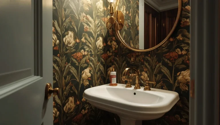
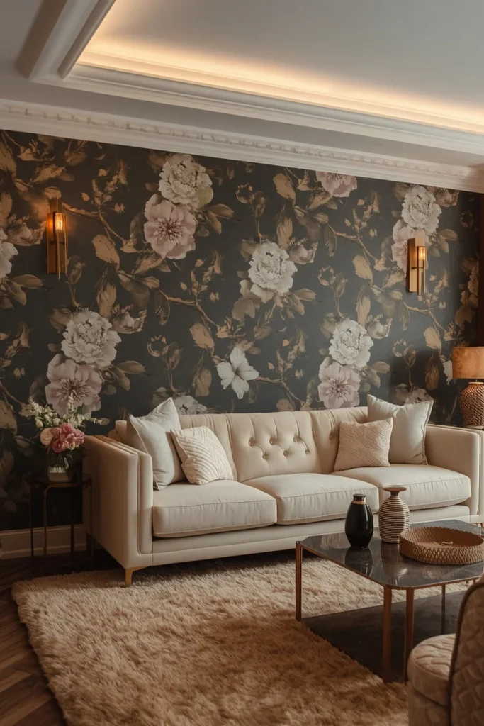
Dark floral wallpaper is the single most dramatic thing you can do to a living room — and when done correctly, the most rewarding. According to 2025 wallpaper trends analysis, moody designs featuring deep hues like emerald green, navy blue, and charcoal gray are among the greatest trends, adding depth and sophistication especially in living rooms with luxurious dark patterns.
The psychology behind it is counterintuitive but powerful: darker walls don’t shrink a room — they make it feel more enveloping. More intimate. More like a place worth lingering.
The balance formula:
- Dark botanical or floral wallpaper on feature wall (or all four walls for maximum impact)
- Crisp white or ivory ceiling — never dark
- Light furniture: cream, ivory, or soft linen upholstery
- Warm, layered lighting at multiple levels
Who benefits most: Rooms with limited natural light that would feel flat with pale colors, where leaning into the intimacy is the better design decision.
Color Pairing: Deep charcoal background + oversized ivory and blush florals + warm brass sconces + cream velvet sofa.
Quick Tip: The psychology behind dark florals translates to increased comfort and relaxation in living room settings — darker walls create a cocoon-like quality. Pair with at least three light sources to prevent the room from reading as dim rather than atmospheric.
4. Scenic Panoramic Mural — When One Wall Becomes a Window to Somewhere Else
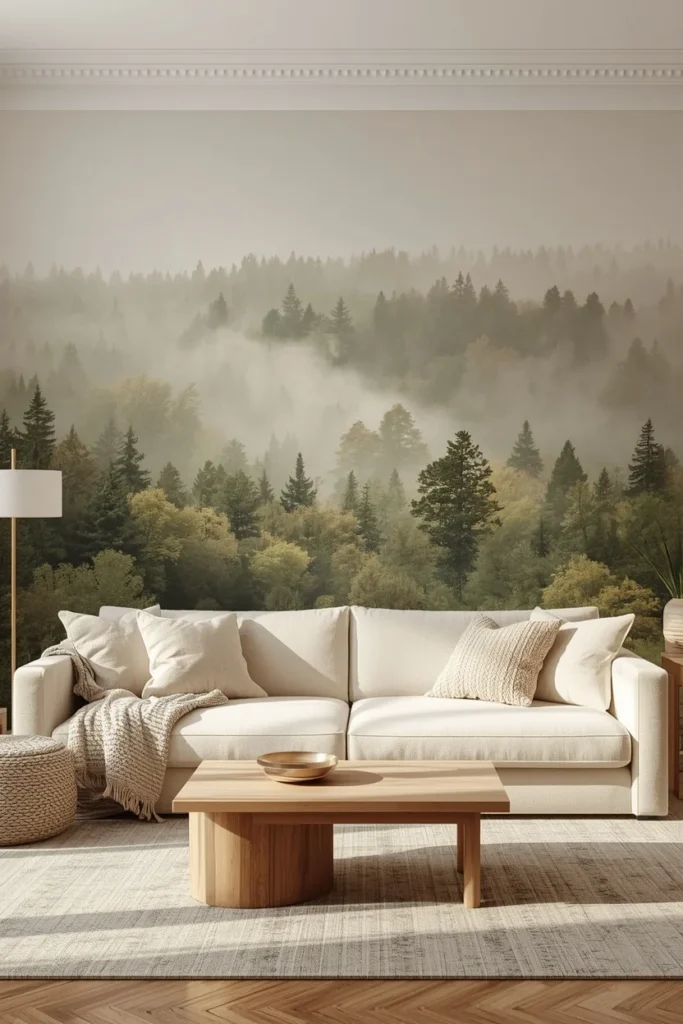
Scenic murals are trending because they let walls tell a story with large-scale, immersive imagery instead of relying on accent walls. Landscapes and subtler botanicals envelop a room and transport you.
According to design director David Harris at Andrew Martin, Google searches for mural wallpaper have skyrocketed by over 5,000% since May 2025. The reasons are clear: a mural doesn’t just decorate a wall — it redefines what the wall is. A mountain vista, a soft forest scene, a watercolor coastal view — each one turns the living room into an experience rather than just a room.
Mural placement strategy:
- The wall you face from your main seating position — maximum daily enjoyment
- The wall visible from the entry — maximum first impression
- A recessed alcove or chimney breast — “framed” by the surrounding walls for a gallery effect
For large living rooms: Go full panoramic, ceiling to floor, edge to edge. The result is immersive in the best possible way.
For smaller rooms: Choose a mural with depth — a misty forest, a fading landscape — rather than a dense, close-up print. Depth in the image creates perceived depth in the room.
5. Soft Painterly Botanical — Beauty Without Drama
Not every living room calls for a bold statement. Sometimes the goal is a room that feels refined, layered, and quietly beautiful — the kind of space that rewards the longer you look.
Botanical and floral prints are having a moment, particularly when they lean moody or painterly rather than sweet. Softer, more country-casual patterns are setting the tone, with traditional landscape murals continuing to be a significant wallpaper trend.
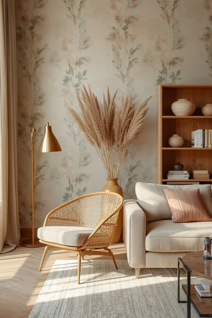
Painterly botanicals — wallpapers that look as though they were applied with a watercolor brush rather than printed — bring an artisan quality to the living room wall. They feel collected rather than purchased.
Style this look:
- Soft botanical wallpaper in sage, dusky blue, or warm rose tones
- Antique or vintage-inspired furniture: a cane chair, a wooden bookcase, a linen sofa
- Warm brass or unlacquered brass hardware
- Books, ceramics, and dried botanicals as accessories
Designer Secret: The best painterly botanicals have hidden details — a small caterpillar in the foliage, a tiny bird in the background — that create interiors which engage you beyond the first impression of a room. Look for wallpapers from heritage brands that invest in hand-drawn detail.
6. Geometric Precision — Structure That Speaks
Geometric wallpaper brings something to a living room that no other wallpaper style can: structure. A clean repeating pattern creates visual rhythm — a sense of architectural intention that makes even simply furnished rooms feel designed.
Fresh and energizing, geometric designs are a major wallpaper trend — whether in the form of geometric wallpaper, vinyl cutouts, or painted designs. Architectural shapes like arches, triangles, and squares give rooms a precise, modern edge.
The two modes of geometric wallpaper:
Bold and graphic: High-contrast black and white, deep navy and gold, charcoal and rust. These work on a single feature wall where the pattern can breathe without competing with itself.
Soft and tonal: Geometric patterns in two shades of the same color — cream on warm white, sage on soft green. These work beautifully on all four walls because the contrast is low enough to feel like sophisticated texture rather than pattern.
Important note: While bold, hard-edged geometric shapes might conjure groovy vibes, some designers feel they can feel harsh and dated in small spaces. For a punchy alternative, stripes, plaids, and florals bring depth and personality without the visual fatigue. Choose geometric patterns with curved or organic edges — arches, soft hexagons — for longevity.
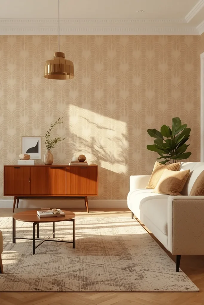
7. Full-Room Wallpaper Drenching — The Jewel Box Effect
The single biggest wallpaper idea of 2025–2026 isn’t about which pattern to choose. It’s about how much wallpaper to use.
Rather than defining one wall plane, there is a growing proclivity towards wallpaper encompassing a room holistically — covering all four walls in the same design for a cozy, fully immersive experience that creates a “jewel box” effect.
When a pattern wraps a room completely, something remarkable happens. The room stops feeling like a decorated box and starts feeling like an environment. The wallpaper becomes the architecture.
How to execute wallpaper drenching successfully:
- Keep the ceiling white — or one shade lighter than the wallpaper’s background color. This prevents the room from feeling caved-in.
- Choose furniture in colors pulled directly from the wallpaper — this creates harmony rather than competition.
- Keep accessories minimal — the wallpaper is the art. Let it be.
- Choose a pattern with breathing room — dense prints on all four walls can feel relentless. Patterns with negative space between elements work better at full-room scale.
Who this is for: Living rooms used more in the evening than daytime, where the artificial lighting creates an enveloping, intimate quality. Also for homeowners who are ready to commit to a bold, singular design statement.
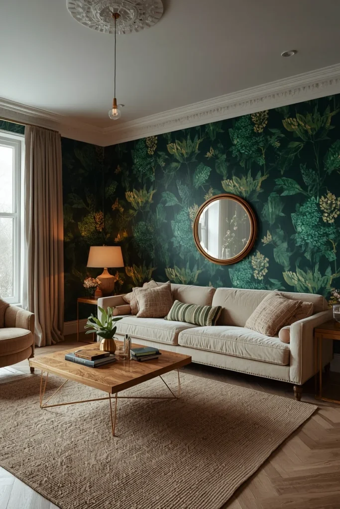
8. Maximalist Print — Pattern as Personality
Maximalist prints can be deployed as a statement wall, creating a dramatic focal point that elevates even the simplest furnishings — or when wrapped across all four walls, achieving a jewel-box effect that feels intimate, layered, and utterly captivating.
The key distinction between maximalist wallpaper that works and maximalist wallpaper that doesn’t is balance. Bold pattern on the walls demands restraint everywhere else.
The Maximalist Balance Formula:
- Bold pattern: on one feature wall only (unless you’re doing full drenching)
- Furniture: simple shapes, neutral tones
- Accessories: pull two or three colors directly from the wallpaper pattern
- Lighting: warm and layered — maximalist rooms need atmospheric light, not overhead brightness
Patterns that work as maximalist living room wallpaper in 2025: Chintz revivals, oversized baroque prints, animal motifs on dark backgrounds, vintage-inspired tapestry patterns, large-scale damask.
Common Mistake: Pairing maximalist wallpaper with maximalist furniture. The result isn’t more personality — it’s visual chaos. The wallpaper should be the loudest voice in the room; everything else should listen.
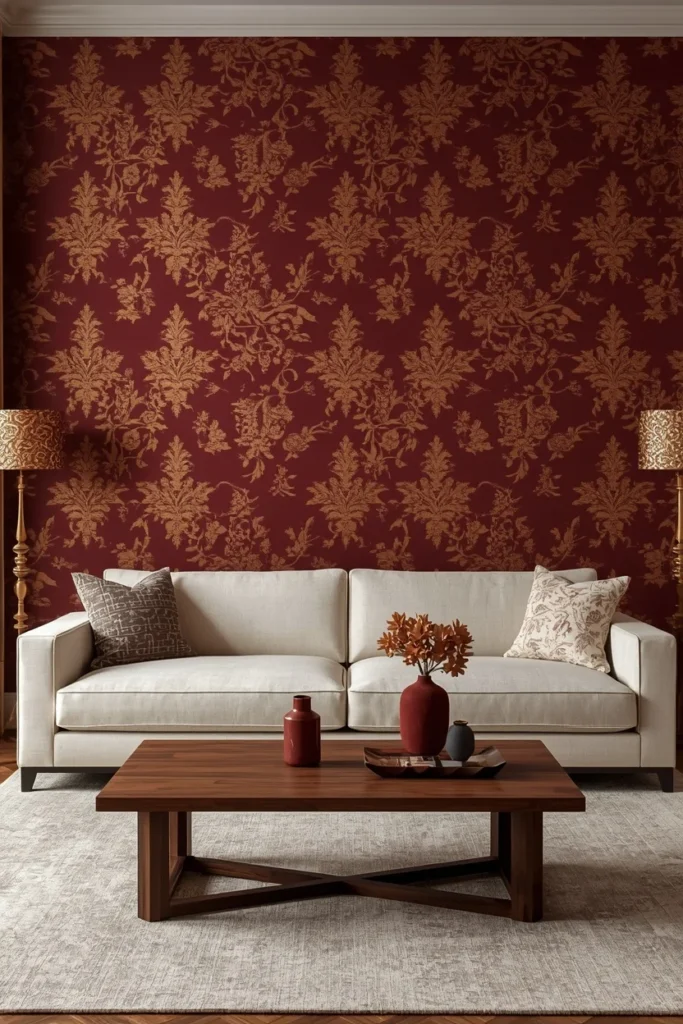
9. Textured Neutral — The Upgrade That Looks Like Nothing Until You’re Standing In It
Texture is emerging as one of the most powerful wallpaper design tools — grasscloth-effect papers, linen-like weaves, soft embossing, and textured plains that catch light and create a sense of calm luxury.
Textured neutral wallpaper is the choice that non-design people don’t understand until they’re standing in the room. It reads as “just a nice wall” in photos, but in person it transforms the quality of every surface. The way morning light rakes across an embossed linen-effect wallpaper at 7am is something paint will never replicate.
Best uses:
- Behind built-in shelving or cabinetry — the texture adds depth to the negative space between objects
- As a full-room treatment where the furniture is the focal point
- In rooms transitioning between styles — textured neutrals are style-agnostic
Texture options ranked by visual impact:
- Grasscloth (genuine or effect) — warmest, most organic
- Linen-effect — refined, elegant, suits both contemporary and traditional rooms
- Embossed geometric — subtle pattern with tactile dimension
- Concrete or plaster effect — industrial-adjacent, works in minimalist rooms
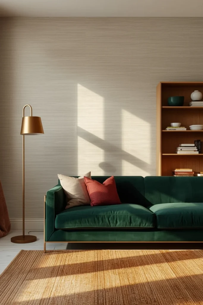
10. Retro Revival — Vintage Pattern, Modern Confidence
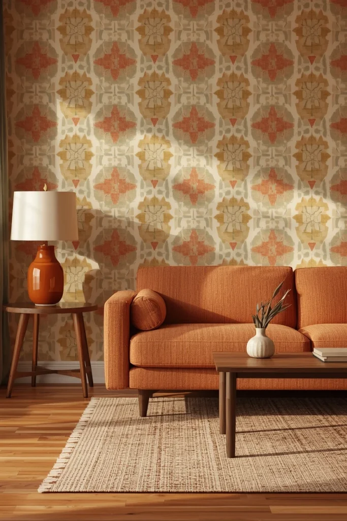
The charm of mid-century modern, Art Deco, and 70s psychedelia is making a comeback with a modern edge — these wallpapers incorporate updated color palettes, metallic accents, and subtle textures to bring retro designs into 2025.
The critical difference between retro wallpaper that feels nostalgic and retro wallpaper that feels dated is the color palette. Original 1970s palettes (harvest gold, avocado, burnt sienna) in original saturation levels feel like a time capsule. The same pattern in a 2025-updated palette — earthy terracotta, warm sage, dusty rose, warm cream — feels current.
Retro revival styles that work in living rooms:
- Art Deco fan patterns in cream and warm gold
- Mid-century abstract shapes in sage and rust
- 1970s-inspired large geometric in updated earthy tones
- Vintage-style damask in contemporary colorways
Styling approach: Pair retro-print wallpaper with modern furniture — a clean-lined sofa, a simple wood coffee table. The juxtaposition between vintage pattern and contemporary form is what makes the room feel intentional rather than themed.
11. Chinoiserie — The Pattern That Has Survived Every Trend Cycle
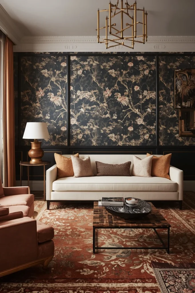
Chinoiserie — the European interpretation of Asian artistic motifs, featuring pagodas, birds, blossoms, and flowing landscape scenes — has appeared in interior design for over 300 years. It remains in use because it manages to be simultaneously maximalist and restrained, bold and refined.
Hand-painted chinoiserie panels and panoramic murals are taking centre stage in 2026, balancing a revival of heritage patterns with bold, contemporary statements.
Why it works in a living room: Chinoiserie brings narrative to a wall — there are always details to discover, always something new to notice. It invites people to look closely.
Color options:
- Classic: navy or black background with ivory and gold motifs — formal, dramatic, hotel-like
- Fresh: soft sage or powder blue background with cream and warm blush motifs — lighter, more contemporary
- Warm: off-white or linen background with warm terracotta and gold — relaxed, collected
Small Space Tip: Chinoiserie on all four walls in a small living room creates a jewel-box effect rather than a cramped feeling — if the background color is medium rather than very dark and the ceiling remains white.
12. Earthy Terracotta & Warm Neutrals — The 2025 Color Story
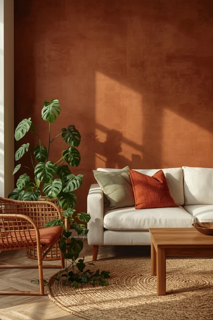
Expect warm, natural earth tones, jewel-inspired hues, and soft desert colors like clay and sandstone in 2025. These shades create an inviting atmosphere that feels both grounded and modern.
Terracotta, clay, warm sand, and earthy ochre have dominated interior palettes for two years — and their appearance in wallpaper form gives them a richness that flat paint doesn’t achieve. The key is texture: a terracotta-toned wallpaper with a slightly raised or woven surface catches light differently at different times of day, creating the living quality that makes rooms feel genuinely warm.
The earthy living room wallpaper palette:
- Terracotta and warm rust → energy and warmth
- Clay and sandstone → calm and grounded
- Warm ochre → joyful, collected, slightly bohemian
- Dusty rose and blush → soft, relaxed, feminine without being fragile
Styling: Layer with natural materials — rattan, wood, linen, jute. Add greenery (trailing pothos, a fiddle leaf fig) to provide the contrast that earthy colors need to read as vibrant rather than dusty.
13. Vertical Stripe — The Trick That Makes Every Ceiling Taller
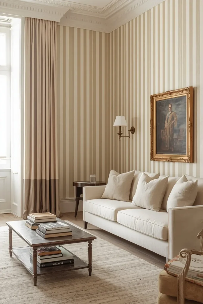
Vertical stripe wallpaper is one of the most practical living room wallpaper ideas available — and one of the most underestimated. By drawing the eye upward, vertical stripes create the optical illusion of ceiling height that no amount of structural work can replicate.
Stripe width guide:
- Narrow stripes (1–2 inches): classic, formal, works in traditional rooms
- Medium stripes (3–5 inches): versatile, contemporary-leaning
- Wide stripes (6+ inches): modern, bold, almost geometric in quality
Color approach: Two-tone stripes in the same color family (warm cream and warm white, sage and soft green) add visual interest without the high contrast that can make stripes feel overwhelming. For bolder impact, try deep navy and warm white — classic, nautical-inspired, and timeless.
Quick Tip: In rooms with lower ceilings (under 8 feet), vertical stripes are one of the most effective design tools available. Add a picture rail slightly below ceiling height and hang artwork from it — this reinforces the upward visual movement and makes the ceiling feel even higher.
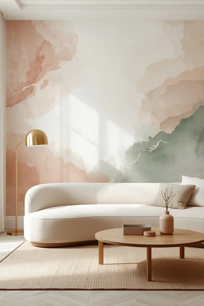
14. Abstract Watercolor Mural — Art That Covers the Whole Wall
Where scenic murals transport you to a specific place, abstract watercolor murals do something subtler and arguably more powerful: they create mood. Soft washes of color, blurred edges, and painterly marks turn a wall into an emotion rather than a location.
Modern wallpaper designers are increasingly collaborating with artists to create wallpapers that resemble hand-painted canvases, watercolor illustrations, or mixed-media collages — bringing a sophisticated, gallery-like aesthetic into the home.
Abstract wallpaper color options and the moods they create:
- Soft blush and warm ivory → romantic, feminine, ethereal
- Warm terracotta and sage → earthy, grounded, creative
- Deep blue and grey → calm, intellectual, sophisticated
- Warm amber and rust → energetic, warm, conversation-starting
Where to place it: Behind the sofa or on the wall you face when seated — this places it in constant peripheral view, which means it does emotional work on you even when you’re not actively looking at it.
15. Wainscoting + Wallpaper Combination — The Designer’s Favorite Trick
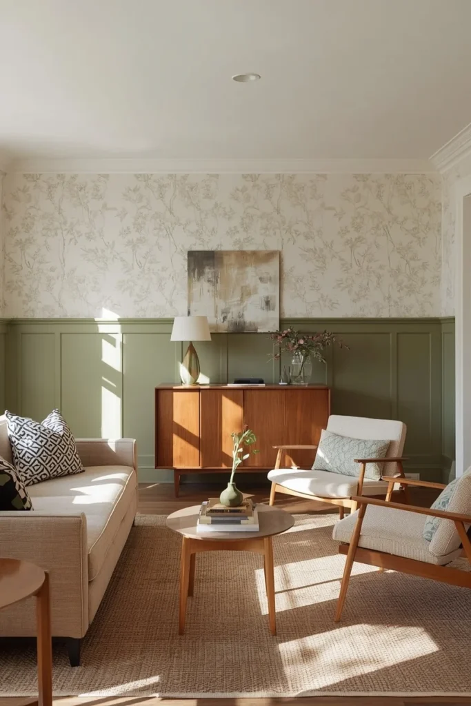
One of the most sophisticated living room wallpapering ideas isn’t about the wallpaper alone — it’s about the relationship between the wallpaper and the architectural detail below it.
Installing wallpaper above a wainscoting or chair rail (real paneling, or achieved with simple MDF trim) divides the wall into two distinct zones. The lower zone (painted, usually in a tone pulled from the wallpaper) grounds the room. The upper zone (wallpaper) adds pattern and personality without overwhelming.
Why this works:
- It prevents wallpaper from dominating rooms with tall ceilings
- It protects the most vulnerable lower portion of the wall from scuffs
- It creates architectural interest that bare walls can’t achieve
- It gives bold patterns a contained, “framed” quality that makes them feel more intentional
Panel height guide: Chair rail height is traditionally 32–36 inches from the floor (about one-third of an 8-foot ceiling). For a more modern proportion, push it higher — to 48–54 inches — for a more dramatic split.
Color tip: Paint the lower wainscoting panel 2–3 shades deeper than the wallpaper’s background color. This creates visual weight at the bottom of the wall and makes the room feel anchored.
16. Behind-the-Bookshelf — The Hidden Detail That Rewards Every Visitor
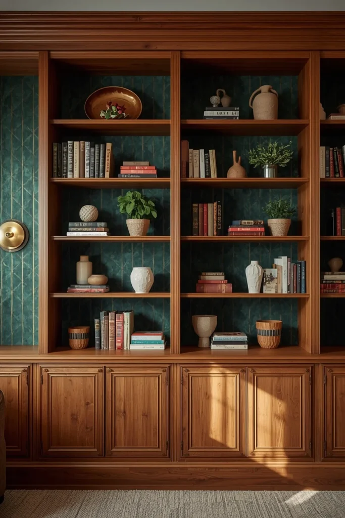
You don’t need to wallpaper an entire wall to get the full impact of pattern. One of the most charming and budget-conscious living room wallpaper ideas is to paper the back panels of a bookshelf or built-in cabinet.
Visible only when someone is browsing books or standing close, this detail reveals itself gradually — and is consistently one of the things guests comment on.
How to execute:
- Remove shelf contents and measure each back panel individually (dimensions vary)
- Apply wallpaper using a non-permanent adhesive paste (or peel-and-stick for renters)
- Choose a bold pattern or color — this is seen in fragments, so it can handle more drama than a full wall
Best patterns for bookshelf backs: Geometric prints, small-repeat botanicals, moody dark patterns, metallic or textured neutrals that catch the light. Even a simple painted backing in a contrasting color has this effect — but wallpaper adds depth that paint can’t.
Budget Alternative: Use leftover wallpaper from another project, sample rolls at reduced price, or discontinued stock from wallpaper brands — the quantities needed for shelf backs are small, making this an excellent way to use beautiful but expensive paper affordably.
17. Peel-and-Stick for Renters — Real Style, Zero Commitment
Renters have historically been locked out of the wallpaper conversation. But peel-and-stick wallpaper technology has improved dramatically, and the gap between temporary and permanent options has almost closed.
Peel-and-stick designs are ideal for kids’ rooms or seasonal accent walls — designed to be swapped out as mood changes — but the same principle applies to rental living rooms where permanent installation isn’t permitted.
Peel-and-stick done right:
- Always clean and prime the wall first — adhesion fails on dusty or unprimed surfaces
- Start from a perfectly level vertical line (use a plumb line or spirit level)
- Overlap patterns before cutting — never guess at alignment
- Choose matte or non-shiny finishes — they read as more authentic than vinyl-finish options
- Remove slowly and at a low angle to minimize wall damage when moving
Best peel-and-stick brands in 2025: Tempaper, Chasing Paper, Spoonflower (custom options), and Wallshoppe offer options across every aesthetic — botanical, geometric, textured neutral, and more.
Renter’s Quick Tip: Apply double-sided command strips to the very top edge of each panel before applying the peel-and-stick. This prevents the tops from peeling back in heated rooms — the most common failure point.
18. Moiré Pattern — 2026’s Most Sophisticated Wallpaper Choice
Moiré is emerging as a standout wallpaper trend for 2026. It’s a pattern that’s softer and more refined than standard geometric designs, bringing contrast without harshness — geometric without being soulless, with a story and history that brings richness to any room.
Moiré is a woven or printed effect that creates a subtle rippling or watered-silk illusion on the wall. It appears to shift and move as you walk past it — an effect that is fascinating without being busy. In a living room, it adds a quiet dynamism that standard flat paint or even textured neutrals can’t match.
As design director Emily Mould explains: “People are looking for designs that feel layered and nuanced, and moiré delivers this in a way that’s both elegant and slightly unexpected. As an organic, free-flowing pattern, moiré introduces movement into interior spaces without overwhelming them.”
Color options that work best: Soft grey and cream, warm ivory and gold, deep navy and soft silver, blush and warm white. The moiré effect is most visible in tonal colorways — two shades of the same hue rather than high-contrast combinations.
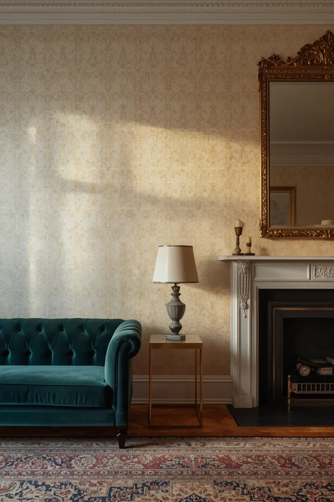
Styling: Moiré is inherently sophisticated and pairs naturally with traditional or transitional furniture. Velvet upholstery, brass hardware, and layered textiles amplify its elegance.
STYLING TIPS
The Pattern Scale Rule: Large rooms can handle large-scale patterns on all four walls. Small rooms should use large-scale patterns on one wall only, or switch to small-repeat or textured patterns for full-room coverage. Matching pattern scale to room size prevents the two most common wallpaper failures: patterns that get lost in large rooms and patterns that overwhelm small ones.
The 2-Tone Color Pull: When adding accessories after wallpaper is installed, pull exactly two colors from the wallpaper pattern. One becomes the dominant accent (sofa, rug, curtains), the other becomes the secondary accent (cushions, lamp, accessories). This creates harmony without matchy-matchy predictability.
Lighting changes everything: Always view wallpaper samples under the room’s actual artificial lighting before purchasing. A warm-toned botanical that looks perfect in the store’s bright white lighting may read significantly more saturated or darker under warm 2700K bulbs at home.
BUDGET ALTERNATIVES
| Designer Look | Budget Version | Estimated Saving |
| Hand-printed botanical mural | Digital print mural from Rebel Walls or Photowall | Save $500–$2,000+ |
| Genuine grasscloth | Grasscloth-effect vinyl from Graham & Brown | Save $8–$20 per sq ft |
| Custom chinoiserie panels | Peel-and-stick chinoiserie from Chasing Paper | Save $200–$800 |
| Full-room wallpaper drenching | Feature wall only + painted matching color on other walls | Save 60–70% on paper cost |
| Professional installation | DIY with peel-and-stick option + YouTube tutorials | Save $200–$600 in labor |
SMALL SPACE ALTERNATIVES
- Tiny living room? One feature wall in a vertical stripe pattern draws the eye up and makes the ceiling feel 20% taller without a single structural change.
- No budget for full walls? Paper the back of your bookshelf — same visual impact, a fraction of the material cost.
- Renting? Peel-and-stick botanical on one wall transforms the room and leaves no damage when you move.
- Awkward proportions? A tonal textured neutral (grasscloth effect, linen effect) on all four walls creates cohesion and makes the room feel more intentional without demanding attention.
- Low ceiling? Always vertical stripes, always pale ceiling, always curtains hung from ceiling height. Never horizontal patterns.
COMMON MISTAKES
Mistake 1: Choosing wallpaper without testing a sample in the actual room Colors shift dramatically between a store sample under fluorescent light and your living room under warm artificial bulbs. Always order samples and live with them for 48 hours before committing.
Mistake 2: Papering a wall that isn’t prepared Wallpaper reveals every imperfection beneath it. Fill all holes, sand rough patches, and prime the wall before hanging. Skipping this step creates bubbling and peeling within months.
Mistake 3: Pattern scale that doesn’t match room size A large-scale repeat in a small room feels relentless. A small-scale repeat in a large room disappears. Match pattern size to room size — or choose a textured neutral for maximum flexibility.
Mistake 4: Ignoring the ceiling The ceiling and wallpaper interact constantly. A dark wallpaper with a matching dark ceiling feels like a cave. Always keep the ceiling one to two shades lighter than the wallpaper’s background tone.
Mistake 5: Not ordering enough Always order 10–15% more wallpaper than your calculations suggest. Pattern-matching wastes more than expected, and dye lots change between print runs. Running short mid-project is a genuine disaster.
Mistake 6: Choosing trendy over personal Focus on your personal style, the purpose of the space, and how comfortable you’ll feel with your wallpaper choice over time. The ideal covering should reflect your taste and make you feel happy. Trend-chasing produces rooms that feel current for 18 months and dated for the next 10 years.
FAQs
CONCLUSION
A living room without wallpaper is a room playing it safe. And safe rooms are forgettable.
The 18 ideas in this guide represent every point on the spectrum — from the quiet confidence of grasscloth texture to the full commitment of a jewel-box botanical drench. From the renter’s peel-and-stick feature wall to the designer-approved moiré pattern that makes every guest ask where you found it.
Your living room is the room where the most happens. It’s where you host, where you rest, where you think, where you gather. It deserves walls that work as hard as everything else in it.
Pick one idea. Order a sample. Hold it against your wall in the evening under your actual lights. Live with it for two days. Then commit.
The conversation it starts will be worth it.