23 Two-Tone Kitchen Cabinet Combos That Look Insanely Expensive
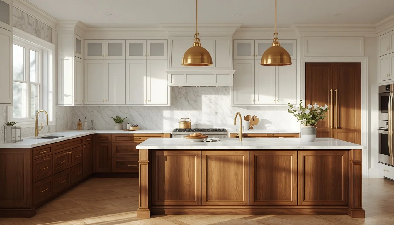
Your kitchen isn’t boring because of its layout. It’s boring because every cabinet is doing the exact same job in the exact same color.
Two-tone cabinets change that math. One shade grounds the room, the other lifts it, and suddenly a kitchen that cost you a can of paint and a weekend looks like it came out of a design magazine. No new appliances. No knocked-down walls. Just two colors, placed with intention.
Below are 23 real, designer-favorite combinations — pulled from what’s actually trending on show floors and in real remodels right now — organized so you can find the one that fits your kitchen size, your light, and your style. Each combo comes with a styling note and a ready-made image, so you can see it before you buy a single paint sample.
Table of Contents
- How Two-Tone Cabinets Work (The 60-Second Version)
- The 23 Combos
- Styling Tips That Make Two-Tone Cabinets Look Custom
- Practical Implementation: How to Actually Do This
- Common Mistakes to Avoid
- Small-Space Alternatives
- Budget-Friendly Alternatives
- Pro Styling Recommendations
- FAQs
- Final Thoughts
- Suggested Pinterest Boards
- Internal Linking Ideas
How Two-Tone Cabinets Work (The 60-Second Version)?
A two-tone kitchen simply means two different cabinet colors or finishes living in the same room instead of one. Most often that’s a lighter color up top and a deeper one on the bottom, or a neutral perimeter with a bold island in the middle.
The logic behind why it works is pretty simple. Light colors near eye level and above bounce light around the room, so ceilings read taller and the space feels open. Darker or richer colors lower down ground the kitchen, hide daily scuffs near the floor, and give your eye somewhere to land. It’s the same trick used in fashion — a dark bottom, a light top, a defined waist. Kitchens just call it cabinetry.
Below, each combo is grounded in what’s actually showing up in modern kitchens, from trade shows to real remodels.
The 23 Combos
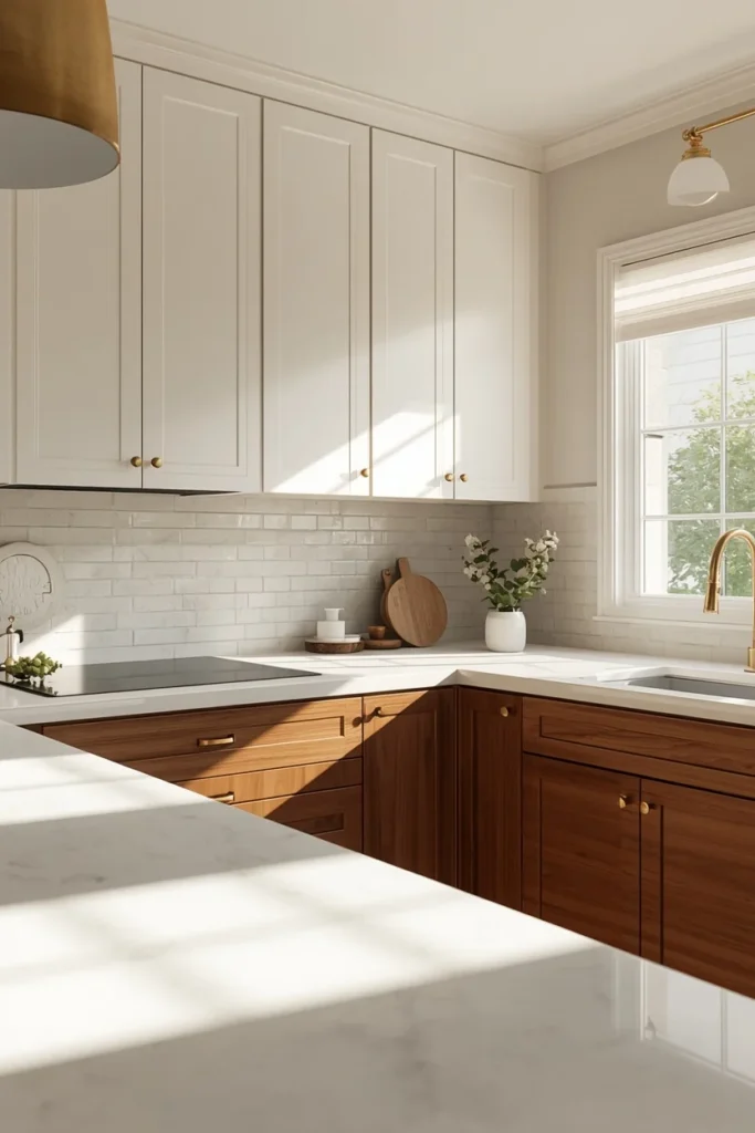
1. Warm White Uppers + Deep Walnut Lowers
This is the pairing that reads “custom cabinetry” the fastest. Warm white keeps the upper half soft and bright, while walnut lowers bring in visible wood grain and real depth. It works in kitchens of almost any size because the white does the heavy lifting on brightness while the walnut adds the personality.
Best for: Transitional and modern-organic kitchens Pair with: Unlacquered brass hardware, a quartz counter with subtle warm veining
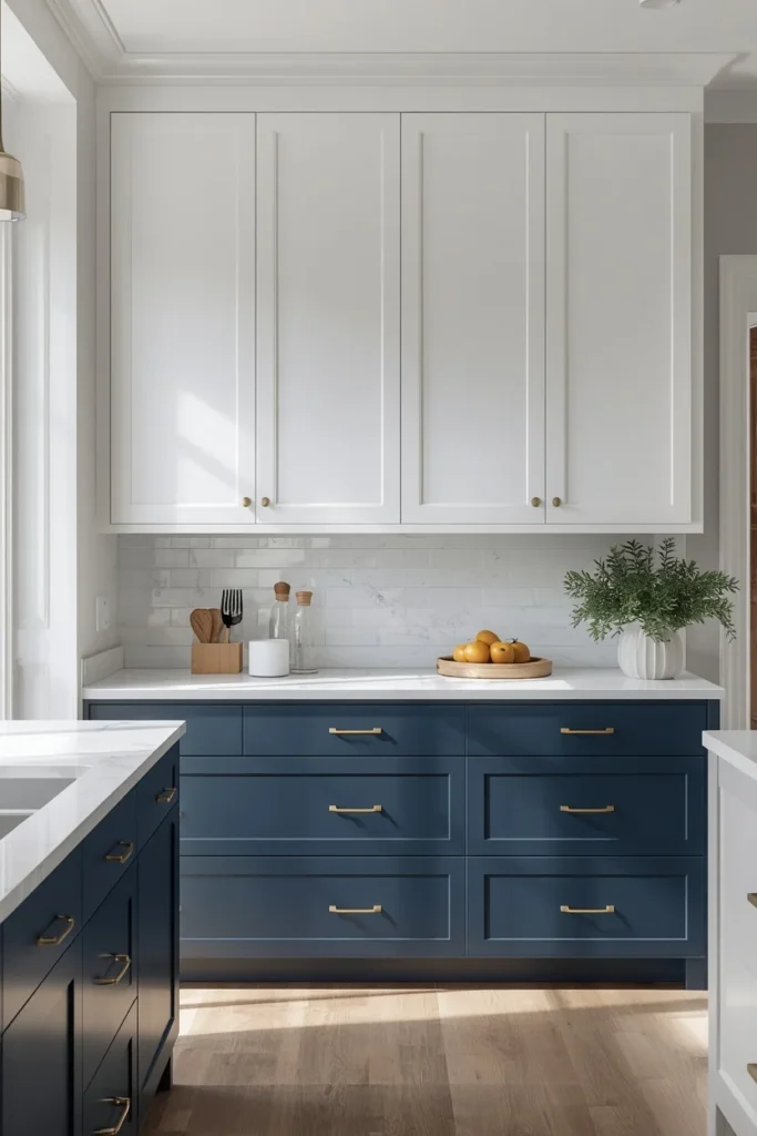
2. Classic White + Navy Blue
The most searched two-tone combo for a reason. Navy lower cabinets or a navy island next to crisp white uppers gives a kitchen a coastal-meets-traditional feel without going full color. It photographs well because the contrast is high but the palette stays disciplined.
Best for: Coastal, traditional, and transitional kitchens Pair with: Polished nickel or brass hardware, white marble or quartz counters
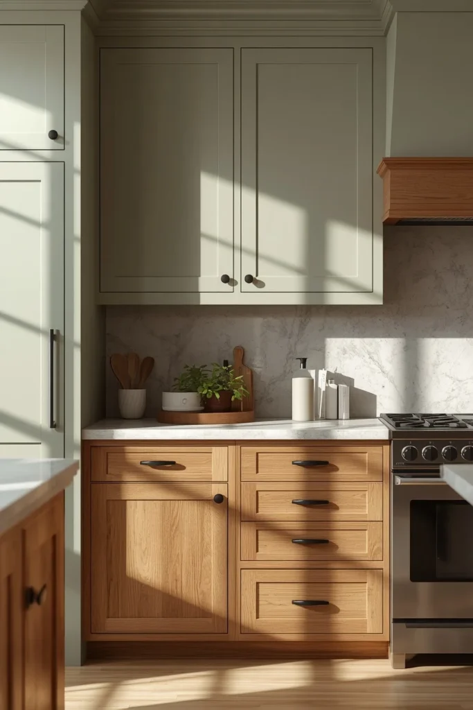
3. Soft Sage Green + Warm Oak
Sage and oak lean into the nature-inspired direction that’s dominating kitchen color trends right now. Sage on the uppers or island stays calm rather than loud, and warm oak lowers bring in the organic texture that makes a kitchen feel collected instead of showroom-perfect.
Best for: Farmhouse, cottage, and Scandinavian-inspired kitchens Pair with: Matte black or brass hardware, honed stone counters
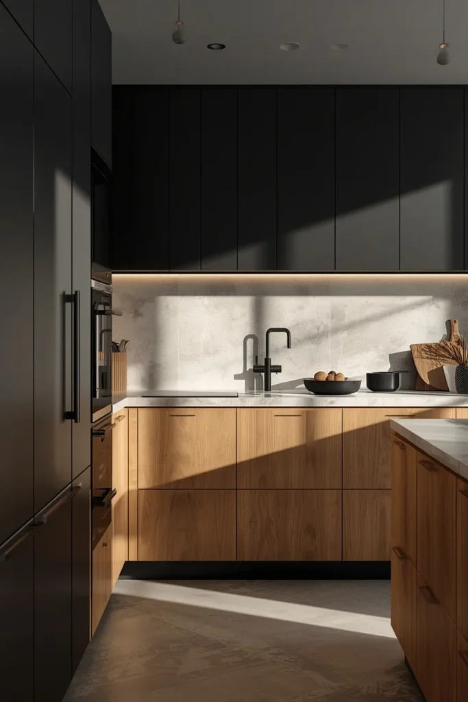
4. Black Uppers + Light Wood Lowers
This is the boldest pairing on the list, and it’s the single most eye-catching combo showing up on 2026 trade show floors. Flipping the usual formula — dark on top, light wood below — creates real drama and works especially well in kitchens with high or vaulted ceilings that can handle the visual weight up top.
Best for: Modern and contemporary kitchens with taller ceilings Pair with: Slim black or brushed brass hardware, a light stone counter to balance the dark uppers
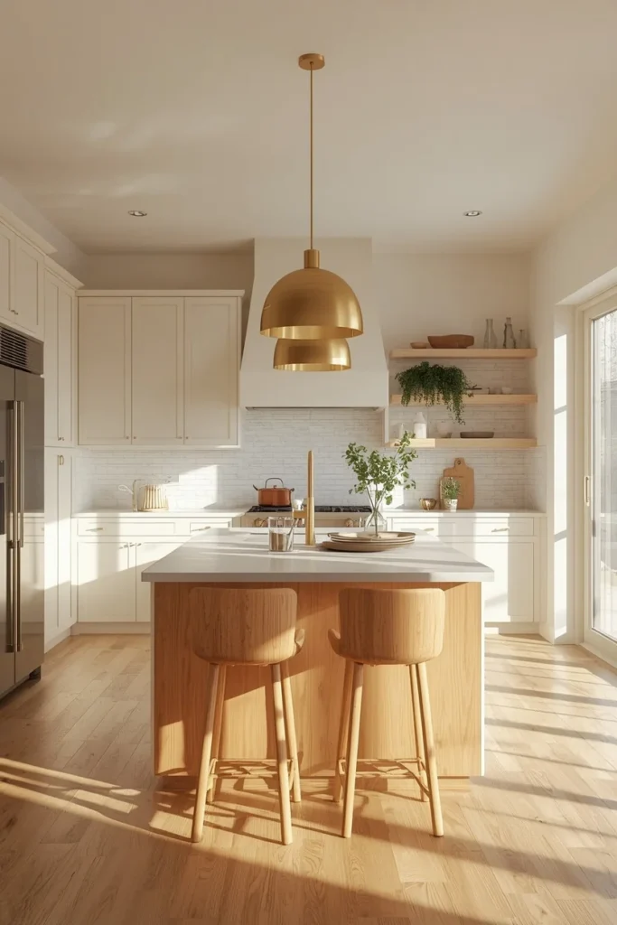
5. Off-White Perimeter + Light Wood Island
Instead of splitting uppers and lowers, this combo keeps the whole perimeter one soft off-white and lets a light wood island do the color work. It’s one of the most requested layouts in transitional kitchens because it feels bright and welcoming without a hard line running through the room.
Best for: Open-concept and transitional kitchens Pair with: Brushed gold hardware, woven pendant lighting over the island
6. Cream Uppers + Matte Black Island
Cream keeps the room feeling soft and lived-in, while a matte black island becomes the obvious focal point the second you walk in. This is a favorite for kitchens that want one bold decision without repainting every cabinet in the room.
Best for: Modern farmhouse and transitional kitchens Pair with: Brass or warm gold hardware, a butcher block or marble island top
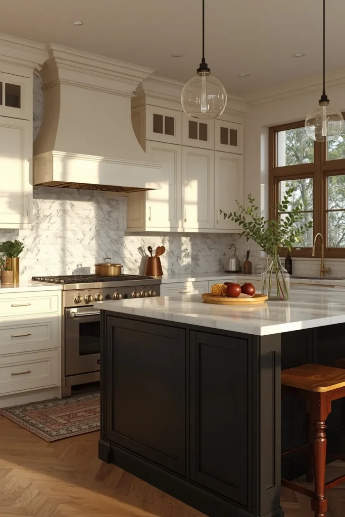
7. Charcoal Lowers + Soft Gray Uppers
For homeowners who want contrast without committing to full black or full color, gray-on-gray with two different depths gives a clean, minimal look. It photographs beautifully in kitchens with a lot of natural light because the tonal shift reads as intentional layering, not just “two grays.”
Best for: Minimalist and modern kitchens Pair with: Matte black hardware, a white quartz counter to keep the palette from feeling heavy
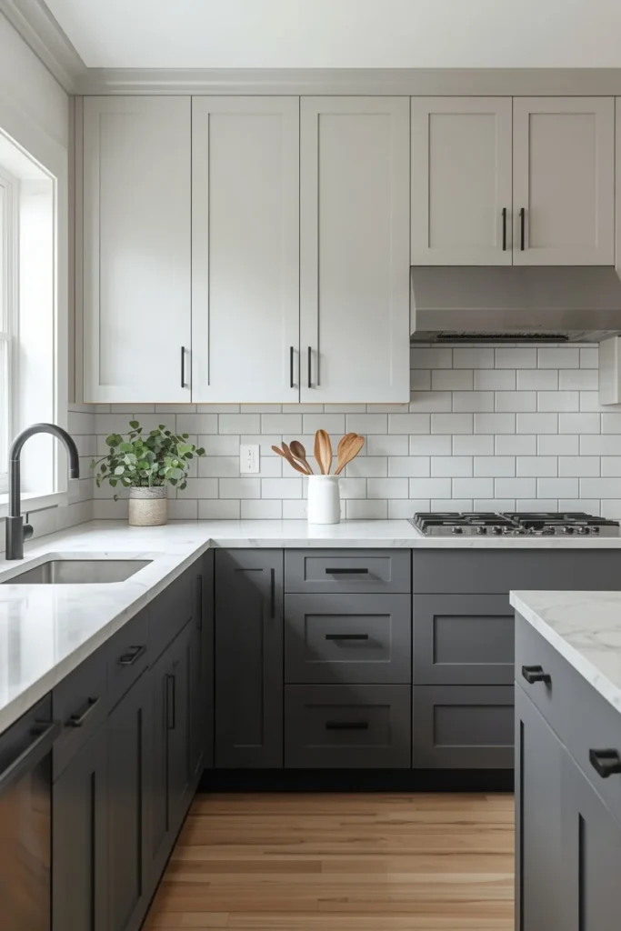
8. Mushroom Taupe + White Oak
Mushroom is one of the defining neutrals of 2026 — warmer than gray, softer than beige. Paired with white oak lowers, it creates a kitchen that feels expensive specifically because nothing about it screams “trend.” It reads as considered and quiet rather than of-the-moment.
Best for: Modern-organic and transitional kitchens Pair with: Unlacquered brass or aged bronze hardware, warm-toned quartz
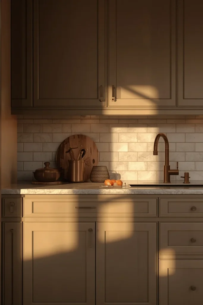
9. Deep Forest Green + Brass + White
Green cabinetry paired with brass hardware and a white counter is the combination most likely to stop someone mid-scroll. The green does the emotional work, brass adds warmth and shine, and white keeps the whole thing from feeling heavy.
Best for: Traditional and transitional kitchens that want one bold statement Pair with: Brass or unlacquered brass hardware, white marble counters
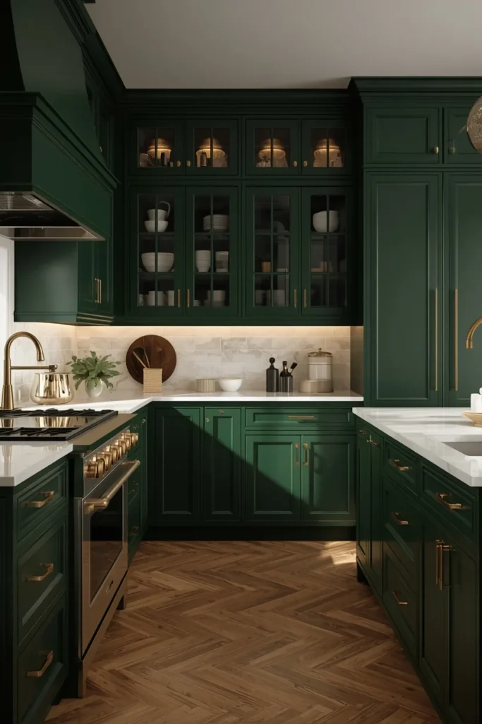
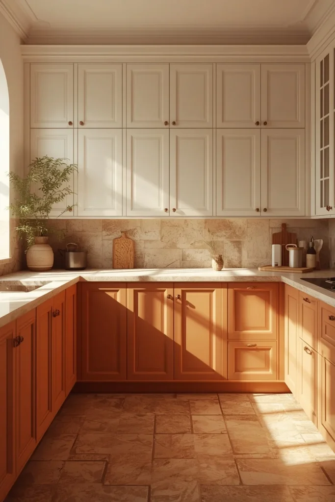
10. Warm White + Terracotta Lower Cabinets
Terracotta lowers under warm white uppers bring an earthy, sun-washed feeling that’s harder to find in most kitchen roundups. It leans Mediterranean and works especially well with natural stone floors and woven textures.
Best for: Mediterranean and warm-modern kitchens Pair with: Aged brass hardware, terracotta or natural stone floor tile
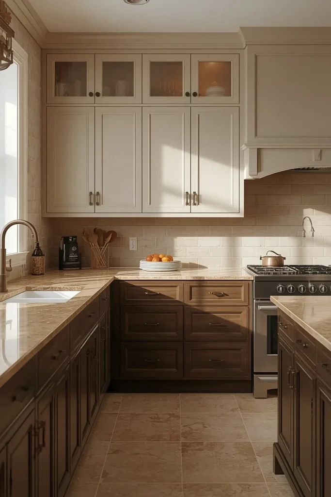
11. Greige Uppers + Espresso Lowers
Greige (that in-between gray-beige) keeps the top half of the kitchen neutral and adaptable, while espresso lowers add serious depth. This is one of the more traditional two-tone pairings, and it tends to age well because neither color is especially trendy on its own.
Best for: Traditional and transitional kitchens Pair with: Oil-rubbed bronze hardware, warm beige quartz counters
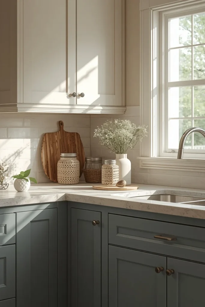
12. Dusty Blue + Warm Cream
Softer than navy and warmer than gray-blue, dusty blue paired with cream feels collected rather than themed. It’s a good option for anyone who wants color but is nervous about committing to something bold and saturated.
Best for: Cottage and soft-modern kitchens Pair with: Brushed nickel or soft brass hardware, cream quartz counters
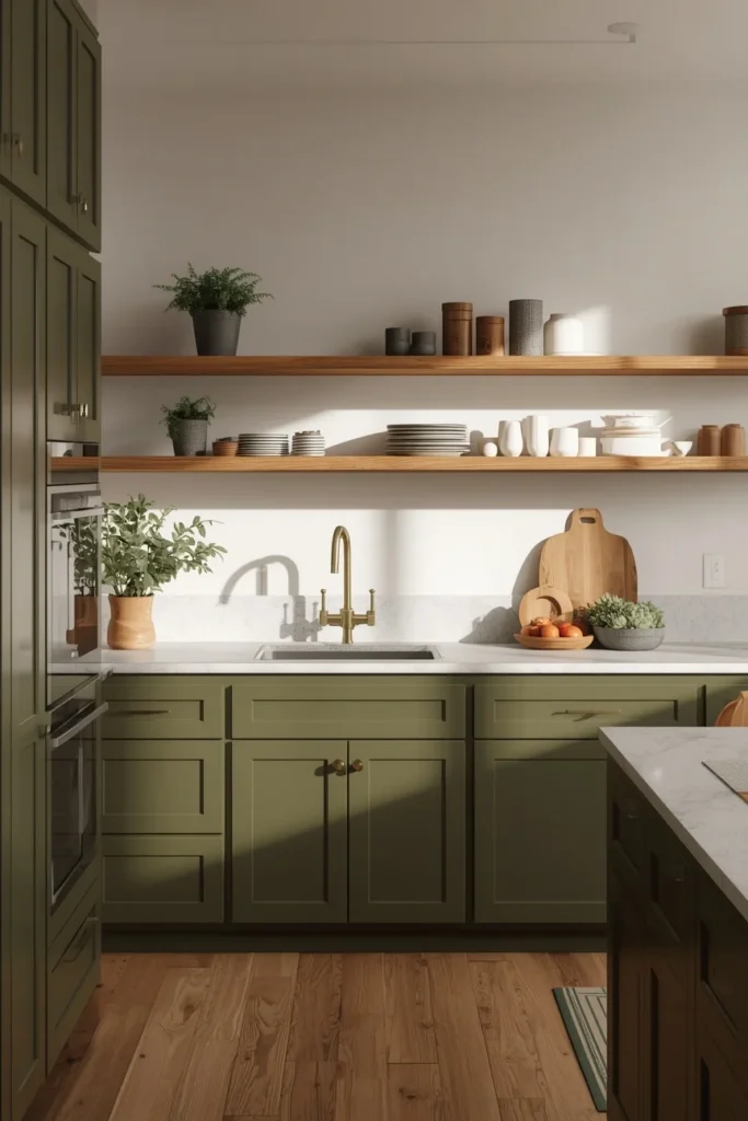
13. Olive Green + Natural Wood
Olive sits between sage and forest green, and it’s becoming one of the most requested “not-quite-neutral” colors in 2026 kitchens. Paired with natural, ungrained-hidden wood tones, it feels grounded and a little bit collected-over-time rather than freshly renovated.
Best for: Modern-organic and biophilic kitchens Pair with: Matte brass hardware, light stone counters
14. Soft Black + Warm White
Not stark black, but a soft, slightly warm black paired with warm (not cool) white. This combo avoids the harsh, cold look that made black-and-white kitchens feel dated a few years ago, and instead reads as high-end and current.
Best for: Modern and industrial-transitional kitchens Pair with: Matte black or brass hardware, warm white quartz counters
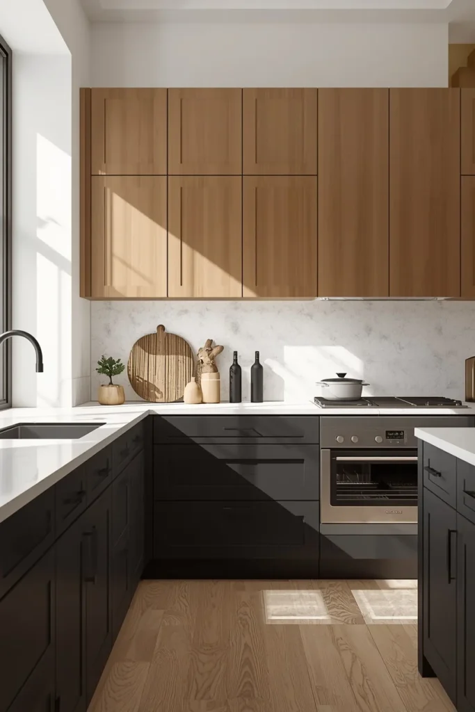
15. White Perimeter + Walnut Island (Focal Point Method)
Instead of splitting the kitchen top and bottom, this method keeps everything but the island one consistent white, then lets a walnut island do all the visual work. It’s one of the most enduring two-tone approaches because it avoids a hard line running the length of the room.
Best for: Any kitchen size, especially open-concept layouts Pair with: Brass pendant lighting, a butcher block or stone island top
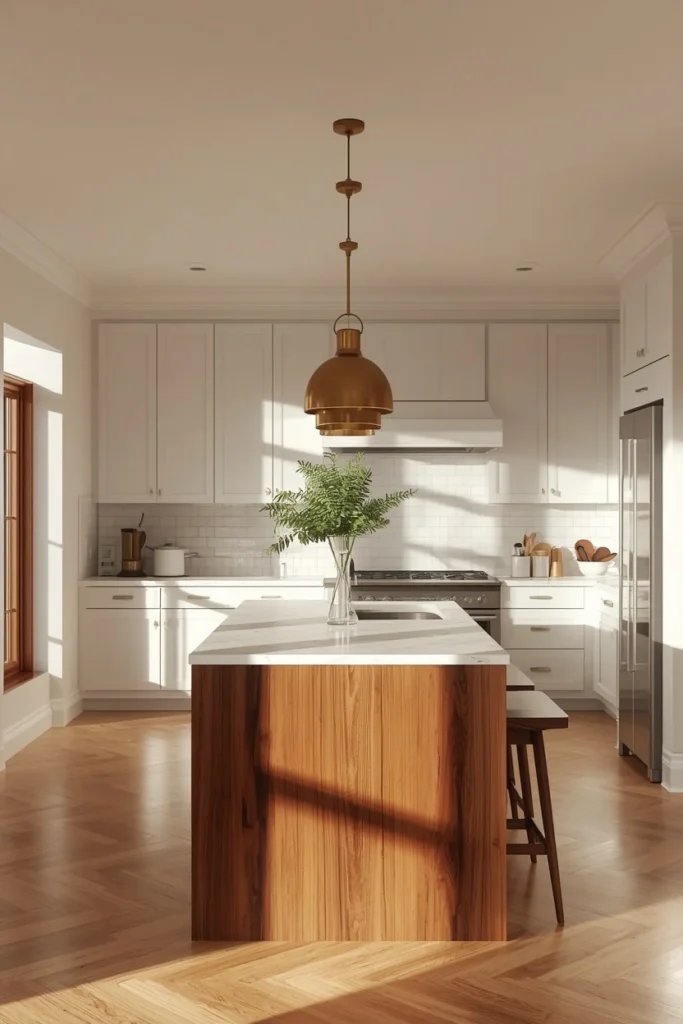
16. Stormy Blue + White
A step darker and moodier than dusty blue, stormy blue reads as a sophisticated alternative to straight black. Against white uppers, it adds richness without making the kitchen feel dark or closed in.
Best for: Modern and coastal-transitional kitchens Pair with: Brushed brass or chrome hardware, white counters
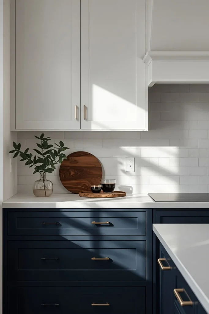
17. Dusty Rose Accent + Charcoal
The boldest, most personality-forward combo on this list. A dusty rose or muted blush island against charcoal perimeter cabinets creates a kitchen that photographs like nothing else on your street, while staying grounded enough not to feel like a theme.
Best for: Eclectic, art-deco-inspired, and statement kitchens Pair with: Brass hardware, black-veined marble counters
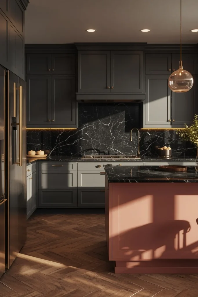
18. Warm Stone Neutral + Deep Navy Island
Warm stone (a step warmer than gray, a step cooler than beige) keeps the perimeter calm, while a navy island becomes the anchor. This is a lower-risk way to try navy without repainting the whole kitchen.
Best for: Transitional kitchens that want a low-commitment bold moment Pair with: Polished nickel hardware, warm white quartz counters
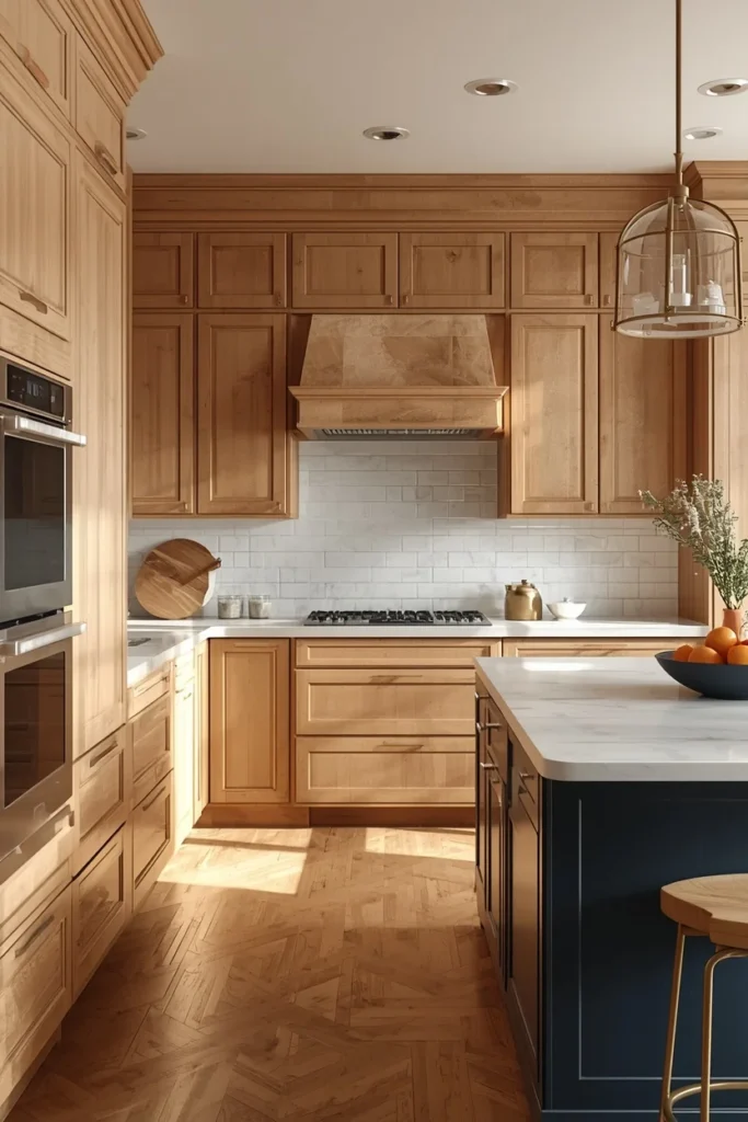
19. Two-Level White + Gray
A quieter cousin of the classic white-and-navy combo. White uppers and soft gray lowers keep the whole kitchen light while still creating a clear tonal break. It’s the safest two-tone pairing on this list and works in almost any home.
Best for: Any style, especially resale-minded remodels Pair with: Brushed nickel hardware, light quartz counters
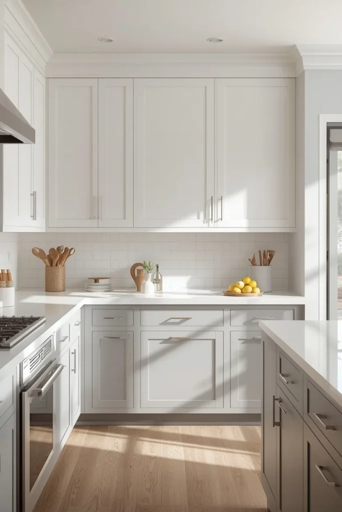
20. Painted Shaker Uppers + Walnut Lowers (Wood + Paint Mix)
Rather than two paint colors, this pairs a painted shaker upper cabinet with unpainted walnut lowers, letting real wood grain do the texture work paint can’t replicate. It’s one of the fastest-growing two-tone approaches because it feels warmer and more organic than an all-painted kitchen.
Best for: Modern-organic and warm-transitional kitchens Pair with: Matte black or brass hardware, a light stone counter
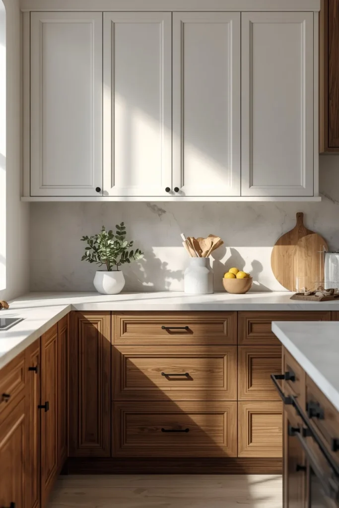
21. Cream Uppers + Deep Green Lowers
A softer entry point into the green-cabinet trend. Cream uppers keep the room bright, while deep green lowers ground the space without the commitment of an all-green kitchen.
Best for: Traditional and cottage kitchens Pair with: Brass hardware, cream or white marble counters
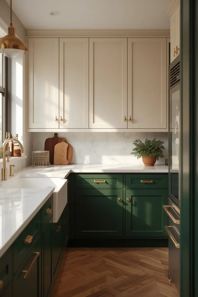
22. Warm White + Soft Black Hardware Contrast
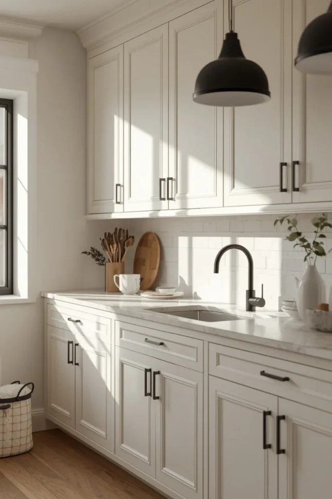
Sometimes the “two tones” aren’t two cabinet colors at all — they’re one cabinet color paired with hardware and fixtures in a contrasting finish. Warm white cabinets with soft black hardware, faucet, and pendant lighting create the two-tone effect through metal instead of paint.
Best for: Anyone who wants the look without repainting a single cabinet Pair with: Soft (not stark) black hardware, matte black faucet
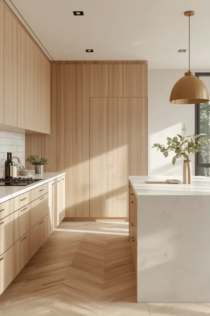
23. Light Wood Perimeter + Off-White Island (Reversed Method)
Flipping the usual formula, this combo keeps the perimeter in light wood and lets an off-white island stand out instead. It’s a fresher, less common take on two-tone that still follows the same balance principles as the classic version.
Best for: Modern and Scandinavian-inspired kitchens Pair with: Brushed brass hardware, a light stone island top
Styling Tips That Make Two-Tone Cabinets Look Custom
- Match color temperature. Cool grays and warm whites next to each other tend to look accidental rather than intentional. Keep both tones on the same side of the color wheel — warm with warm, cool with cool.
- Put the darker or bolder color low. Grounding the room with your deeper tone at the bottom and keeping the lighter shade up top draws the eye upward and makes ceilings feel taller.
- One hardware finish, used everywhere. Brass, matte black, or nickel — pick one and repeat it across both cabinet colors so the two tones read as a single, connected design instead of two separate decisions.
- Let the countertop bridge the two colors. A countertop that pulls a hint of both cabinet tones ties the whole room together, especially when the two colors have a lot of contrast.
- Pick one focal point, not two. Whether that’s an island, a wall of cabinetry, or a pantry nook, giving the eye one clear place to land keeps the kitchen from feeling busy.
Practical Implementation Ideas
You don’t need a full cabinet replacement to get any of these looks:
- Repaint what you have. Most two-tone kitchens start as a single-color kitchen that gets a targeted repaint on the lowers or the island.
- Reface instead of replace. Cabinet refacing swaps out doors and drawer fronts while keeping the existing boxes, which cuts both cost and timeline significantly.
- Start with just the island. If you’re not ready to commit to a full two-tone kitchen, repainting only the island is the lowest-risk way to test a bold color.
- Order sample doors first. Compare your two finalists side by side in your own kitchen, in both morning and evening light, before committing to either color.
Common Mistakes to Avoid
- Mismatched color temperature. A cool gray next to a warm off-white will feel subtly wrong even if you can’t explain why.
- Too many colors at once. Two tones is the sweet spot. A third or fourth color on walls, backsplash, or flooring usually tips the room into “busy” territory.
- Skipping the lighting test. Paint reads differently under morning daylight, afternoon sun, and evening bulbs. Test both colors at all three before you commit.
- Ignoring kitchen shape. A U-shaped kitchen that’s missing upper cabinets on one wall can end up lopsided if you split colors top-to-bottom. A focal-point island approach often works better in that layout.
- Chasing a trend you won’t love in five years. The combos that hold up best long-term lean toward colors you’d choose even if they weren’t trending.
- Mismatched hardware finishes. Switching hardware finish between the two cabinet colors makes an intentional design choice look like two unrelated decisions.
Small-Space Alternatives
Small kitchens can absolutely do two-tone — it just needs a lighter touch:
- Keep the lighter color as the dominant tone (roughly 70 percent of the cabinetry) and use the darker or bolder shade only on the island or a small run of lowers.
- Avoid high-contrast pairings like black and white in very compact kitchens; a softer, closer-in-value pairing (like warm white and soft sage) tends to feel more spacious.
- Light upper cabinets specifically help a small kitchen feel taller, since they don’t visually “cap” the room the way a dark upper cabinet can.
- Glass-front upper cabinets in the lighter tone can add depth without adding visual weight.
Budget-Friendly Alternatives
- Paint only the island instead of full upper-and-lower cabinetry. This gets 80 percent of the visual impact for a fraction of the cost.
- DIY-friendly cabinet paint kits exist specifically for kitchen cabinets and can be applied over a weekend with the right prep and primer.
- Peel-and-stick or contact paper finishes can simulate a two-tone look temporarily for renters or anyone testing a color before committing.
- Swap hardware only. If a full repaint isn’t in the budget yet, updating hardware finish alone can create a two-tone-adjacent effect and buy time before the bigger project.
Pro Styling Recommendations
- Order two physical sample doors of your top combo before buying a single gallon of paint — screens and swatches never show true color.
- If you’re nervous about commitment, start with the island. It’s reversible, contained, and gives you real-world feedback before you touch the rest of the kitchen.
- Keep your backsplash simple (subway tile, plain slab, or a subtle texture) when your cabinet colors are doing a lot of visual work. A busy backsplash on top of a bold two-tone combo usually competes rather than complements.
- Work with a designer or painter experienced in cabinet finishes if you’re pairing two saturated colors (like green and navy) — that combination can go wrong fast without an experienced eye.
FAQs
Final Thoughts
A two-tone kitchen isn’t about following a trend chart. It’s about giving your eye somewhere to travel instead of hitting the same flat color on every surface. Pick two colors that share a temperature, keep your hardware consistent, and let one of the two do the quiet work while the other gets to be the focal point. That’s the whole formula behind every kitchen on this list.