22 Home Entrance Decor Ideas That Make a Stunning First Impression Every Time
You know that feeling within the first three seconds of walking into someone’s home? Before you’ve even said hello, you already know something about them. That’s the entryway doing its job — or, more often, not doing it at all.
Most entrances end up as the room nobody plans. Shoes pile by the door. Mail sits in a stack nobody sorts. The one wall that greets every single guest gets left blank because the rest of the house felt more urgent. But the entrance is the first room people experience and the last one they remember on their way out, which makes it one of the highest-impact spaces in the whole house.
This list covers 22 home entrance decor ideas that work in real homes — narrow city foyers, grand double-door entries, front porches that need a little curb appeal, mudrooms drowning in backpacks. Some take an afternoon. Some take a weekend project. All of them are picked to make that first three seconds count.
Table of Contents
1. Statement Front Door Color
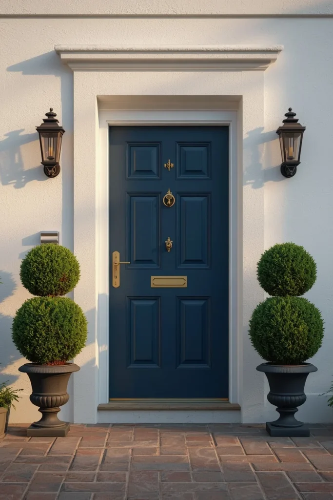
A bold front door color is the fastest, cheapest way to make an entrance memorable before a guest even steps inside. Deep tones like ink blue, forest green, or a rich clay red read as intentional and confident, especially against a neutral or white exterior facade. Test the color on a sample board taped to the actual door for a few days, since paint reads differently in morning light versus late afternoon shadow. Pair the door with matching or complementary hardware — aged brass with a warm color, matte black with a cooler one — so the whole entry feels finished rather than half-updated. This is one of the highest-impact, lowest-cost changes on this list, often completed in a single weekend with just a quart of exterior paint.
2. Oversized Arched or Round Mirror
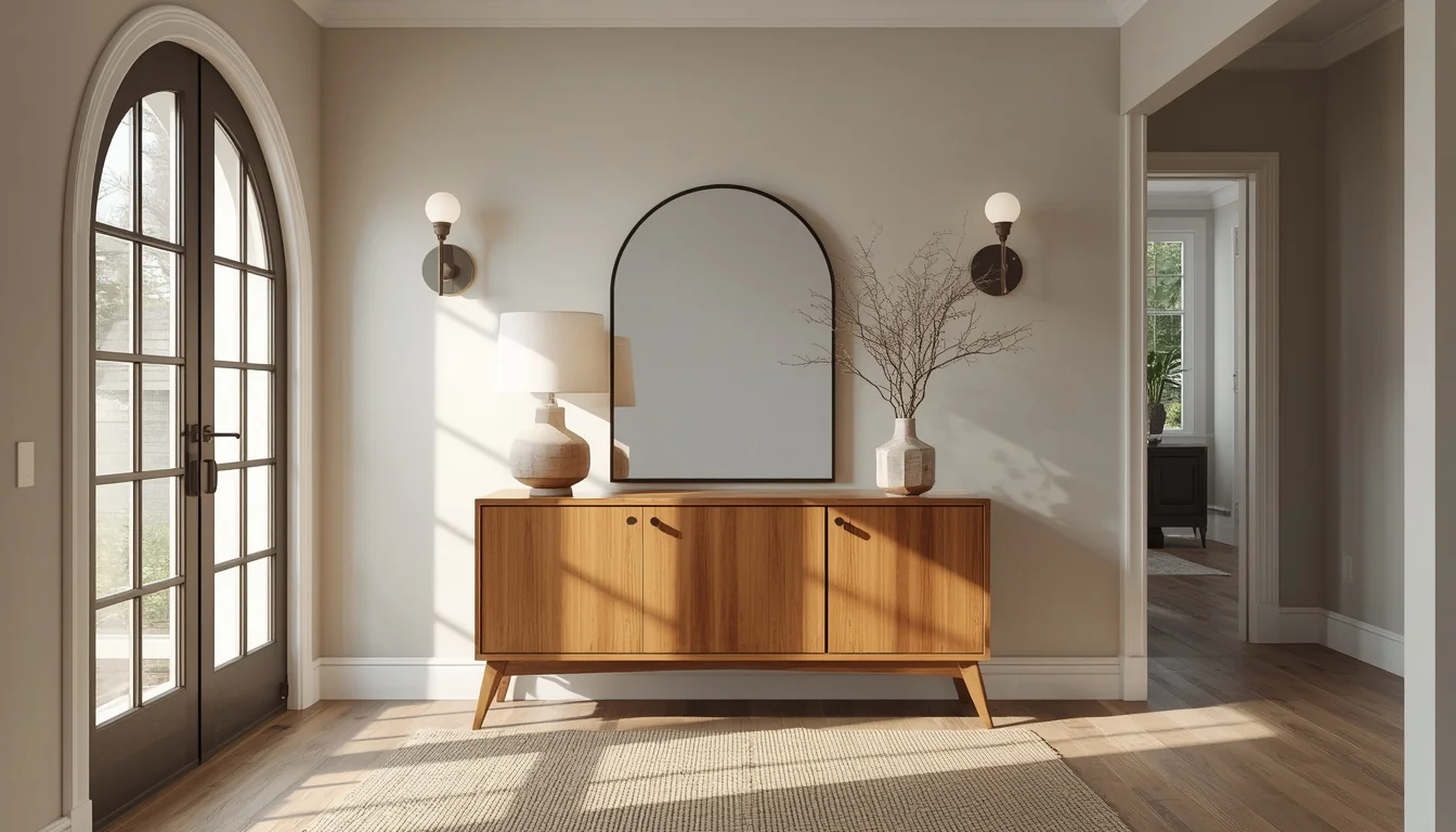
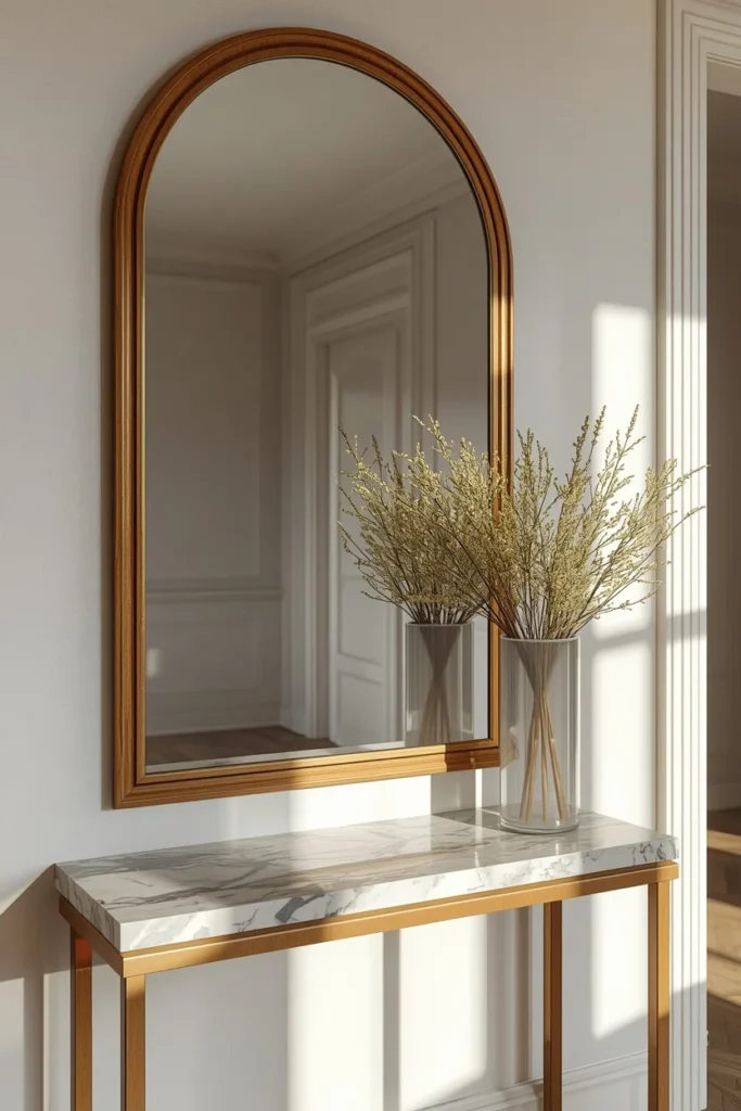
An oversized mirror does more work in an entryway than almost any other single object, bouncing available light around a space that’s often naturally dim. A round or gently arched shape feels softer and more current than a sharp rectangular frame, echoing the curved silhouettes showing up across 2026 entryway furniture. Hang it above a console at a height that reflects either a window or the front door itself, so the whole entry reads as brighter and more open the moment someone walks in. Size the mirror to about two-thirds the width of the console beneath it, wide enough to feel substantial without overwhelming a narrow wall. This is consistently one of the most repeated upgrades in modern entryway design because it solves a lighting problem and a styling one at the same time.
3. Sculptural Frame Console Table
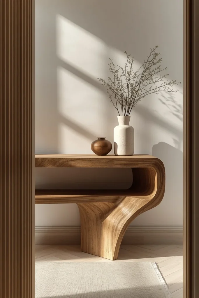
The console is the backbone of most entryways, and 2026’s strongest version treats it as a full sculptural frame rather than a thin decorative table pushed against the wall. A console built with an open lower shelf or a frame-like base holds the wall visually with more weight, while still leaving room underneath for a stool or a stack of baskets. Choose a fluted wood front or a stone top for texture that photographs well from across the room, not just up close. Keep what sits on top restrained — a lamp, one sculptural object, a small vase — rather than crowding the surface with everything the household needs to store. This single piece of furniture tends to set the tone for the whole entry, since the mirror, lighting, and rug all typically get chosen to complement it.
4. Layered Lighting Design
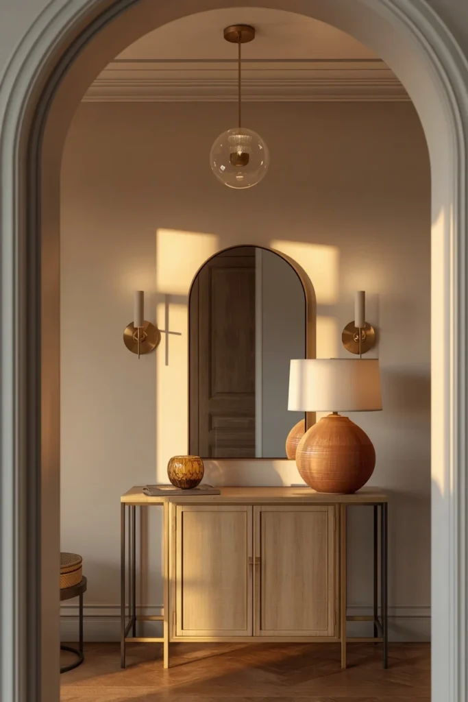
A single overhead bulb makes even a well-decorated entryway feel flat and uninviting, which is why layered lighting has become one of the most repeated trends in 2026 entry design. Combine a pendant or small chandelier as the main overhead source with a pair of wall sconces flanking the mirror and a table lamp on the console for a warmer, closer layer of light. Choose warm-toned bulbs over cool white ones across every fixture, since warm light is what makes an entry feel expensive and lived-in rather than clinical. Position sconces on either side of the mirror rather than centered above it, which spreads the light more evenly and avoids one single glaring hot spot. This layered approach costs relatively little to add incrementally, since most homes already have the overhead fixture and just need the sconces and lamp added over time.
5. Anchoring Entryway Rug
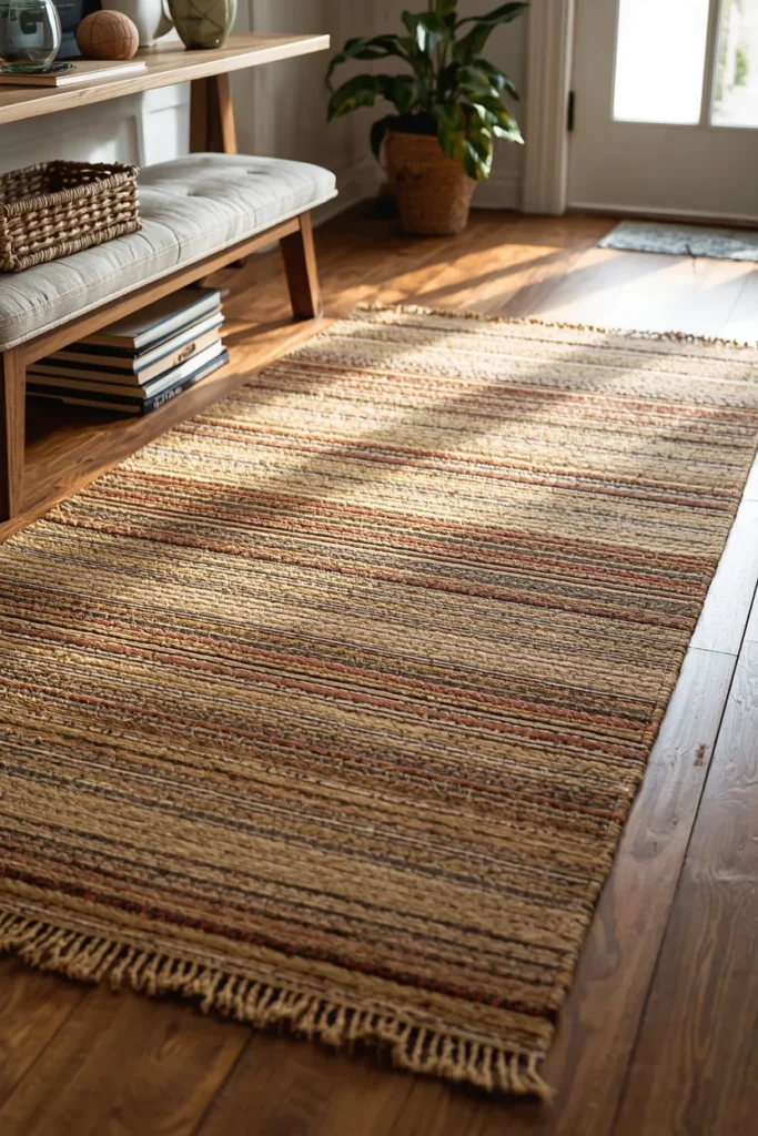
A rug in the entryway does a job most people underestimate: it defines where the entrance zone starts and ends, especially in open floor plans where the foyer bleeds directly into a hallway or living room. Choose a rug large enough that the front two-thirds sits under any bench or console, since a rug that floats untethered from nearby furniture tends to look like an afterthought. A low-pile, tightly woven material like a flatweave or jute blend holds up far better than a plush rug in a high-traffic entry exposed to dirt and moisture. Layer a smaller vintage or patterned rug on top of a neutral jute base for texture and color without needing a bold, busy rug to cover the whole floor. This is one of the simplest ways to visually ground an entry, especially one with hard flooring that otherwise feels cold or echoey.
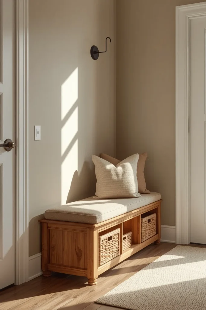
6. Built-In Bench With Hidden Storage
A bench with storage underneath solves the entryway’s biggest practical problem — shoes, bags, and everyday clutter — while still looking like an intentional piece of furniture rather than a bin shoved in a corner. Choose a bench with a lift-up seat or drawers below rather than open cubbies if hiding daily mess matters more than quick access. Cushion the top in a durable, easy-to-clean fabric like performance velvet or outdoor-rated linen, since an entry bench takes more direct wear than almost any other seat in the house. Position it along the longest open wall rather than directly opposite the door, so it doesn’t block the natural path of movement into the home. This piece earns double credit in a small entryway, functioning as both storage and the room’s only real seating.
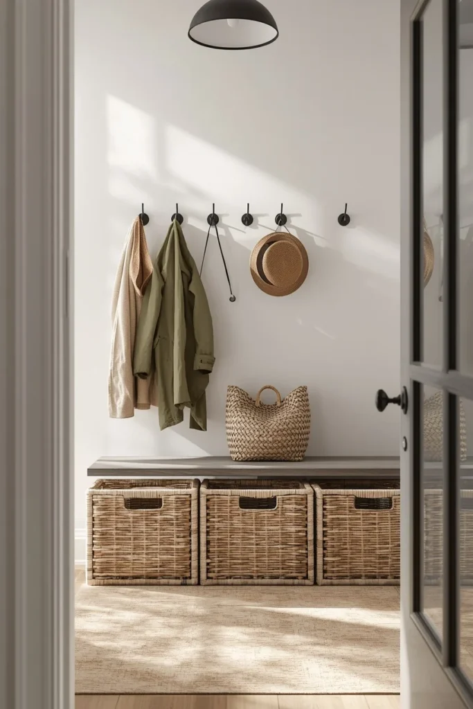
7. Wall Hooks and Basket Drop Zone
A simple row of wall hooks paired with a few woven baskets turns the daily chaos of coats, bags, and leashes into an organized, almost decorative system instead of a pile by the door. Choose hooks in a finish that matches the console or door hardware, and space them widely enough that jackets don’t bunch together into one crowded mess. Use baskets on the floor beneath the hooks for shoes or gear that doesn’t hang well, keeping one basket per household member if space allows. Mixing materials — a black metal hook, a woven rattan basket, a wood shelf — adds visual interest to what’s otherwise a purely functional corner. This idea works especially well in mudrooms and side entrances, where storage matters even more than polish.
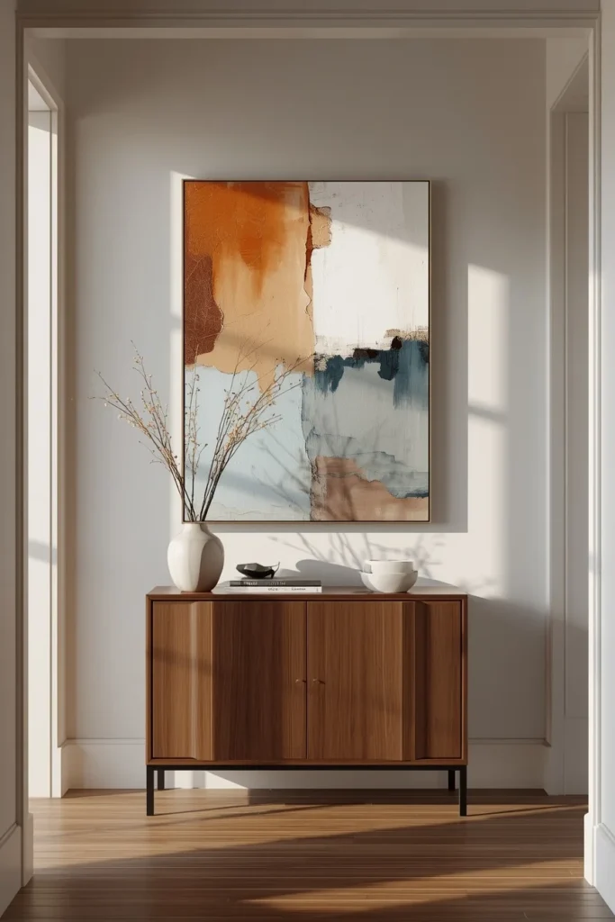
8. One Bold Vertical Art Piece
Rather than a cluster of small frames, the strongest 2026 entryways lean toward one large, intentional piece of art as the room’s single focal point. Choose a vertical composition when the wall is narrow or tall, since vertical artwork elongates the space and draws the eye upward rather than sideways. Fill roughly two-thirds of the available wall height with the piece, large enough to feel substantial without crowding the ceiling or the console below it. An abstract composition in warm neutrals, soft clay, or muted blue tends to read as both current and timeless, avoiding a look that will feel dated in a couple of years. This approach also photographs better for real estate or social sharing, since one confident piece reads as curated in a way a busy gallery wall sometimes doesn’t in a small space.
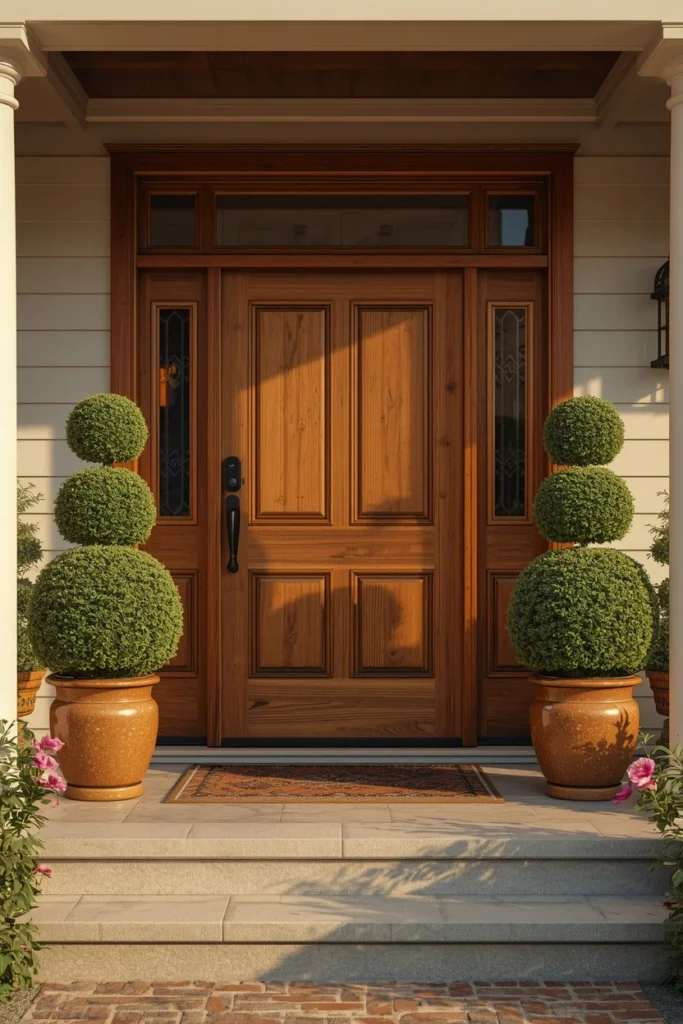
9. Flanking Potted Plants or Topiaries
A pair of matching potted plants or trimmed topiaries on either side of the front door adds instant symmetry and a sense of care before a guest even reaches the doorbell. Boxwood or bay laurel topiaries hold their shape well and tolerate a range of climates, making them a reliable choice for year-round curb appeal. Choose matching planters in a material that complements the door and house facade, like glazed ceramic against a stucco exterior or galvanized metal against wood siding. Keep the plants trimmed and the soil topped with mulch or stone, since overgrown or bare-soil planters undercut the polished effect the pair is meant to create. This is one of the most repeated exterior entrance upgrades because it works on almost any architectural style, from craftsman to modern.
10. Seasonal Wreath Rotation
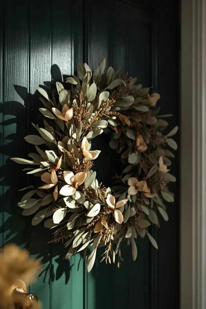
A wreath is one of the simplest ways to signal that a home is cared for and current, and rotating it with the seasons keeps the entrance feeling fresh rather than static year-round. Choose a base material — dried grasses, eucalyptus, magnolia leaves — that suits the season, then swap smaller seasonal accents like berries, ribbon, or dried citrus rather than replacing the whole wreath each time. Hang it at a height centered on the door’s upper third, roughly eye level or just above, rather than dead center on the whole door. A slightly oversized wreath relative to the door’s size reads as more intentional than a small, sparse one that gets lost against the door’s panels. This is a low-cost, low-effort idea that still meaningfully changes how the entrance feels every few months.
11. Statement House Numbers
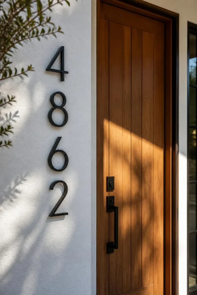
House numbers are one of the most overlooked entrance details, yet an updated set in a bold font and finish can visually upgrade an entire facade for very little cost. Choose a modern sans-serif style for a contemporary home or a classic serif for a traditional one, matching the numbers’ finish to the door hardware or light fixtures nearby. Mount them against a contrasting background, like matte black numbers on a white wall or brushed brass on a deep painted surface, so they’re legible and visually distinct rather than blending in. Position them at eye level near the door rather than tucked high under the eaves, both for practical visibility and for the styling impact. This is a small, inexpensive detail that consistently gets noticed in curb appeal comparisons precisely because so many homes still have their original builder-grade numbers.
12. Pendant Light or Small Chandelier
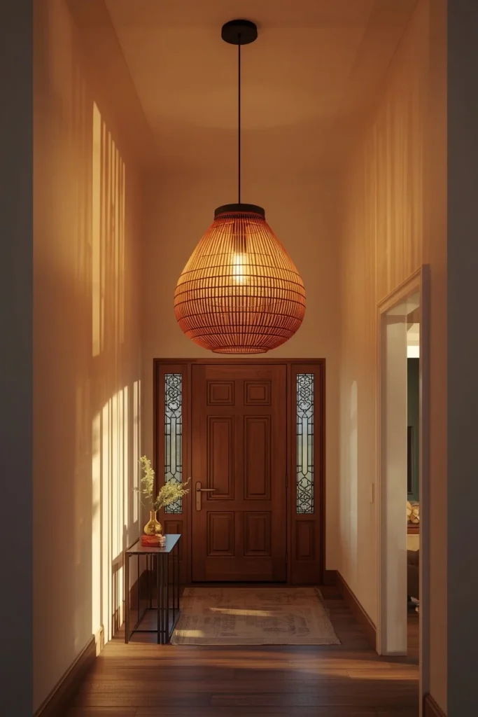
Swapping a builder-grade flush mount for a sculptural pendant or small chandelier instantly elevates a foyer’s sense of scale and intention. Choose a fixture sized to the ceiling height, hanging low enough to feel present in a double-height foyer but high enough to clear head height comfortably in a standard-ceiling entry. A woven or textured shade softens the light and adds warmth, while a metal or glass fixture leans more modern and reflective. This fixture typically becomes the entry’s visual anchor, with the mirror, console, and rug all working to support rather than compete with it. It’s a moderate-cost upgrade that often has the single biggest visual impact of anything on this list, since lighting shapes the mood of the whole space the moment someone walks through the door.
13. Runner Rug Down the Hallway
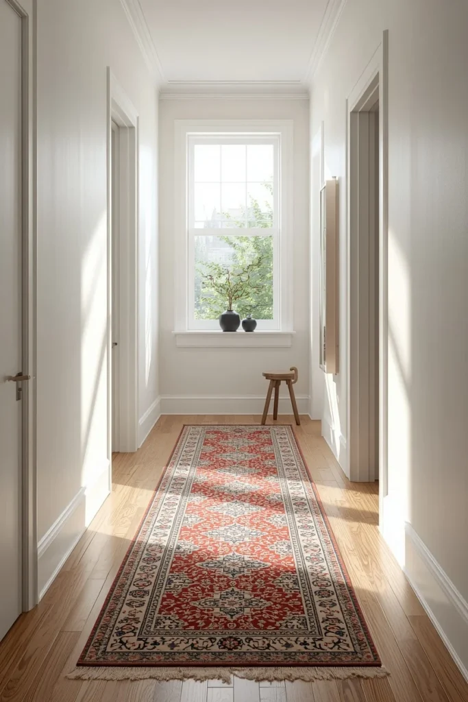
A patterned runner leading from the entrance down a connecting hallway extends the entry’s design language into the rest of the home instead of letting the styling stop abruptly at the foyer’s edge. Choose a runner in a durable, tightly woven material, since hallway rugs see even more consistent foot traffic than the entry rug itself. Repeat one color or motif from the entryway rug or artwork in the runner’s pattern, so the whole path reads as one continuous, considered design rather than two unrelated rugs. Leave a few inches of visible flooring on either side of the runner rather than choosing one that spans wall to wall, which keeps the hallway feeling proportionate. This idea works particularly well in homes with long, narrow hallways branching directly off the entrance, turning a plain corridor into part of the overall first impression.
14. Curved and Rounded Furniture Silhouettes
Curved silhouettes have taken over entryway furniture in 2026, softening what used to be a room full of hard right angles between the door frame, console edges, and mirror corners. A mushroom-shaped ottoman, a rounded stool, or a console with a gently arched apron all introduce a visual break from the straight lines surrounding them. These softer shapes also tend to feel safer in a tight, high-traffic space, since rounded edges are less likely to catch a hip or a bag strap on the way past. Mix one or two curved pieces with straighter furniture rather than making everything rounded, since an entry made up entirely of curves can start to feel indistinct. This trend pairs especially well with the quiet, neutral palettes currently dominating entryway design, since the shape alone carries enough visual interest without needing bold color.
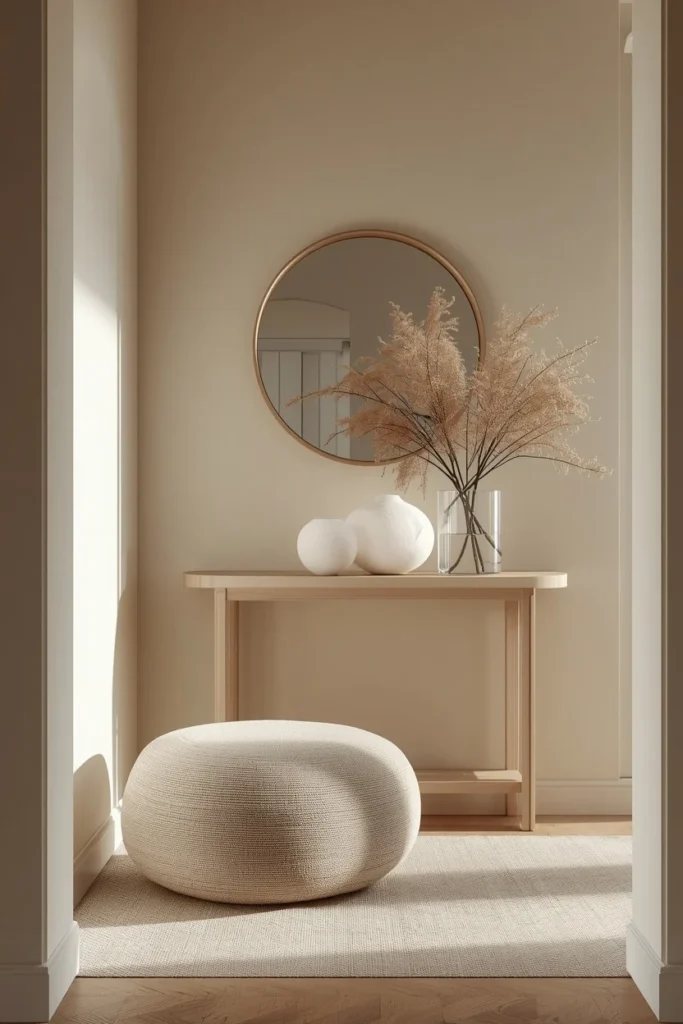
15. Left-to-Right Rhythm Styling
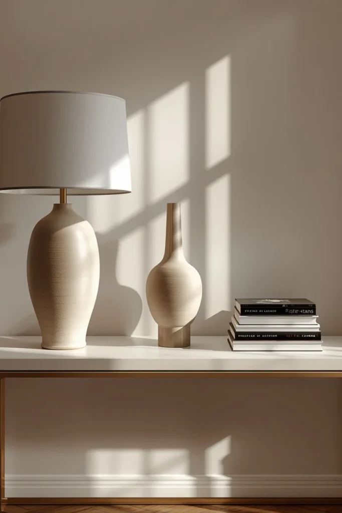
Rather than clustering every decorative object in one spot on the console, the strongest entryway styling spreads pieces in a left-to-right rhythm, similar to how a designer would compose a still life. Place a taller item, like a lamp or a slim vase, toward one end, a mid-height sculptural object near the center, and something low and horizontal, like a shallow bowl or a stack of books, toward the other end. This distribution keeps the surface from feeling heavy on one side while still reading as full and considered rather than sparse. Leave visible negative space between each grouping so the eye has a place to rest before moving to the next object. This approach takes the same handful of objects most people already own and simply rearranges them with more intention, making it one of the lowest-cost styling upgrades on this list.
16. Glass or Fluted Console for Airiness
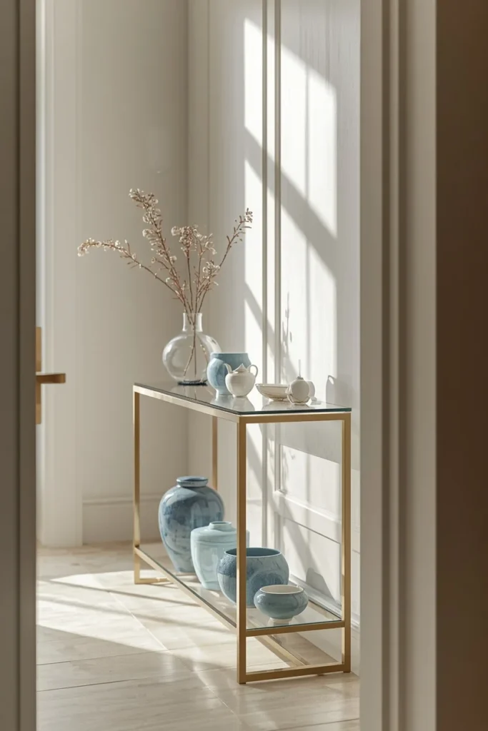
In a narrow or naturally dim entryway, a console with a glass top or an open fluted frame keeps the space feeling light instead of visually blocking the wall the way a solid, heavy piece can. Glass tops work especially well when paired with a collection of matching ceramics or glassware displayed underneath, since the transparency turns storage into a visible, curated display rather than hidden clutter. A fluted wood or metal frame achieves a similar effect through its open, rhythmic vertical lines rather than pure transparency. This choice matters most in entries with limited natural light or a lower ceiling, where a bulky solid console can make the whole space feel more cramped than it actually is. It’s a smart middle ground between a fully open shelf and a heavy, solid-front cabinet.
17. Grid-Paneled Mirror Wall
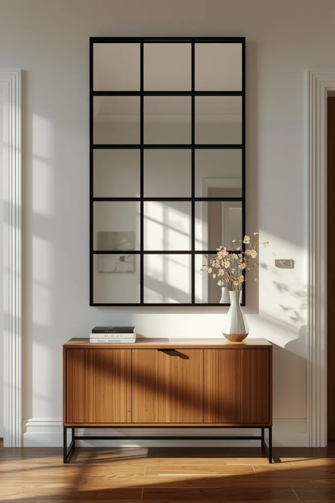
A mirror broken into a grid of smaller panes adds structure and visual interest to a plain entry wall without requiring any trim or paneling work. Each individual pane reflects light slightly differently depending on the angle, which spreads brightness more evenly across the entry than one single flat mirror surface would. Choose a grid with a thin black or brass frame between panes for definition, or a nearly invisible seam for a more minimal, continuous look. Pair it with a simple console styled with a low-to-high object arrangement, so the mirror itself remains the wall’s main visual event. This is a strong option for anyone who wants the light-enhancing benefit of an oversized mirror but prefers a more architectural, gridded look over a single round or arched piece.
18. Signature Entryway Scent
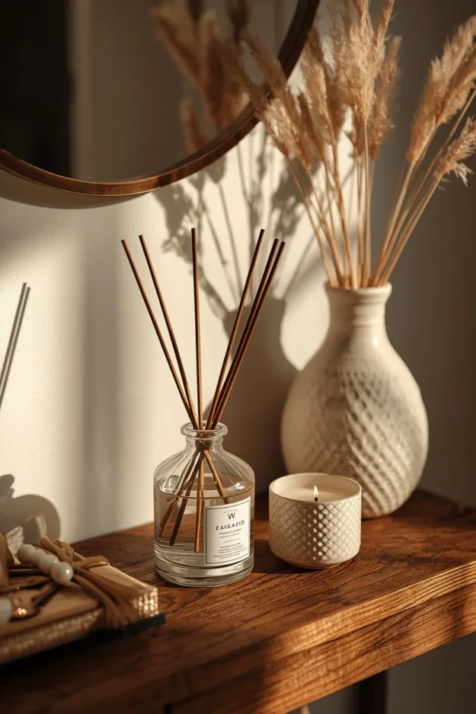
A subtle, consistent scent at the entrance shapes a guest’s first impression just as much as anything visual, often without them consciously noticing why the space feels so welcoming. Choose a reed diffuser or a covered candle over an open flame near a high-traffic doorway, since spills and safety matter more in an entry than almost anywhere else in the home. Keep the scent understated — a soft woody or citrus note rather than anything heavy or sweet — since a nose adjusts quickly to overly strong fragrance, making it feel invisible to residents but overwhelming to a first-time guest. Place the diffuser or candle on the console itself, styled alongside the other objects rather than tucked out of sight, so it does double duty as both scent and decor. This detail costs very little but consistently comes up as one of the small touches guests remember without being able to say exactly why.
19. Natural Material Trays and Baskets
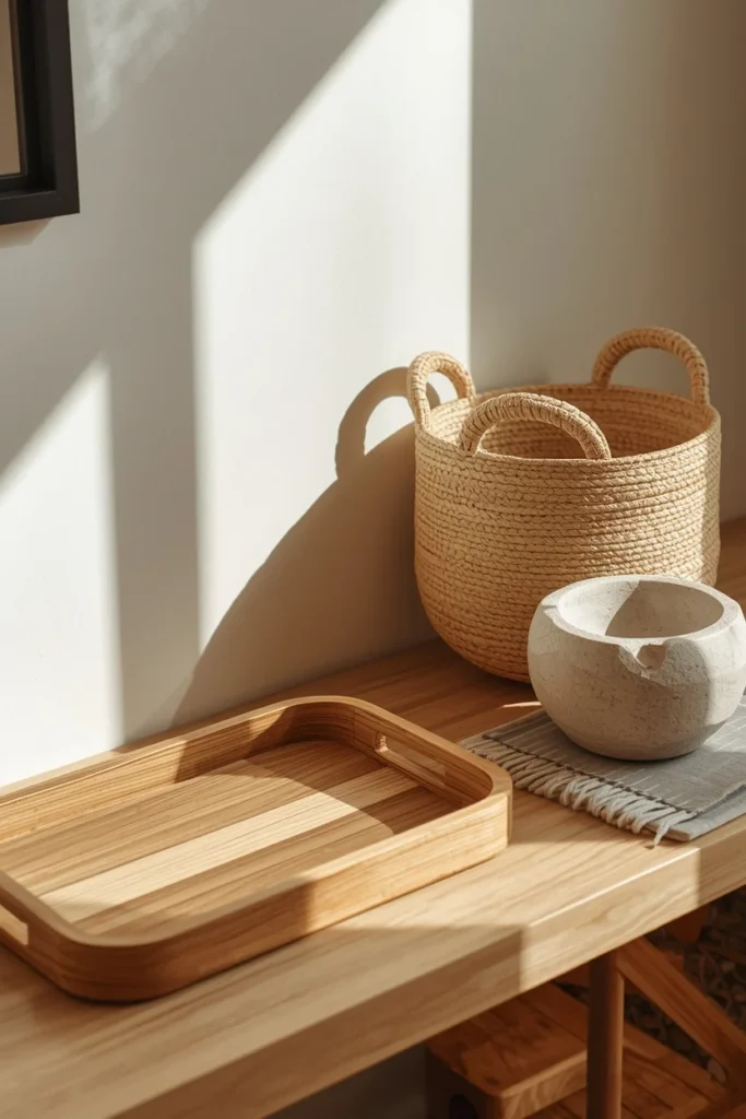
Layering in natural materials — a wood tray for keys, a woven basket for mail, a stone bowl for loose change — connects an entryway visually to the outdoors while also solving small daily organization problems. Mix at least two different textures, like a smooth wood tray next to a rough woven basket, since the contrast between materials is what makes this styling read as rich rather than one-note. Keep each container assigned to one specific purpose rather than a general catch-all, which keeps the surface from slowly filling with unrelated clutter over time. Choose materials in warm, natural tones — rattan, unfinished wood, raw stone — that echo the broader nature-inspired palettes currently popular across entryway design. This is one of the easiest ideas to implement immediately, since most households already own some version of these objects and simply need to group them intentionally.
20. Two-Tone Paint or Wall Molding
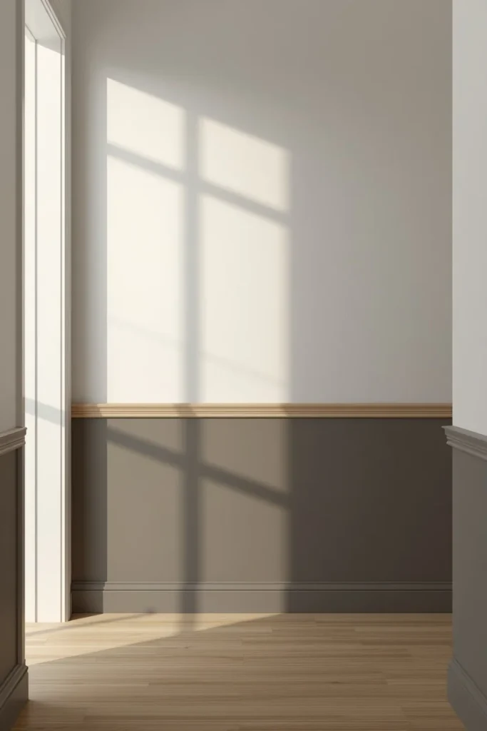
A two-tone paint treatment, like a chair-rail-height color break or simple picture-frame molding, adds architectural interest to a plain entryway wall without a full renovation. Keep the lower portion in a slightly deeper or richer tone than the upper wall, which grounds the space and hides scuffs from shoes, bags, and foot traffic better than an all-white wall would. Add simple molding in evenly spaced rectangles above the color break for extra texture, especially effective in older homes with existing trim details elsewhere. This treatment also gives the entry a natural stopping point for a runner rug or bench, since the color break visually defines where the entry zone ends. It’s a moderate DIY project that pays off in both durability and design impact, especially in a high-traffic entry that takes more wear than most other rooms.
21. Covered Porch Seating Nook
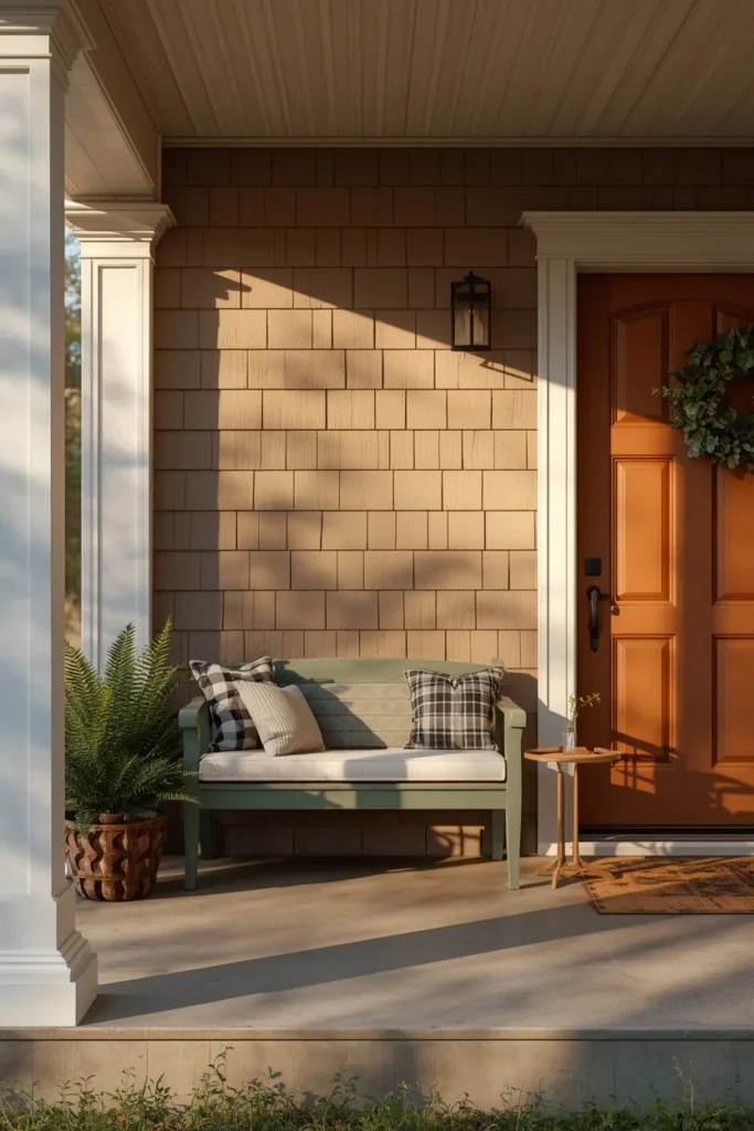
For homes with a covered porch or stoop, adding a small seating nook right at the entrance extends the welcoming feeling outside the front door itself. A pair of simple chairs or a narrow bench with weather-resistant cushions gives guests, delivery visitors, or the household a spot to pause before heading inside. Choose furniture scaled to the porch’s actual depth, since an oversized piece on a shallow stoop will crowd the walkway rather than invite anyone to sit. Add a small side table and a potted plant nearby to round out the vignette, echoing the same layered styling approach used just inside the door. This idea works especially well for homes where the entrance sits set back from the street, since the seating nook gives the approach a clear, welcoming destination before guests even reach the door.
22. Welcome Mat and Boot Tray Combo
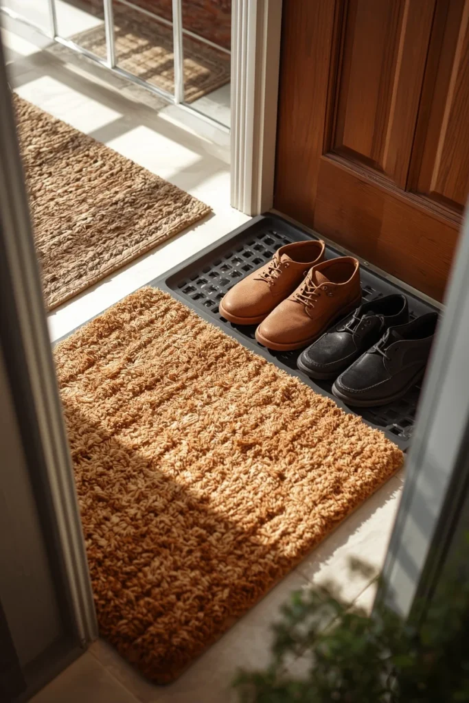
A well-chosen doormat paired with a boot tray just inside handles both the first visual cue at the threshold and the practical mess that follows guests and family in from outside. Choose a mat in a natural fiber like coir for the exterior side, which scrapes dirt and debris off shoes more effectively than a thin printed rubber mat. Add a boot tray just inside the door in a material that hides water and salt stains, like a textured rubber or a wood tray with a waterproof liner. Keep the mat’s design simple and the color grounded in the same palette as the front door or exterior trim, rather than choosing something purely novelty that clashes with the rest of the entrance. This combination is one of the most functional ideas on this list, protecting flooring and reducing daily cleanup while still contributing to the overall look of the entrance.
Styling Tips
- Keep console styling to three or four objects maximum — restraint reads as more expensive than a fully packed surface.
- Repeat one material or color between the interior entry and the exterior entrance (a door color echoed in a throw pillow, a wood tone repeated in a planter) so the transition feels like one continuous design.
- Use warm-toned lighting throughout the entry, since cool white bulbs are one of the fastest ways to make an otherwise well-styled space feel clinical.
- Give every object on the console a job — decorative, functional, or both — rather than adding things purely to fill space.
- Step outside and walk back through your own front door periodically; styling choices that look right from inside the house don’t always read the same way on approach.
Practical Implementation Ideas
- Measure your console and mirror together before purchasing either one, keeping the mirror at roughly two-thirds the console’s width for proportion.
- Install sconces at a height just above eye level, roughly 60 to 66 inches from the floor, so the light source flatters rather than glares.
- Choose entryway rug materials based on your actual weather and foot traffic — flatweave or synthetic-blend rugs handle rain and mud far better than a delicate wool pile.
- Plan storage first, styling second: figure out where shoes, bags, and mail actually need to live before choosing decorative pieces.
- For exterior updates like door paint or house numbers, check any HOA guidelines before committing to a bold color or unconventional finish.
Common Mistakes to Avoid
- Choosing a rug too small for the space, which ends up floating awkwardly instead of anchoring the furniture around it.
- Relying on a single overhead light source, leaving the entry feeling flat and under-lit no matter how nice the furniture is.
- Overcrowding the console with too many small objects, which reads as cluttered rather than curated.
- Skipping storage entirely in favor of pure styling, which guarantees the space will look cluttered again within a week.
- Ignoring the exterior approach while focusing only on the interior entry, missing half of what actually shapes a guest’s first impression.
Small-Space Alternatives
- Choose a slim console with a glass or fluted front instead of a bulky solid piece, keeping the entry feeling open rather than cramped.
- A tall, narrow mirror does more for a tight foyer than a wide one, since it draws the eye upward instead of emphasizing limited floor width.
- Wall-mounted hooks and floating shelves free up floor space that a bench or larger storage piece would otherwise take up.
- Stick to light, neutral wall colors in a small entry, saving bold two-tone treatments for larger foyers with more wall to work with.
- A single well-chosen art piece works better than a gallery wall in a tight space, avoiding visual clutter in a room with little room to step back and view it.
Budget-Friendly Alternatives
- Repainting the front door delivers one of the highest-impact, lowest-cost upgrades on this entire list.
- Thrifted mirrors, consoles, and baskets often have more character than new pieces and cost a fraction of the price.
- Restyle existing decor using the left-to-right rhythm approach before buying anything new — the objects you already own may just need rearranging.
- A reed diffuser and a couple of new throw items (a runner, a small rug) can refresh an entryway’s whole feel for well under the cost of new furniture.
- DIY picture-frame molding or a two-tone paint treatment costs mostly just paint and tape, delivering an architectural look without new construction.
Pro Styling Recommendations
- Treat the console as the anchor and choose every other element — mirror, lighting, rug — to support its scale and material rather than picking pieces independently.
- Layer at least three light sources (overhead, wall, and table) in any entry meant to be used after dark, since a single fixture can’t create the same warmth.
- Extend the entry’s material or color story a few steps into the connecting hallway with a runner or repeated art piece, so the transition doesn’t feel abrupt.
- Address the exterior approach — door color, house numbers, planters — with the same intention as the interior console, since guests experience both before ever stepping inside.
- Choose one seasonal element, like a wreath or a rotating console vignette, to keep the entry feeling current without needing to redesign the whole space every few months.
FAQs‘
Conclusion
A home entrance doesn’t need a full renovation to make the impression it’s capable of making. Sometimes it’s one oversized mirror. Sometimes it’s finally repainting the front door that color you’ve been saving on a mood board. Whatever you pick from this list, the goal stays the same: a space that tells guests something true about your home in the first three seconds, instead of making them look past the clutter to find it.
Start with the one idea that matches how your entrance actually gets used — a busy family mudroom calls for something different than a formal double-door foyer — and build outward from there. The entrance has been waiting long enough to do its job.