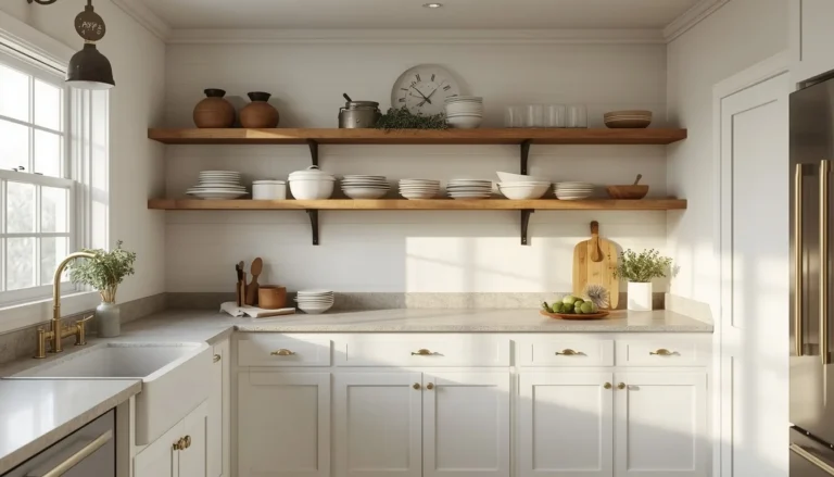
18 Cottagecore Kitchen Ideas That Make Cooking Feel Like a Fairy Tale
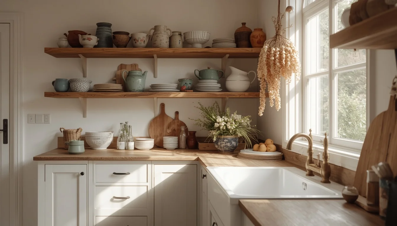
There is a particular kind of kitchen that makes you want to bake something. Not because you planned to, but because the room itself seems to call for it. The warm light comes through linen curtains. Dried herbs hang above the window, filling the air with a faint, earthy calm. The shelves hold mismatched ceramics that each have a history. You find yourself reaching for the flour jar, choosing the slow way to make dinner, staying in the kitchen long after the meal is done.
That is the promise of the cottagecore kitchen — and in 2025 and 2026, it’s no longer a niche aesthetic. Searches for dark cottagecore kitchens alone have surged more than 900% on Pinterest, with related searches for village kitchen ideas and grandma-core kitchens not far behind. What they all share is the same underlying craving: a kitchen that feels genuinely inhabited, full of warmth and story, the opposite of the sleek, sterile spaces that dominated the past decade.
The good news is that the cottagecore kitchen is also one of the most accessible design aesthetics in existence. Its most powerful elements — a jar of dried lavender, a brass tap, a shelf of mismatched ceramics, a worn wooden table — are also among the cheapest. This guide covers 18 specific ideas, from foundational design decisions to small weekend projects, with the practical reasoning behind each one so you can build the kitchen that makes you want to stay.
Table of Contents
- The Apron-Front Farmhouse Sink
- Open Wooden Shelving
- The Windowsill Herb Garden
- Dried Herb and Flower Bundles
- The Vintage Kitchen Dresser
- The Worn Wooden Kitchen Table
- Mismatched Floral China Collection
- Copper Cookware Display
- Gingham and Floral Curtains
- Botanical Wallpaper Feature Wall
- Butcher Block Countertop
- Wicker and Woven Basket Collection
- The Rattan or Woven Pendant Light
- The Skirted Sink
- Sage Green Cabinet Painting
- Blush or Lilac Pastel Kitchen
- The Dark Cottagecore Kitchen
- The Fully Realized Cottagecore Kitchen
WHAT MAKES A KITCHEN GENUINELY COTTAGECORE IN 2026
Cottagecore is not, at its core, a design style. It is a philosophy — a belief that cooking should feel like an act of care rather than a task to complete, and that a kitchen should reflect the life actually lived in it rather than the life projected elsewhere.
The 2026 iteration of the aesthetic has matured considerably from its earlier, more maximalist expression. Where the cottagecore kitchen of a few years ago piled florals on every surface and hung dried flowers from every visible hook, the version designers are specifying and homeowners are inhabiting today is more edited and deliberate. The values stay the same — natural materials, honest objects, a visible connection to the garden and the seasons — but the approach is calmer. One botanical wallpaper wall instead of four. A curated shelf instead of an overflowing one. A few significant vintage pieces instead of dozens of small ones competing for attention.
The result is a kitchen that looks collected rather than assembled, designed rather than decorated. The distinction is everything.
Three Principles That Guide Every Decision
Honest materials: Wood, stone, linen, clay, copper, and brass used without apology and displayed without hiding. The goal is materials that look better with use and age — the opposite of surfaces maintained to look perpetually new.
Collected over time: A mismatched shelf of ceramics sourced from different markets, different years, and different relationships tells a story that a matching set purchased in one afternoon never will. This principle extends to furniture, textiles, and hardware — the room should feel like it accumulated rather than was installed.
Connection to nature: Fresh herbs on the windowsill, dried botanicals overhead, seasonal flowers on the table, garden produce in a wicker basket. These are not decorative choices — they are the kitchen’s conversation with the natural world outside it, and they change through the year in ways that keep the room alive.
THE COTTAGECORE KITCHEN COLOR AND MATERIAL FORMULA
The Palette Architecture
Cottagecore kitchens build their color palette in layers rather than choosing a single hero color.
The base layer — walls, large cabinet runs, and ceiling — stays in the warm, light-reflective range: soft cream, warm white, or a very pale warm linen. These are not stark whites with cool blue undertones. They are the whites that glow softly under morning light and warm further as the day moves toward evening.
The structure layer introduces natural wood into the room — in cabinetry, open shelving, a central table, butcher block countertops, or exposed ceiling beams. The wood tone should sit in the warm, honey-to-walnut range rather than anything bleached or grey-washed. This layer does more to warm a cottagecore kitchen than any paint color.
The accent layer introduces color — and this is where cottagecore moves into personality. In its light and airy interpretation, the accent arrives in muted pastels: sage green on the lower cabinets, duck egg blue on the kitchen dresser, soft blush on a single pantry door. In its dark cottagecore interpretation, the accent shifts dramatically: deep forest green, charcoal, hunter green, or burgundy on full cabinet runs, delivering atmosphere rather than charm.
The Hardware Rule
Brass and copper are the only metals that genuinely belong in a cottagecore kitchen. Both warm the room in a way that chrome and stainless steel actively undermine. Both develop character over time — unlacquered brass in particular takes on a living quality as it oxidizes, darkening in high-touch areas and brightening where it’s regularly handled. Matte black hardware, while handsome in other settings, sits too close to contemporary minimalism to feel at home here.
IDEA 1: The Apron-Front Farmhouse Sink
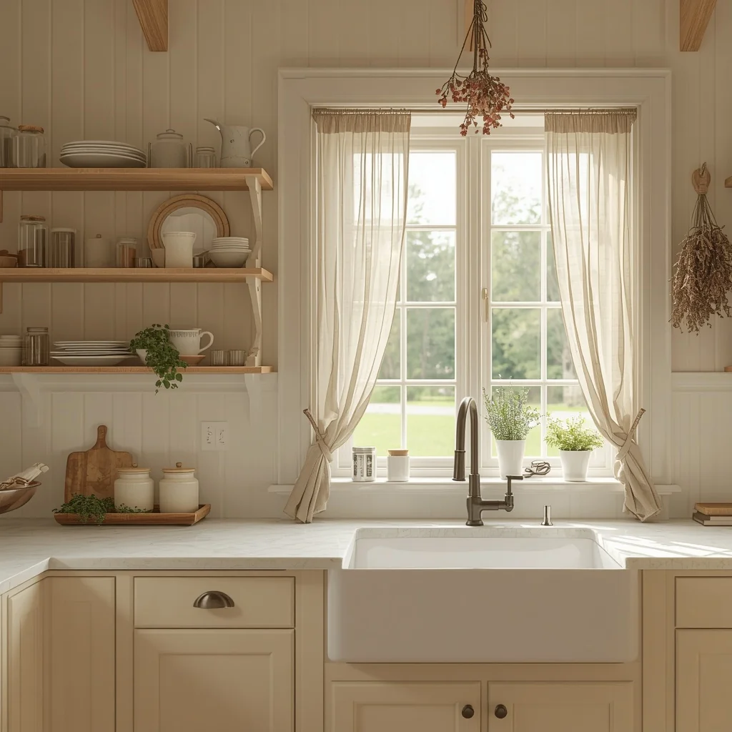
The farmhouse apron-front sink is the single most recognizable feature of a cottagecore kitchen, and for good reason. Its deep, wide basin, exposed front panel, and placement beneath a window together create the visual anchor that everything else in the kitchen organizes itself around.
Fireclay is the traditional material and remains the most cottagecore-appropriate choice — it develops a subtle patina with daily use and handles the temperature changes of a working kitchen with genuine durability. White or off-white fireclay reads as the most classic. Copper offers the most dramatic alternative for kitchens leaning into a warmer, more antique quality. Cast iron with a porcelain coating sits between the two — deeply traditional, substantial in weight, and increasingly hard to find in vintage condition (which makes it the most coveted option for serious cottagecore enthusiasts).
Position matters as much as material. The sink beneath a window, with a view of the garden or yard, creates the quintessential cottagecore moment — the cook at the sink is connected to the world outside the glass in a way that no other kitchen layout achieves.
A brass or unlacquered brass tap completes the picture. Even if a full farmhouse sink replacement is out of budget, swapping an existing mixer tap to a bridge-style brass version achieves a remarkable portion of the same visual warmth for a fraction of the cost.
For narrower galley kitchens, a 30-inch apron-front sink gives full visual impact while maintaining the proportions the space needs. The standard 36-inch width can disrupt the workflow in a compact kitchen significantly.
Designer Secret: Style the counter immediately beside the farmhouse sink with a worn wooden cutting board, a small clay pot of fresh herbs, and a linen dish towel draped naturally — not folded, not displayed, just used. This trio of objects next to the sink reads as genuinely inhabited rather than staged.
IDEA 2: Open Wooden Shelving
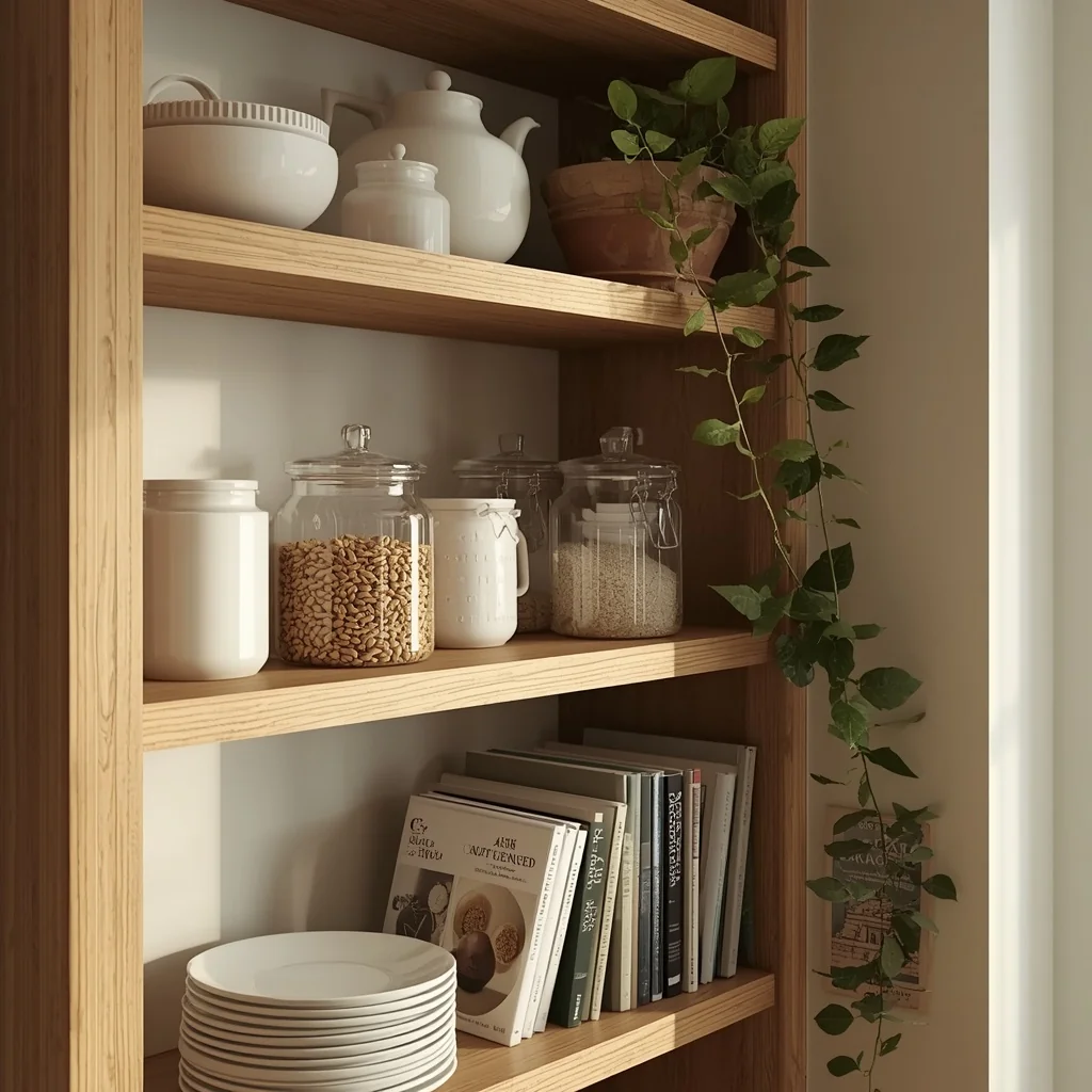
Removing one run of upper cabinet doors and replacing them with simple wooden floating shelves is the highest-impact, most accessible cottagecore kitchen transformation available. It costs relatively little, requires no special skills, and immediately changes a kitchen’s entire personality — from storage facility to inhabited room.
The shelves themselves should be in a warm-toned natural wood: reclaimed pine, natural oak, or raw walnut. Avoid anything too polished or grain-filled — the slightly imperfect, lived-in quality of natural wood is precisely the point.
What goes on the shelves matters more than the shelves themselves. Stack everyday stoneware bowls rather than display pieces. Line up glass jars filled with the things actually cooked with — pasta, dried lentils, rice, oats. Add a cookbook or two on their sides. Tuck in a small potted herb or a single vintage ceramic you love. The key is using objects that belong in a kitchen and displaying them in a way that looks slightly casual — like someone set them there and that is simply where they live.
The shelf height formula that works consistently: position the lowest shelf 18 inches above the counter surface (enough clearance to work comfortably beneath it), then space subsequent shelves 12 to 14 inches apart. This accommodates most ceramics and jars without creating wasted vertical gaps.
Quick Tip: Before buying anything for new shelves, look through your own cupboards first. The mug you’ve had for years, the ceramic bowl from a trip, the wooden breadboard you forgot about — these existing objects are almost always more authentic and more interesting than anything purchased specifically for a shelf display.
IDEA 3: The Windowsill Herb Garden
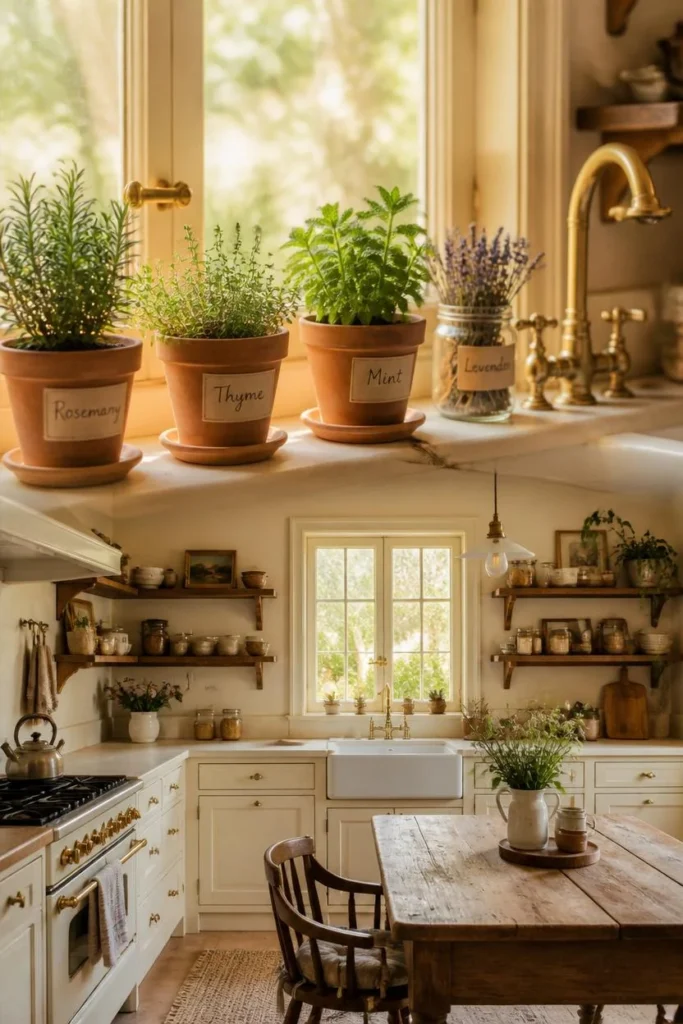
A collection of small clay pots, vintage tins, or ceramic planters on the kitchen’s sunniest windowsill — filled with basil, rosemary, thyme, chives, and mint — does more for a cottagecore kitchen’s character than almost any decorative purchase. It is simultaneously the most practical and most visually right detail the style offers.
The container matters. Matching white plastic pots from a garden center undermine the effect entirely. Small terracotta pots, enamel mugs, old jam jars, or mismatched ceramic vessels each bring the right quality of imperfection. Small handwritten labels on short wooden stakes or ceramic tags add the kind of quiet personal detail that gives a kitchen its particular character.
Herbs that genuinely thrive in a kitchen windowsill in most climates: basil, chives, mint, and parsley in the warmer months; rosemary, thyme, and sage year-round where there’s reasonable natural light. The slightly overgrown, slightly leggy quality of a kitchen herb plant that’s actually being used regularly looks more authentic than a perfect, nursery-fresh display.
Quick Tip: Use seasonal herbs to change the windowsill through the year — spring brings soft mint and basil, autumn calls for woody rosemary and sage alongside a small pumpkin or two. This habit of seasonal rotation keeps the kitchen feeling alive and connected to the time of year without requiring any permanent changes.
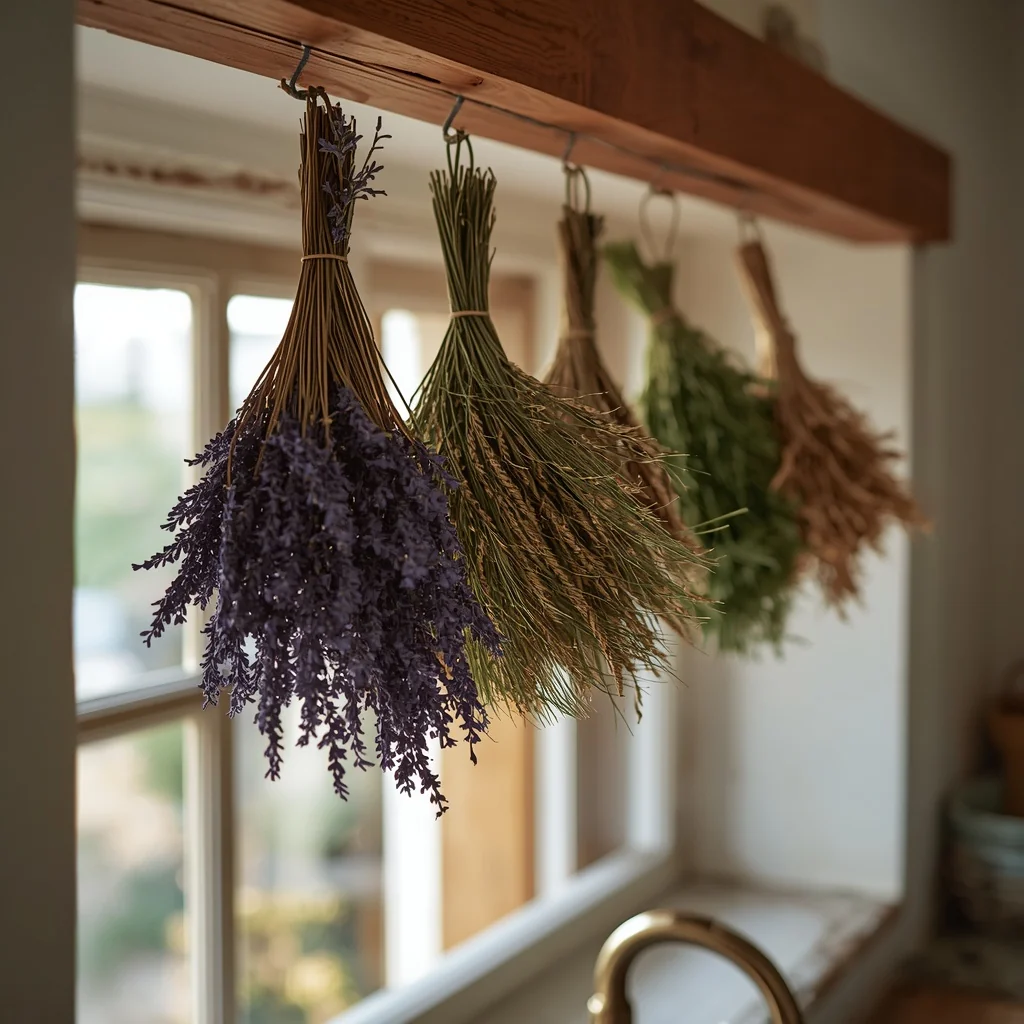
IDEA 4: Dried Herb and Flower Bundles
Where fresh herbs belong on the windowsill, dried botanicals belong overhead — hung from ceiling hooks, a small wooden rail above the window, or along an exposed beam. Bundles of dried lavender, rosemary, eucalyptus, wheat stems, and chamomile each bring a slightly different tone to the kitchen’s color palette: grey-lilac, deep green, silver-green, warm golden, soft cream.
The hanging is both functional and atmospheric. Dried lavender genuinely scents a kitchen at the warmth of cooking — a quality no candle or diffuser replicates in the same register. Dried rosemary and thyme can be pulled from the hanging bundle and used directly in cooking, giving the display a purposeful quality that pure decoration never has.
The arrangement should be slightly informal. Bundles of varied lengths and sizes, hung at marginally different heights, read as more genuine than a perfectly symmetrical display. A small bunch of dried wildflowers mixed in with culinary herbs adds visual interest without looking contrived.
Source: dry your own from the garden or a farmers’ market in late summer for the most authentic cottagecore approach, or purchase from florists and specialty dried flower suppliers — the cost is low and the visual and aromatic return is disproportionately high.
IDEA 5: The Vintage Kitchen Dresser
A kitchen dresser — a freestanding piece with open shelving above and closed cabinet doors below — is the most characteristically traditional cottagecore kitchen storage piece. It functions as display surface, dining ware storage, and visual anchor simultaneously, doing the work of an entire wall of built-in cabinetry in a single piece of furniture that can be sourced secondhand, painted, and taken with you when you move.
Source from estate sales, antique markets, and charity shops — a genuine old dresser with slightly distressed paint, visible wood grain, and perhaps a replaced handle or two has a quality that no reproduction comes close to. Paint it in a muted sage, duck egg blue, or warm cream using chalk paint or a quality eggshell, leaving the inside of the shelving units in a slightly different tone to give depth.
Display your best china on the upper shelves — not your everyday mugs, but the pieces worth looking at. Mix vintage plates with modern ceramics, prop a serving platter vertically against the back, and tuck a small succulent or dried floral arrangement on one shelf. Use wicker baskets on the lower shelves to store less attractive practical items: reusable bags, a first aid kit, seasonal kitchen linens.
Designer Secret: A slightly distressed dresser finish — where the chalk paint has been lightly sanded at the corners and edges to reveal the wood beneath — reads as authentically aged rather than freshly decorated. It is the visual equivalent of an object with a history, which is precisely what cottagecore values above almost anything else.
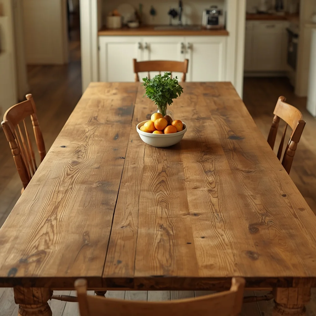
IDEA 6: The Worn Wooden Kitchen Table
More than any single design element in a cottagecore kitchen, the table makes the kitchen what it is. Not the worktop, not the cabinets, not the sink — the table. Because a cottagecore kitchen is not fundamentally about cooking. It is about being in the kitchen, in the way that only a table invites.
An old farmhouse kitchen table — with visible scratch marks, worn patches where hands have rested, a slightly uneven surface from years of use — carries a quality that no new furniture piece can replicate. That quality is time. And time is the ingredient cottagecore kitchens are made of.
Look for this table at estate sales and antique shops rather than furniture retailers. Solid pine, oak, or elm in the original worn condition will almost always be more authentic and more interesting than a new piece given an artificial distressed finish. A trestle base, turned legs, or a simple plank construction all work beautifully — what matters is the material and the patina, not the specific style.
Position it in the best light in the kitchen: beside a window if possible, or in the center of the room where it becomes the natural gathering point for everything that happens in the space — cooking prep, morning coffee, children’s homework, weekend breakfasts that extend longer than planned.
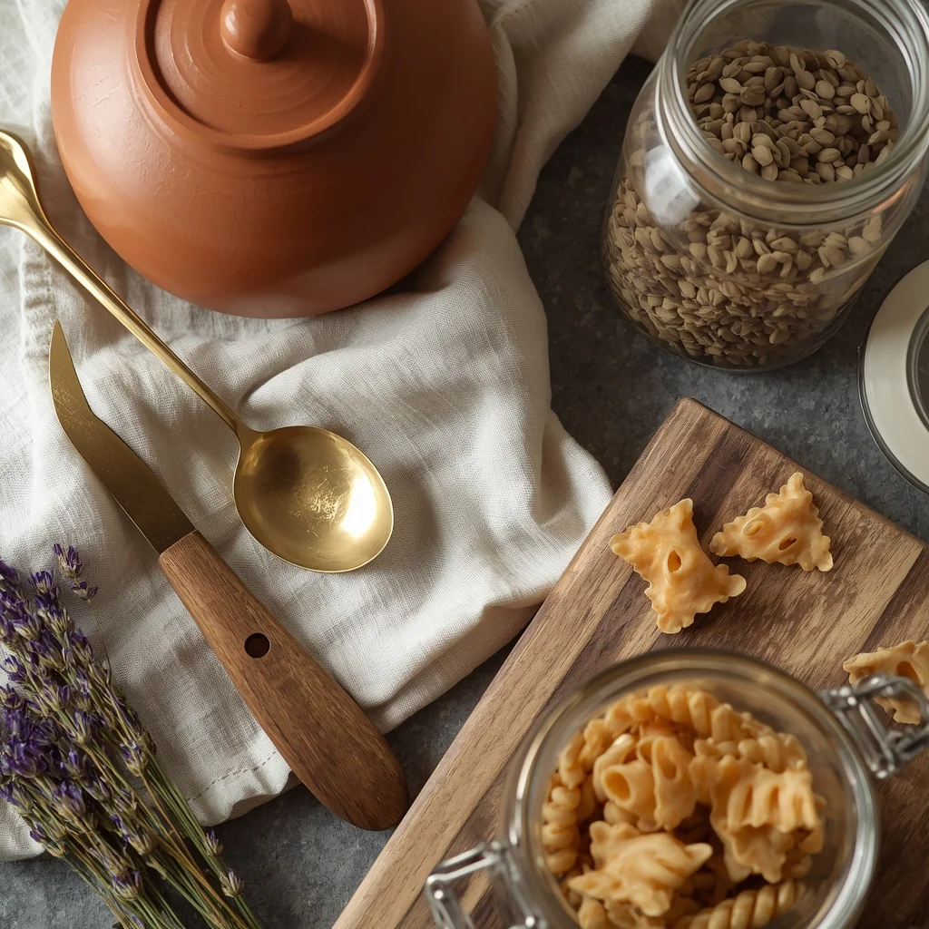
THE OPEN SHELF STYLING GUIDE
Open shelves are where cottagecore kitchens are most often executed beautifully — and most frequently ruined by over-styling or wrong-footed purchasing. The formula that consistently works is simpler than most people expect.
Layer in three depths:
The back layer carries the tallest items: a stack of vintage plates stood vertically, a large ceramic platter leaning against the wall, a row of books placed horizontally. These items fill the visual depth of the shelf without crowding the front.
The middle layer holds mid-height objects: ceramic jugs, glass jars filled with grains or dried botanicals, a small plant in a clay pot, a stoneware bottle. These are the workhorses of a well-styled shelf — practical objects that look good doing what they do.
The front layer is the smallest and most personal: a single vintage spoon lying across the shelf edge, a small smooth stone, a seed packet tucked against a jar. These details are what separate a shelf that reads as genuinely lived-in from one that reads as deliberately styled.
The 40% Rule:
Leave approximately 40% of the shelf surface empty. The breathing space between objects is what gives each piece room to be noticed. A shelf packed edge to edge reads as clutter; the same number of objects with deliberate gaps reads as curation.
What to avoid:
Matching sets of anything new. Identical jars in the same size and finish, purchased from one shop in one visit. Uniformly printed labels. These details communicate “recently decorated” rather than “built up over time” — and the difference is immediately visible.
IDEA 7: The Mismatched Floral China Collection
A group of mismatched floral china — plates, cups, saucers, and serving pieces that share a broadly floral or botanical theme but vary in color, pattern, scale, and era — is the visual heart of a genuine cottagecore shelf display. The variety is what makes it work. A single type repeated identically is a collection; mismatched pieces from different sources and different times is a story.
Source these pieces individually and over time: estate sales, thrift stores, charity shops, antique markets, and online vintage sellers. The best finds are often the most unexpected — a single teacup with a pattern you’ve never seen before, bought for less than the cost of a coffee. Resist the urge to buy matching sets from one shop in one trip.
The shared floral or botanical motif across the collection provides enough visual coherence to prevent the display from reading as random, while the variation in patterns and tones provides the layered interest that makes people look more closely.
Display on open shelving, or use daily — the cottagecore kitchen china should be the everyday china, not a display reserved for special occasions.
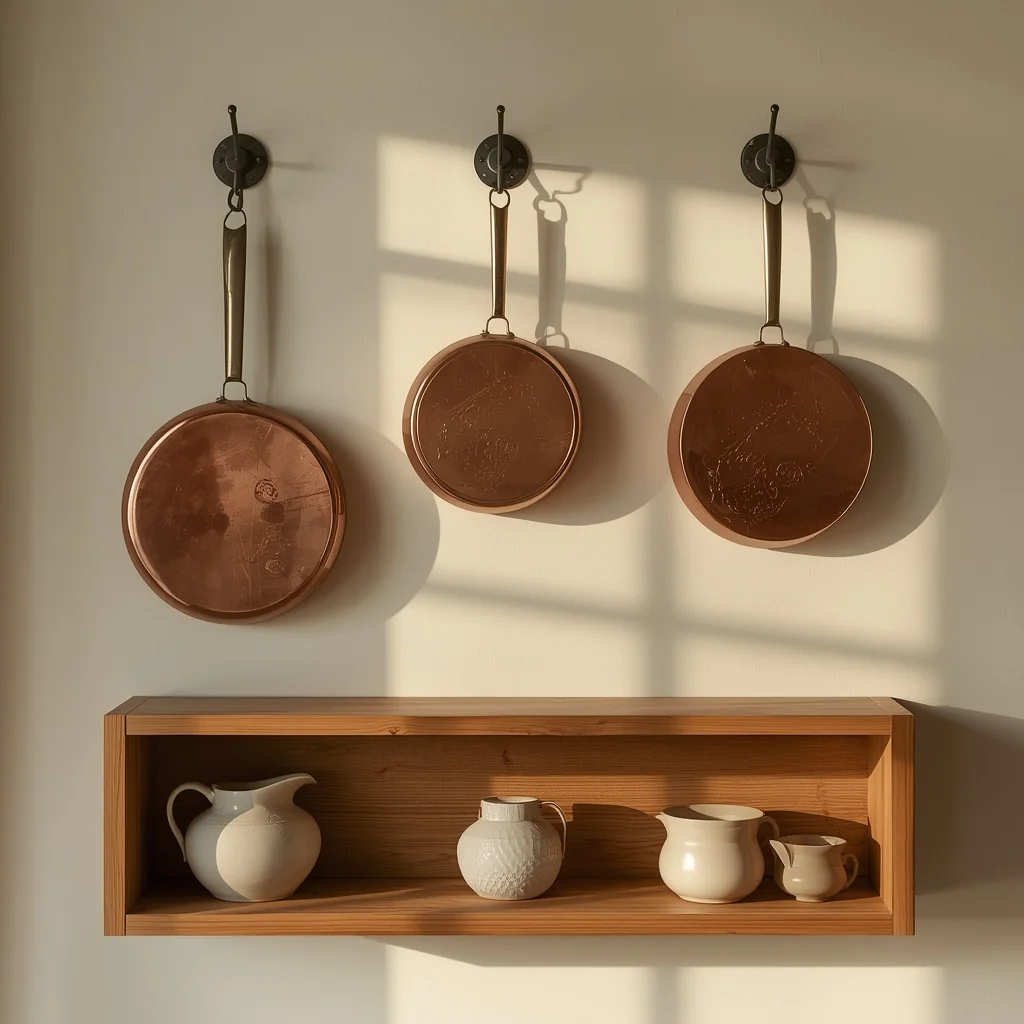
IDEA 8: The Copper Cookware Display
Copper pots, pans, a kettle, and mixing bowls serve two purposes in a cottagecore kitchen: they cook beautifully, and they look more beautiful hanging on a wall or resting on a shelf than almost any decorative object purchased for the purpose.
The warm, reddish-orange tone of copper does something that stainless steel and black cookware don’t — it catches and reflects warm light, creating a shifting, living quality throughout the day. A copper kettle on the stovetop glows differently at 8am, at noon, and at 6pm. That responsiveness to changing light is a quality that genuinely expensive kitchens pay significant sums to replicate artificially.
Slight tarnish and small imperfections in copper add rather than detract. A perfectly polished copper pot looks like a display item; one with the slight patina of regular use looks like it belongs in a real kitchen, which is a much more valuable quality in a cottagecore context.
Source vintage copper at estate sales and antique markets — pieces from these sources are typically a fraction of the price of new copper cookware and carry the patina that new pieces take years to develop.
IDEA 9: Gingham and Floral Curtains
Curtains in gingham, small floral prints, or a simple cotton check are the quintessential cottagecore kitchen window treatment. The soft pattern, the light natural fabric, the way a slight breeze lifts them on a warm day — these are qualities that no other window treatment replicates.
Choose lightweight cotton or linen in natural or warm-toned colors: cream and sage gingham, soft cream with a small blue floral print, a loose weave in warm white. Heavy or lined curtains block the natural light that cottagecore kitchens depend on — always test fabric against a window before buying to confirm it’s sheer enough to let light filter through.
Café-style curtains that cover only the lower half of the window are the most traditionally cottagecore option, filtering direct sunlight at counter height while leaving the upper glass fully open to the sky. Full-length panels tied back loosely with a simple cotton ribbon or a piece of twine work equally well and create a softer, more romantic effect.
Wash cotton and linen curtains before hanging to allow for shrinkage. The slightly rumpled, slightly uneven texture of a line-dried curtain — never ironed perfectly smooth — is actually the correct finish for this style. It looks genuinely domestic rather than showroom-fresh.
Common Mistake: Choosing curtains that are too heavy or too opaque. Natural light is the primary light source in a cottagecore kitchen, and anything that significantly reduces it undercuts the entire atmosphere.
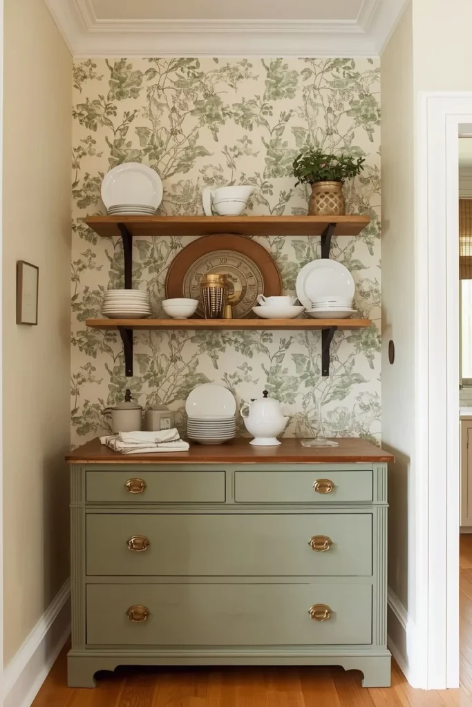
IDEA 10: Botanical Wallpaper Feature Wall
Floral or botanical wallpaper makes the most dramatic single statement available in a cottagecore kitchen — and it requires the most care in placement and selection to avoid the two most common mistakes: choosing too bold a print for the room’s scale, and putting it where kitchen moisture will damage it quickly.
The 2026 approach is more selective than the maximalist cottagecore of earlier years. One accent wall — behind the kitchen dresser, on the dining alcove wall, or in a pantry nook — does more with less. Botanical and floral wallpaper on all four walls typically overwhelms a kitchen rather than enhancing it, creating visual noise rather than atmospheric warmth.
Print scale matters significantly. Smaller, more delicate botanical prints — illustrated herbs, trailing wildflowers, soft leaf patterns — read as vintage and gentle, which is exactly the cottagecore quality to aim for. Large, bold tropical florals push toward a different aesthetic entirely.
For kitchens with steam or cooking area proximity, choose a washable, moisture-resistant wallpaper and keep it away from the direct vicinity of the stovetop and sink. For renters, peel-and-stick botanical wallpaper in this same scale and palette achieves essentially the same effect with zero permanent installation.
IDEA 11: Butcher Block or Wooden Countertop
A butcher block countertop is the most practical expression of the cottagecore kitchen’s “honest materials” principle. Wood is warm, it shows its use, it develops a patina, and it gets more beautiful as the years pass rather than less. Those qualities are exactly inverted from what most modern surface materials offer, which is precisely why butcher block belongs so completely in a cottagecore kitchen.
On a kitchen island or prep section, butcher block creates a warm, natural workspace that feels fundamentally different from stone or quartz. The surface invites contact — it is the kind of counter that makes the act of chopping vegetables feel more considered and more satisfying.
Maintain it with food-safe mineral oil applied monthly — this keeps the wood from drying and cracking while also feeding the rich, warm tone that makes butcher block so visually compelling. A surface that has been well oiled for years develops a depth of color and warmth that no new piece possesses.
For kitchens with limited renovation budget, installing butcher block on the island only — while leaving existing stone or laminate on the perimeter — introduces the warmth at the most prominent, most actively used surface at a fraction of a full countertop replacement cost.
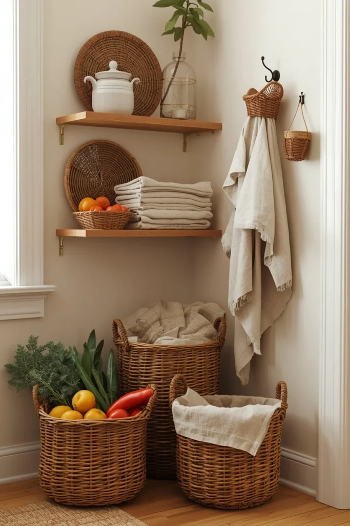
IDEA 12: Wicker and Woven Basket Collection
Wicker and woven baskets fill a specific role in the cottagecore kitchen that closed cabinetry cannot: they contain things beautifully while remaining visually open. A wicker basket full of seasonal vegetables on the counter, a woven basket of bread on the table, a small basket for folded linen tea towels on a shelf — each one organizes its contents while adding natural texture to the kitchen’s visual layer.
The variety of natural fiber textures available — rattan, seagrass, willow, bamboo, water hyacinth — creates an opportunity to layer genuinely different qualities of weave and tone throughout the kitchen without any of them competing. A tightly woven seagrass basket next to a loosely woven rattan one reads as collected rather than mismatched.
Size variation matters: one large floor basket for seasonal produce or firewood, medium baskets on shelves, small ones as countertop organizers. This hierarchy of sizes throughout the kitchen creates the sense of a system that evolved through use rather than one purchased as a matched set.
COTTAGECORE KITCHEN LIGHTING
Lighting is where a cottagecore kitchen either succeeds or fails in the evening — and it is the most frequently neglected element of the whole aesthetic. The most beautifully styled cottagecore kitchen photographed in morning natural light can feel flat, institutional, or slightly wrong after dark if the artificial lighting hasn’t been planned with equal care.
The approach is layered — at least three distinct sources — rather than reliant on any single fixture.
Natural light — the primary source during the day: Keep windows as unobstructed as possible. Use sheer cotton or linen rather than heavy curtains. Keep windowsills styled with small, low objects that don’t block the glass. The farmhouse sink beneath the window places the most-used work surface in the best natural light — a decision that repays itself every day.
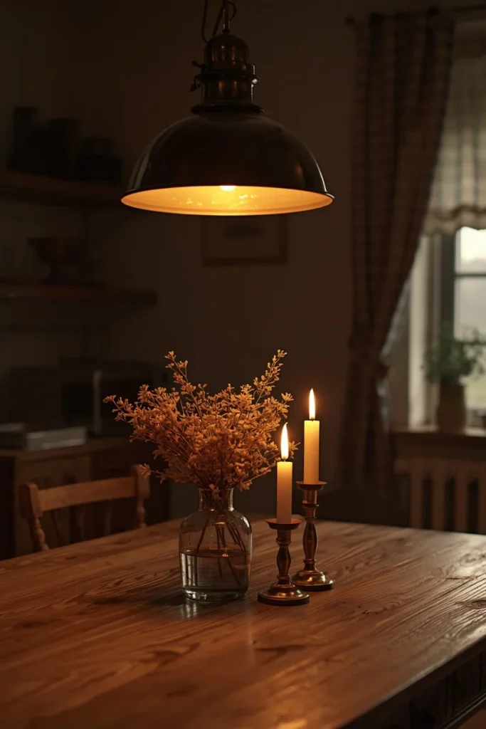
The overhead pendant — the room’s warm anchor: A single pendant light above the kitchen table or island, in aged brass, a woven rattan shade, or a glass bell with a visible warm Edison bulb, sets the entire room’s evening tone. All bulbs should be warm white — 2700K is the target temperature that makes a cottagecore kitchen glow rather than simply illuminate. Anything cooler (3000K and above) pushes the room toward a contemporary, functional quality that undercuts the warmth.
Task and accent lighting — the warmth layer: Under-cabinet warm LED strips provide practical countertop light while maintaining the warm tonal quality of the room. Table and counter candles — in beeswax or soy, in brass, iron, or raw wood candlesticks — complete the evening atmosphere in a way that no electric fitting replicates.
IDEA 13: The Rattan or Woven Pendant Light
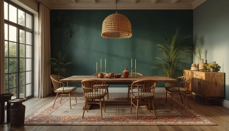
A rattan or woven pendant light above the kitchen table or island immediately establishes a cottagecore atmosphere that no other light fitting achieves as economically. The natural fiber, the organic irregular shape, the slight randomness of a handmade weave — these qualities are the visual opposite of the recessed downlights and sleek pendants that define contemporary kitchens.
The most beautiful effect of a woven pendant is something you can only appreciate by being in the room: the warm, dappled shadow pattern it casts on surrounding walls and surfaces as light passes through the basket weave. This shadow pattern shifts through the evening as the room’s other light levels change, giving the kitchen a genuine quality of movement and atmosphere.
Choose a pendant sized to the table or island it hangs over — a shade too small for a large table loses its presence, while one too large becomes visually dominant in a way that overwhelms a small kitchen. As a guide, the pendant diameter should be roughly half to two-thirds the table width.
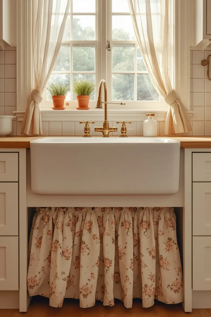
IDEA 14: The Skirted Sink
Before fitted kitchen cabinetry became the standard, a gathered fabric panel concealing the plumbing beneath the sink was the universal solution — practical, beautiful, and deeply personal in its choice of fabric. The skirted sink is one of those cottagecore details that costs almost nothing and adds a warmth that solid cabinet doors simply cannot provide.
A simple tension rod beneath the sink holds a length of gathered fabric: gingham, floral cotton, natural linen, or a soft stripe are all appropriate. The fabric should be loose enough to gather softly rather than pulled tight across the rod — this soft gathering is the detail that reads as genuinely domestic rather than improvised.
The hidden storage benefit is practical as well as aesthetic. Cleaning products, extra bottles, and small appliances disappear completely behind the fabric and are accessed by simply moving the curtain aside — no hinges, no handles, no installation required.
Match the fabric to the kitchen’s curtains or dish towels to create a visual thread that runs through the room without being obviously coordinated.
IDEA 15: Painted Sage Green Cabinets
Sage green — in the warm, slightly yellow-leaning tone rather than a cool or grey-inflected version — is the paint color most consistently associated with the cottagecore kitchen, and with good reason. It reads as inherently natural, deeply connected to the English countryside aesthetic at cottagecore’s heart, and it responds beautifully to the warm artificial light that cottagecore kitchens use in the evening.
For north-facing kitchens with limited natural light, choose a sage green with more yellow warmth in its undertone — Sherwin-Williams Jadite or Farrow & Ball Mizzle are both frequently cited for exactly this quality. South-facing kitchens with abundant light can handle a cooler, more blue-inflected sage without it reading as cold.
The most practical starting point is painting the lower cabinets only, leaving upper cabinets or open shelving in warm white. This two-tone approach delivers the full cottagecore personality of green cabinetry while keeping the kitchen visually open and light-reflective — a particularly important consideration in smaller kitchens.
Pair with a butcher block countertop on the island or a prep area, unlacquered brass hardware throughout, and a cream or warm white wall tile or simple plaster above.
Designer Secret: Test any green paint in your specific kitchen at different times of day before committing. Green shifts more dramatically between morning natural light and evening artificial light than almost any other color — a shade that looks exactly right at noon can read either too dark or too yellow by lamplight.
IDEA 16: Blush or Lilac Pastel Kitchen
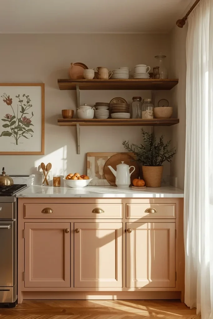
Soft blush and dusty lilac are the most fairytale-adjacent interpretation of the cottagecore palette — the tones of old roses and English cottage walls, faded to a softness that feels genuinely old rather than recently chosen. They are not the high-saturation pastels of a trend-chasing kitchen. They are the colors of things that have been loved for a long time.
The key is the specific shade. A blush that leans warm — closer to dusty rose than pink — stays adult and sophisticated. A lilac that leans grey — closer to lavender at dusk than fresh lavender in bloom — achieves the same quality. These are colors that improve in lower light and in morning shadow, which makes them particularly well suited to the cottagecore kitchen’s range of lighting conditions.
Pair both tones with white honed stone or marble countertops, aged brass hardware, and a small section of botanical wallpaper — a vintage printed herb illustration, a trailing vine, or a soft wildflower repeat. Keep surrounding walls in warm cream rather than stark white to maintain the gentle, faded quality of the whole palette.
IDEA 17: The Dark Cottagecore Kitchen
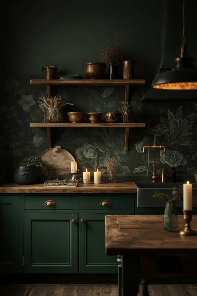
Dark cottagecore takes the same values as the light and airy version — natural materials, vintage objects, connection to the garden and the seasons — and applies them within a dramatically different palette. Deep forest green, hunter green, charcoal, burgundy, and indigo cabinets create an atmosphere that feels intimate and moody rather than bright and fresh.
The Pinterest data around this aesthetic is remarkable: searches for dark cottagecore kitchens have surged more than 900%, and the reasons are consistent in what homeowners describe — a craving for a kitchen that feels genuinely enveloping, that has atmosphere rather than simply design, that rewards being in it at night as much as in the morning.
The warmth layer is essential and non-negotiable in a dark cottagecore kitchen. Without it — without the aged brass fixtures, the warm 2700K lighting, the dried herb bundles, the natural wood surfaces, the earthenware on open shelves — deep cabinet colors read as cold rather than intimate. Every dark cottagecore kitchen succeeds because of its warmth counterbalances, not despite the dark color.
The accessories shift slightly in this interpretation. Vintage apothecary bottles replace clear Kilner jars. Earthenware with more serious forms replaces the delicate floral china. Dark botanical wallpaper with jewel-toned blooms replaces the gentle wildflower prints. The overall effect is less English cottage garden and more old stone farmhouse at the edge of a forest — which is precisely why it has its own devoted following.
Quick Tip: Pair dark cabinetry with a lighter countertop — white marble, butcher block, or even painted wood — to prevent the kitchen from reading as oppressively dark. The countertop contrast is the single decision that most determines whether a dark cottagecore kitchen feels dramatic or simply gloomy.
IDEA 18: The Fully Realized Cottagecore Kitchen
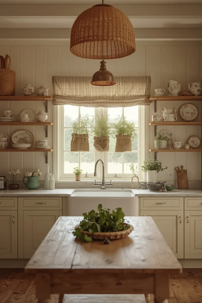
The most complete cottagecore kitchen brings every element together not as a design exercise, but as a genuinely inhabited room — one where the bread on the counter is actually rising, where the herbs on the windowsill are actually being cooked with, where the scratched table has years of dinners in its grain.
This is the kitchen where the farmhouse sink sits beneath the garden-facing window, where the shelves hold the china that was actually collected piece by piece, where the worn table was found at an estate sale rather than manufactured to look like it was. Where the copper kettle has a slightly greenish tinge at the spout from years of daily use, and the linen curtains are slightly uneven because they were washed and hung by someone in a hurry on a Tuesday morning.
The design principles that create this kitchen are not complex. They are simply applied with consistency and patience rather than urgency: choosing honest materials over simulated ones, valuing a genuine old object over a new reproduction, making the seasonal changes that keep the room connected to the world outside it, and resisting the urge to fill every surface until there is nowhere left for anything to breathe.
The result is a kitchen that improves with use rather than degrades — that looks more itself five years from now than it does today. That is not a quality available in a shop. It is the product of time and genuine inhabitation, and it is what makes a truly realized cottagecore kitchen feel unlike any other room in a house.
DESIGNER TIPS
Tip 1 — Start With What You Already Own Before purchasing a single item, look through your own cupboards and storage. The mug you bought on a trip years ago, the wooden board you forgot about, the mismatched set of bowls you’ve been using for a decade — these are almost always better starting materials than anything purchased specifically for the aesthetic. Authenticity in a cottagecore kitchen comes from genuine use, and the objects already in your kitchen have already earned it.
Tip 2 — Let Things Be Imperfect A cottagecore kitchen improves with visible imperfection: a ceramic jug with a slight lopsidedness, a butcher block with a few blade marks, a curtain that has rumpled gently rather than hanging perfectly crisp. Resist the urge to conceal or replace signs of use. They are precisely what communicates that someone genuinely lives and cooks here.
Tip 3 — One Strong Focal Point Choose one element to anchor the kitchen’s visual identity — a farmhouse sink, a kitchen dresser, a botanical wallpaper wall, or the central wooden table — and organize every other element around that single anchor. Kitchens without a focal point distribute attention so evenly across the room that nothing registers clearly. One strong center of gravity gives the room coherence even when the individual elements are deliberately eclectic.
Tip 4 — Layer the Lighting Consistently A cottagecore kitchen needs at least three light sources operating simultaneously in the evening: one warm overhead pendant, task lighting under cabinets or shelves, and candles on the table and windowsill. Single overhead lighting makes even a beautifully styled kitchen feel flat after dark. The layering of light at different heights and intensities is what creates the warmth the aesthetic depends on.
Tip 5 — Use the Seasonal Rotation One of the most distinctive qualities of a genuinely inhabited cottagecore kitchen is the way it changes with the seasons — spring flowers from the garden in ceramic jugs, summer herbs overflowing on the windowsill, autumn dried botanicals and warm candlelight, winter branches and beeswax. The base kitchen remains constant; the seasonal layer changes throughout the year at virtually no cost and keeps the room connected to the world outside it in the way that the aesthetic genuinely values.
BUDGET AND RENTAL-FRIENDLY ALTERNATIVES
| Cottagecore Look | Investment Version | Budget/Rental Alternative |
| Apron-front farmhouse sink | White fireclay ($600–$1,800) | Replace existing tap with brass bridge style ($80–$200) |
| Sage green cabinets | Professional repaint ($1,000–$2,500) | Annie Sloan chalk paint DIY ($60–$120) |
| Open wooden shelves | Carpenter-built custom shelves ($300–$600) | IKEA BERGSHULT shelf in oak ($30–$50 each) |
| Kitchen dresser | Antique market find ($300–$800) | IKEA HEMNES repainted in sage or duck egg ($250) |
| Botanical wallpaper | Designer paper ($80–$200/roll) | Peel-and-stick floral ($20–$40/roll) |
| Butcher block countertop | Professional installation ($40–$65/sq ft) | IKEA BADELUNDA section as island top ($60–$120) |
| Copper cookware display | Vintage copper set ($200–$500) | One copper kettle + two pots from thrift stores ($30–$80) |
| Rattan pendant light | Artisan woven pendant ($150+) | IKEA or Amazon rattan pendant ($25–$60) |
The most effective cheap cottagecore kitchen transformations, in order of impact:
- Swap the tap to brass or copper — single highest visual impact per cost
- Hang dried lavender above the window — costs almost nothing from a farmers’ market
- Remove one upper cabinet door and style the opening as an open shelf
- Source three to five mismatched ceramic pieces from a charity shop or thrift store
- Add gingham or floral curtains in a light cotton
- Place a small collection of terracotta herb pots on the sunniest windowsill
The most authentic cottagecore kitchen elements are frequently the least expensive. Starting there — with the dried lavender, the thrifted ceramic, the warm bulb in an existing fitting — builds the atmosphere that everything else layers onto.
SMALL SPACE STRATEGIES
One dresser instead of upper cabinets: A freestanding kitchen dresser against one wall provides the equivalent storage of a full run of upper cabinets while simultaneously functioning as the room’s visual focal point. The design return per square foot is higher than almost any other single piece of furniture in a small cottagecore kitchen.
Hang vertically: Wall-hung copper pots, baskets on hooks, and a magnetic knife strip in aged iron all add storage and visual character without consuming any counter space — crucial in a compact kitchen where the counter surface is precious.
Use the windowsill fully: In a small kitchen, the windowsill becomes a working element rather than a decorative one. Herb garden on the sunniest end, small ceramic jars of frequently used ingredients in the middle, a single candle on the other side. Every available surface contributes to both function and atmosphere.
Round table over rectangular: A round farmhouse table seats the same number as a small rectangular one but allows more comfortable circulation around it — an important practical consideration when the kitchen table is also in the kitchen.
One bold element, everything else quiet: In a small kitchen, one strongly cottagecore choice — a farmhouse sink, a vintage dresser, a botanical wallpaper wall — does more visual work than many smaller details scattered throughout. Restraint paradoxically makes a small space feel more designed and more intentional.
COMMON MISTAKES
Mistake 1: Curtains too heavy for the space Heavy, lined curtains block the natural light that is the primary atmospheric ingredient of a daytime cottagecore kitchen. Always test fabric at a window before buying — hold it up to daylight and confirm it allows sufficient light through before committing.
Mistake 2: Buying a matching ceramic set instead of collecting A new matching set of ceramics from one shop in one trip communicates “recently styled” rather than “lived in over time.” Source shelf pieces individually from different places across different visits — the variety of sources is what creates the layered, collected quality.
Mistake 3: Floral wallpaper near steam or cooking zones Kitchen steam and grease will damage wallpaper that is not specifically rated for kitchen use and positioned away from the immediate cooking area. Specify moisture-resistant finishes and restrict wallpaper to walls away from the stovetop and sink.
Mistake 4: Over-accessorizing until the kitchen loses its breath The version of cottagecore that fails is always the one that tipped past warmth into overwhelm — too many objects, too many patterns, every surface fully occupied. The 2026 approach is edited: one focal point, breathing space on shelves, enough clear surface area that the kitchen still functions as a kitchen.
Mistake 5: Chrome or matte black hardware Both read as too contemporary and work against the organic warmth the style depends on. Brass, copper, or aged bronze are the appropriate finishes — they warm the room immediately and develop rather than degrade with use.
Mistake 6: New wood that looks too perfect A perfectly smooth, evenly finished butcher block or brand-new farmhouse table without a mark on it contradicts the honest materials principle directly. If buying new is the only option, oil the wood actively from the first day and use it without restraint — the kitchen earns its character through genuine daily life, not through aging processes applied artificially.
Mistake 7: Harsh overhead lighting Fluorescent or cool-temperature overhead lighting is the single fastest way to destroy a cottagecore kitchen atmosphere after dark. Compensate immediately with multiple warm lamp sources and candles at table and windowsill height — the layered warmth will create the right atmosphere despite a fixed overhead fitting.
FAQs
CONCLUSION
The cottagecore kitchen is not a trend to follow. It is a choice about how you want cooking to feel.
When you make that choice — the open shelves with their mismatched ceramics, the dried herbs above the window, the worn table at the center of the room, the brass tap catching the morning light — you are choosing a kitchen that rewards slowness. One that improves with use. One that makes a Tuesday evening dinner feel, just occasionally, like something from a story.
The 18 ideas in this guide give you both the inspiration and the practical framework to create that feeling in your own kitchen — whether you are beginning with a full renovation including a farmhouse sink and sage green cabinetry, or with this weekend’s project of hanging a bunch of dried lavender above the window and moving your favorite old jug to the most visible shelf.
Start anywhere. The warmth follows quickly.